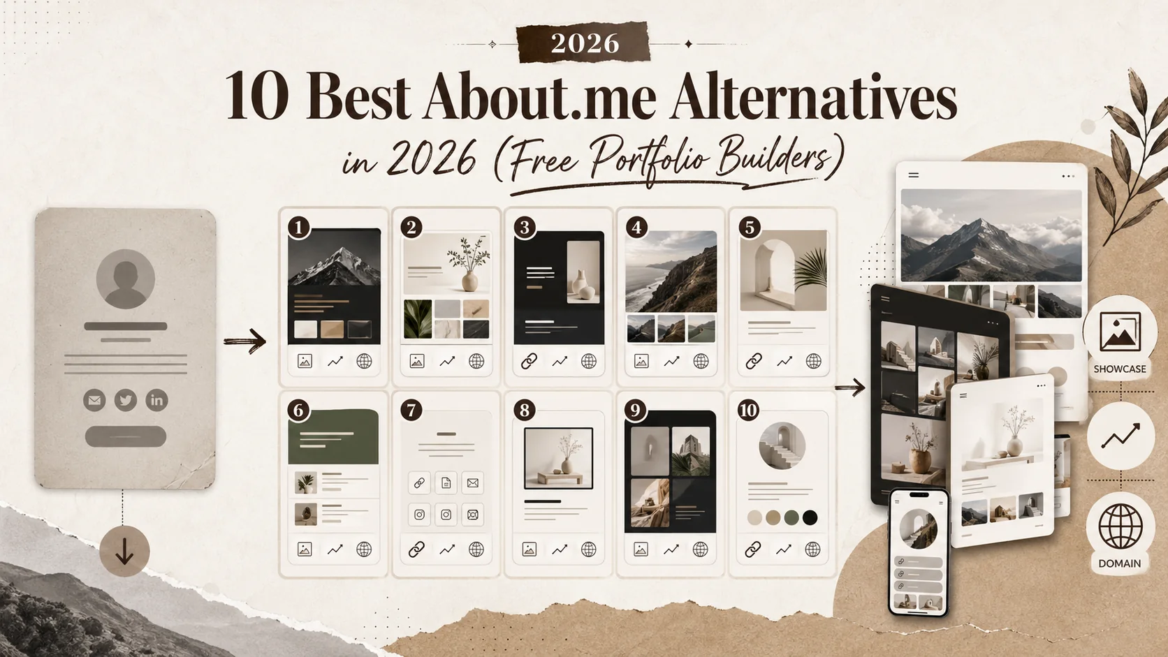


Short answer: the best About.me alternative is not the one with the prettiest hero. It is the one that helps a stranger verify who you are, what you do, what you shipped, and where to click next.
The old bio-page model was built for identity. A name, a photo, a sentence, a few links. That is still useful, but it is thin. Recruiters, clients, collaborators, and followers now need proof. They do not want another tiny page that says "builder, creator, strategist." They want evidence.
Sources checked
What changed
AI made generic personal branding cheap. Anyone can generate a polished tagline, a confident bio, and a wall of achievements. That means the value moved from wording to verification. The page that wins is the page with artifacts: shipped URLs, screenshots, before-after examples, testimonials, metrics, press, code, talks, client work, or a credible project timeline.
This is where Popout should sit: not as another link list, but as a compact proof surface.
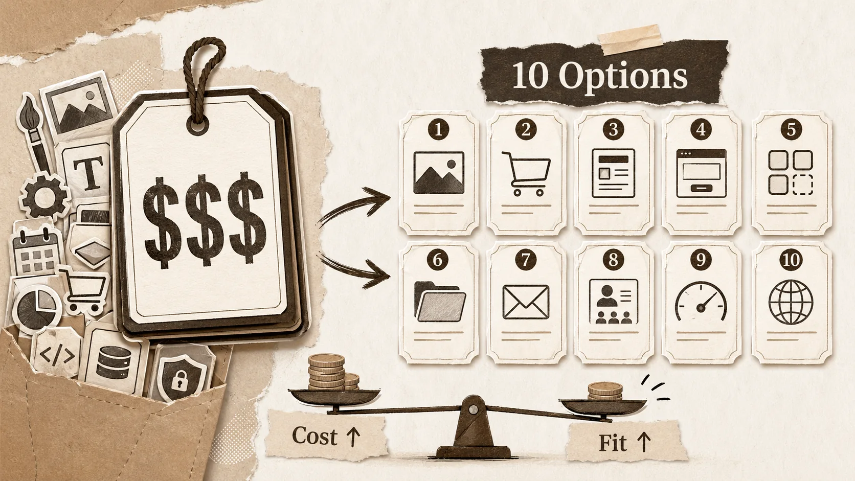
Alternatives by use case
| Tool type | Good for | Weak spot | Best fit |
|---|---|---|---|
| About.me-style bio | Simple identity page | Thin proof | People who only need a calling card |
| Link-in-bio tools | Social traffic routing | Work samples feel secondary | Creators with many channels |
| Carrd-style builders | Lightweight landing pages | More setup decisions | Makers comfortable designing |
| Full website builders | Deep customization | Slow for simple presence | Businesses with content teams |
| Popout-style portfolio hub | Links plus proof | Requires choosing evidence | Job seekers, creators, freelancers |
The recruiter trust test
Open your page and ask four questions. Can a recruiter understand your role in six seconds? Can they verify one project without asking you? Can they find the most important external profile? Can they contact you without hunting?
If the answer is no, the page is not a portfolio. It is a decorative waiting room.
What to put above the fold
Use a role-specific headline, one proof line, three primary links, and one featured project. Keep the page focused. A developer might lead with "Frontend engineer shipping fast React interfaces" plus a shipped product link, GitHub, LinkedIn, and a case study. A designer might lead with portfolio, Figma preview, client result, and contact.
Avoid vague identity soup: "creative technologist, storyteller, strategist, dreamer." It sounds nice and proves nothing.
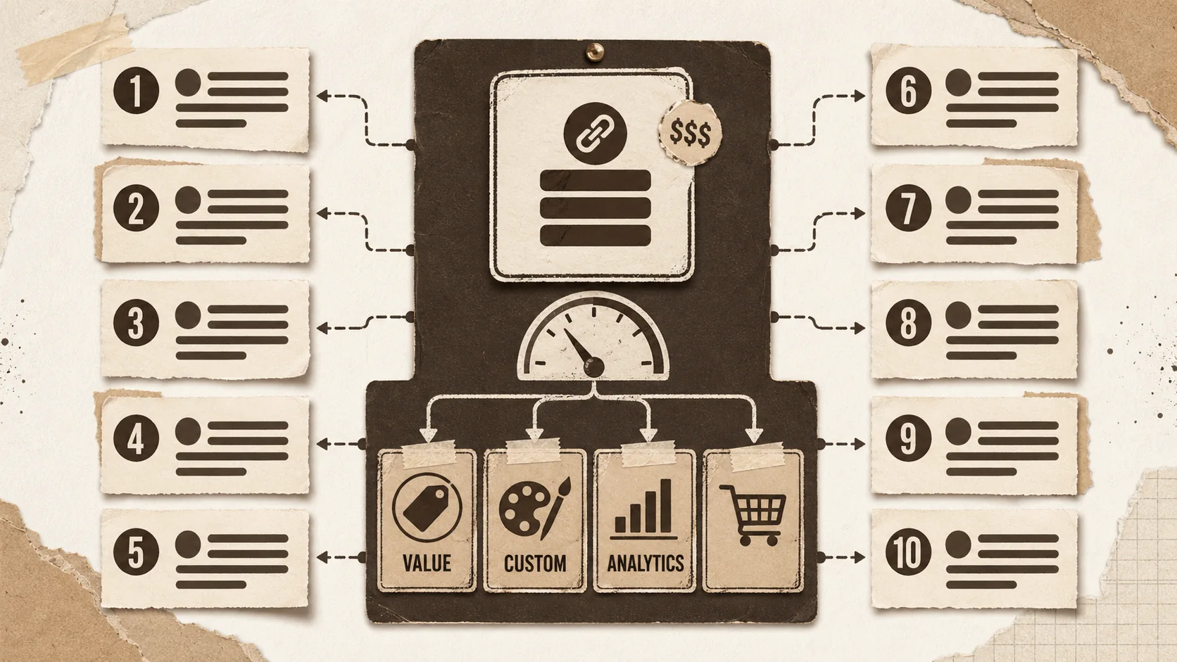
The proof block
Every strong alternative to About.me needs a proof block. Use this format:
| Claim | Proof |
|---|---|
| "I build production apps" | App Store link, live URL, GitHub repo, screenshots |
| "I grow audiences" | Analytics screenshot, newsletter archive, campaign example |
| "I design brands" | Before-after visual, client quote, style guide excerpt |
| "I write" | Best three articles, publication logos, reader metric |
Popout can turn this into a page that feels alive without becoming a full website project.
Internal links that support this cluster
Read /blog/linktree-alternatives, /blog/carrd-alternatives, /blog/bento-alternatives, /tools/developer-bio-generator, and /tools/portfolio-review-checklist. The point is not to collect tools. The point is to pick the surface that proves your work fastest.
FAQ
Is About.me still useful?
Yes, for a simple identity page. It is weaker when you need projects, proof, and career conversion.
Is a link-in-bio page enough for job search?
Usually no. Job search needs evidence, not only links.
Should I build a full website instead?
Only if you need deep content, custom pages, or SEO publishing. Many people need a sharper proof hub first.
What is the fastest improvement?
Add one featured project with context, screenshot, result, and link. That single block often does more than rewriting the headline five times.
The page architecture that converts
Use five blocks. First, identity: name, role, location or availability, and one clear sentence. Second, proof: featured project, metric, screenshot, or client outcome. Third, links: the three places that matter most, not every platform you have ever joined. Fourth, trust: testimonials, logos, press, GitHub, case studies, or credentials. Fifth, contact: obvious, low-friction, and current.
This architecture beats a pretty but vague page because it matches how strangers evaluate you. They scan, verify, compare, and decide whether to click.
Pricing is not the only cost
When comparing alternatives, do not look only at monthly price. Count setup time, design decisions, domain support, analytics, SEO control, mobile rendering, and whether the page encourages proof or just link dumping. A cheap tool that leaves you with a thin page can be expensive in missed opportunities.
For job seekers, the highest cost is ambiguity. If a recruiter cannot tell what you do, the page has failed even if it was included.
The three examples
For a developer, the hero should lead to a shipped project and GitHub proof. For a freelancer, it should lead to outcomes and booking. For a creator, it should lead to best work, email capture, and platform links. Each page can use the same structure, but the proof changes.
Popout's advantage is speed with personality. It gives you enough structure to look professional without forcing you into a full website build before you have chosen the proof that matters.
The cleanup checklist
Remove duplicate links. Replace adjectives with evidence. Put the strongest project first. Add one screenshot. Add one result. Make contact visible. Test on mobile. Then send the page to one person who does not know you and ask what they think you do. Their answer is your real headline.