How to Build a Personal Brand Page That Gets You Hired (Not Just Followers)


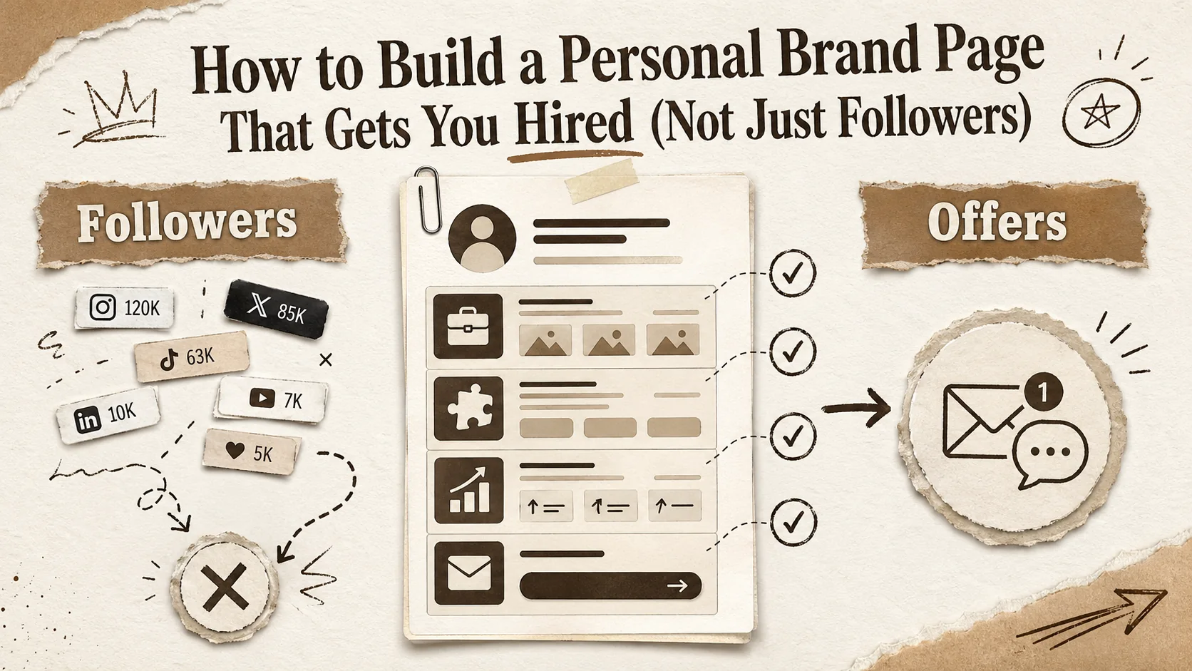
There's a particular kind of personal brand page that gets thousands of followers and zero job offers. You've seen it: an aesthetic gradient background, a clever one-liner bio, twelve social media links, and a content feed that screams "look at me" but never answers the only question a recruiter actually has — "what can this person do for us?"
The follower trap is real, and in 2026 it's worse than ever. The explosion of bio link tools, personal website builders, and "build your brand" courses has created an ocean of polished, professionally designed personal pages that are functionally useless for career advancement. They optimize for engagement when they should optimize for employment.
This is not a guide to getting more followers. This is a guide to building a personal brand page that makes hiring managers reach out, that passes the recruiter's six-second scan, and that converts a cold profile visit into a warm conversation. Every recommendation here is grounded in how recruiting actually works in 2026 — not how brand coaches say it works on TikTok.
The Follower Trap: Why Most Bio Pages Fail at Career Goals
Let's start with the uncomfortable reality. According to LinkedIn's 2026 Talent Trends report, 78% of recruiters visit a candidate's personal website or link-in-bio page during the evaluation process. But here's the number that matters: only 12% of those visits result in the recruiter taking a next step — clicking a portfolio link, downloading a resume, or reaching out. The other 88% bounce within ten seconds.
Why? Because most personal brand pages are built for an audience of followers, not an audience of decision-makers. There's a fundamental structural difference between content that attracts a crowd and content that attracts an opportunity.
Follower-optimized pages lead with personality. They feature catchy taglines, lifestyle photos, and links to social platforms. The call to action is implicit: "Follow me." The content hierarchy prioritizes breadth — look at all the things I do, all the places I exist, all the content I create.
Career-optimized pages lead with capability. They feature specific skills, measurable outcomes, and links to work samples. The call to action is explicit: "Here's what I can do. Here's the proof. Here's how to reach me." The content hierarchy prioritizes depth — here's exactly what I'm great at and why you should care.
The mistake most people make is treating these as the same goal. They aren't. A page that's great for building an audience is almost always terrible for getting hired, because the two audiences want fundamentally different things.
Followers want to be entertained, inspired, or educated. Recruiters want to be convinced — quickly, specifically, and with evidence.
What Recruiters Actually Look At in 2026
Before building anything, you need to understand the evaluation framework on the other side of the screen. Career platform Greenhouse published an internal study in early 2026 surveying over 2,000 hiring managers on how they evaluate personal brand pages. The findings dismantle most personal branding advice.
The six-second scan is real. Recruiters spend an average of six seconds on their first pass of your page. In that window, they're looking for three things: what you do, how well you do it, and whether it's relevant to what they need. If your above-the-fold content doesn't answer all three, you've lost them.
Job titles beat creative taglines. "Senior Product Designer specializing in B2B SaaS" outperforms "Creative Problem-Solver & Design Thinker" by a factor of 3x in recruiter engagement. Recruiters search by role and keyword. Creative taglines are invisible to this process. The survey found that 67% of recruiters said vague taglines like "Passionate Creator" or "Building the Future" made them less likely to continue evaluating a candidate.
Portfolio links matter more than follower counts. 82% of recruiters said a link to relevant work samples was the single most important element on a personal brand page. Only 8% said social media follower counts factored into their evaluation. Your 50K Instagram following impresses other content creators. It does not impress the engineering director looking for a frontend lead.
Contact clarity converts. Pages that include a professional email address visible without clicking see 3.4x more recruiter outreach than pages that hide contact information behind a form or a DM prompt. Recruiters are busy. They will not fill out a contact form. They will not DM you on Instagram. They want to fire off an email and move on.
Recency matters. Pages with work samples or updates from the last 90 days get 2.7x more engagement than pages that haven't been updated in six months. A stale brand page signals a stale career. Recruiters interpret lack of recent activity as lack of current involvement.
These data points aren't opinions. They're the measurable behaviors of the people who decide whether you get the interview. Build for them.
The 5-Section Framework for a Career-First Brand Page
Based on the recruiter behavior data above and the patterns of personal brand pages that consistently generate job opportunities — not just traffic — here's a five-section framework you can implement today.
Section 1: The Headline That Works (Job Title vs. "Creative")
Your headline is the single most important line on your page. It's the first thing a recruiter reads, the text that appears in search results, and the primary filter for whether someone stays or leaves.
The formula that works: [Role] + [Specialization] + [Differentiator]
Examples:
- "Full-Stack Engineer | React + Node | 6 Years in Fintech"
- "Product Designer | Enterprise SaaS | Previously at Stripe and Notion"
- "Marketing Strategist | B2B Growth | $12M Pipeline Generated in 2025"
Examples of what doesn't work:
- "Dreamer. Builder. Storyteller." (What do you actually do?)
- "Making the world a better place through design" (So is everyone else)
- "Multi-passionate creative entrepreneur" (Recruiter translation: "unfocused")
The differentiator is what separates you from the ten thousand other people with the same job title. It can be an industry specialization, a notable employer, a measurable outcome, or a technical niche. It gives the recruiter a reason to click deeper instead of moving to the next candidate.
Some nuance here: if you're in a creative field — illustration, content creation, photography — a slightly more expressive headline can work, but it still needs to be specific. "Brand Illustrator for Tech Startups" is creative and clear. "Visual Storyteller" is neither.
For more on tailoring your page to your specific career stage, our guide on building a portfolio that stands out in 2026 covers the broader strategic framework.
Section 2: Social Proof That Actually Matters
Social proof on a career-focused brand page is not your follower count. It's not the number of likes on your latest post. It's evidence that other credible people and organizations have trusted you with real work and real responsibility.
Effective social proof for career pages:
-
Client or employer logos. "Worked with" followed by three to five recognizable company logos instantly establishes credibility. You don't need Fortune 500 names — recognizable within your industry is enough. A UX designer showing logos of three well-known SaaS products communicates more than any bio paragraph.
-
Specific testimonials with names and titles. "Great to work with!" from an anonymous source is worthless. "Alex reduced our onboarding time by 40% and was the most reliable contractor we've had in three years — Jamie Torres, VP Engineering at Datawise" is gold. Always include the recommender's name, title, and company. Always tie the testimonial to a measurable outcome.
-
Speaking engagements and publications. If you've spoken at conferences, been quoted in publications, or contributed to notable projects, list them. These are third-party validators that you can't fake easily.
-
Certifications and awards — sparingly. Only include certifications that the people hiring you would recognize and value. An AWS Solutions Architect certification matters for a cloud engineer. A Canva design certificate does not matter for a senior product designer.
What to leave off: follower counts, "as seen in" badges from pay-to-play publications, self-published awards, and any social proof that requires explanation to understand why it's impressive. If you have to explain it, it's not proof.
Section 3: Portfolio Links (Quality Over Quantity)
This is where most personal brand pages fail catastrophically. They either link to everything (twelve portfolio items across five platforms with no curation) or link to nothing (just social media profiles and a vague "my work" label).
The data from recruiter surveys is clear: three to five curated work samples outperform twenty uncurated links in every measurable way — time on page, click-through rate, and outreach conversion.
The curation framework:
-
Lead with your best, most relevant work. Not your most recent. Not your most popular. The work that most closely aligns with the job you want next. If you're targeting a senior frontend role, lead with your most sophisticated frontend project, even if your most recent work was a backend script.
-
Each portfolio link needs context. Don't just link to a live site or a GitHub repo and expect the recruiter to figure out what's impressive about it. Add one sentence of context: "Rebuilt the checkout flow from scratch — reduced cart abandonment by 23%." The link is the evidence. The context sentence is the argument.
-
Match the format to the role. Developers: link to GitHub repos with good READMEs, live demos, or technical blog posts. Designers: link to case studies with before/after visuals and process documentation. Marketers: link to campaign results, content samples, or strategy documents. Writers: link to published pieces on recognizable publications.
-
Remove anything that's not portfolio-grade. That side project you built in a weekend and never polished? It's doing more harm than good. Recruiters will judge you by your weakest visible work, not your strongest. Five strong pieces beat ten mediocre ones every time.
-
Ensure everything loads instantly. Broken links, slow-loading portfolio sites, and password-protected samples are recruiter repellents. Test every link quarterly. If a project is no longer live, use a video walkthrough or screenshot gallery instead.
If your portfolio spans multiple disciplines, consider creating role-specific versions of your brand page. A page targeting product design roles should feature different work than one targeting UX research roles, even if you do both. For guidance on this, check out our article on the portfolio audit framework for career moves.
Section 4: The CTA That Converts
Every page needs a call to action. On a follower-optimized page, the CTA is "follow me on social media." On a career-optimized page, the CTA needs to answer a different question: "What should someone who wants to hire me do right now?"
The highest-converting CTA patterns for career pages:
-
Direct email link with context. "Looking for a senior React developer? Let's talk: alex@email.com" — this outperforms every other CTA format for recruiter outreach. It's clear, it's immediate, and it requires zero friction. Put this above the fold and at the bottom of the page.
-
Calendar booking link for targeted roles. If you're actively looking, a Calendly link with a clear label ("Book a 15-minute intro call") converts well for senior and executive roles where the conversation is the first step. Don't use this as your only CTA — always include an email alternative.
-
Resume download with a clear label. "Download my resume (PDF, updated March 2026)" performs significantly better than hiding the resume behind a form or not offering it at all. Recruiters want to download and forward. Make it trivially easy.
CTA mistakes that kill conversions:
- Contact forms that ask for more than name and email. Nobody is filling out a five-field form to reach out to a potential candidate.
- "DM me on Twitter/X" as the only contact method. This signals that you're optimizing for social engagement, not professional communication.
- No CTA at all. A shocking number of personal brand pages have zero actionable next step. The recruiter is interested — now what?
- CTAs buried at the bottom of a long page. If someone has to scroll through your life story to find your email, most won't.
Section 5: Contact Strategy That Respects Both Parties
The final section bridges the gap between your personal brand page and an actual conversation. This is more nuanced than just listing an email address.
Professional email address. Use a custom domain email (alex@alexsmith.dev) or at minimum a clean Gmail address. yourname.dev@gmail.com is fine. xX_designmaster_420@hotmail.com is not. This sounds obvious, but 14% of personal brand pages still list unprofessional email addresses according to a 2026 CareerBuilder survey.
Response time expectations. If you add a note like "I typically respond within 24 hours," you set expectations and signal professionalism. It's a small detail that recruiters notice, especially when they're comparing you against candidates who never responded.
Location and availability signals. Remote-friendly? Open to relocation? Available immediately or after a notice period? This information saves both parties time. A recruiter in London looking for an on-site hire will appreciate knowing upfront that you're based in São Paulo and remote-only, rather than discovering it three emails deep.
LinkedIn link — but strategically. Your LinkedIn profile should be linked, but it should not be the only thing on your brand page. A brand page that's just a pretty wrapper around a LinkedIn link adds zero value. LinkedIn is one data point. Your brand page should contain information, context, and curation that LinkedIn doesn't offer.
What to omit: phone numbers (use email or scheduling tools instead), home addresses, personal social media accounts that aren't professionally relevant, and any platform where your content doesn't serve your career goals.
Common Mistakes That Sabotage Career-Focused Brand Pages
Beyond the section-by-section guidance above, here are the structural mistakes that undermine even well-intentioned personal brand pages.
The identity crisis page. You're a developer AND a photographer AND a podcast host AND a startup advisor AND a DJ. Pick one primary identity for your career-focused page. You can have multiple interests — you cannot have multiple primary professional identities on a single page and expect a recruiter to take any of them seriously.
The social media hub. Your brand page is just a list of social media links with a profile photo. This adds nothing that a Linktree doesn't already provide. Your page needs original content — context, curation, and capability — that doesn't exist anywhere else.
The novel-length bio. Your about section is 800 words covering your childhood, your career journey, your philosophy, and your hobbies. Recruiters read about 50 words of bio text. Make them count. Lead with what you do and why you're good at it. Save the personal journey for the interview.
The aesthetic-first page. Beautiful typography, custom animations, gorgeous color palette — and no substance. The design serves the content, not the other way around. A plain page with strong content outperforms a beautiful page with weak content every single time.
The outdated page. Last updated eight months ago. Portfolio links are broken. The featured project is from 2024. Bio still says "currently at" a company you left last year. An outdated brand page is worse than no brand page at all, because it signals that you've either stagnated or stopped caring. Set a calendar reminder to audit your page every 90 days. For a systematic approach to this, our portfolio audit question framework provides a repeatable process.
Before and After: What the Shift Looks Like
To make this concrete, here are two profiles — same person, different page structures.
Before (follower-optimized):
- Headline: "Creative | Builder | Lifelong Learner"
- Bio: 200 words about their journey from art school to tech, their passion for innovation, and their love of travel
- Links: Instagram, Twitter/X, TikTok, YouTube, LinkedIn, Medium, GitHub, Dribbble, Behance, personal newsletter
- CTA: "Let's connect! DM me on Twitter"
- Result: 3,400 followers. Zero recruiter outreach in six months.
After (career-optimized):
- Headline: "Product Designer | B2B SaaS | Previously Figma, Currently Open to Senior Roles"
- Bio: 50 words — "I design complex workflows for enterprise SaaS products. 7 years of experience turning messy data problems into clean interfaces. Shipped features used by 200K+ users at Figma and two Series B startups."
- Links: Three case studies with one-line context each, resume PDF, LinkedIn
- CTA: "Hiring a senior product designer? alex@alexsmith.design | Available from April 2026"
- Result: 340 page views/month from organic search. Four recruiter emails in the first month. Two interviews. One offer.
The follower-optimized page had 10x the audience. The career-optimized page had 10x the results. That's the difference between building for engagement and building for employment.
Tools and Platforms: Choosing the Right One
Not all personal brand page tools are created equal for career purposes. Here's a practical comparison based on what matters for job seekers.
Popout — Built specifically for professional brand pages. Structured sections that align with the framework above. Clean, recruiter-friendly layouts without the design overhead. Best for: anyone who wants a career-focused page without building a custom website. The structured format naturally guides you toward the right content hierarchy.
Linktree / Later Link in Bio — Good for social media link aggregation, poor for career content. No space for portfolio context, testimonials, or work samples. Best for: content creators whose primary goal is cross-platform audience growth, not job seeking.
Personal website (custom-built) — Maximum flexibility and control. Requires design and development skills or budget to hire someone. Best for: developers and designers who want their personal site to double as a portfolio. Worst for: anyone who will build it once and never update it.
Notion / Super — Flexible and easy to update. Can be professional if well-structured. Lacks some SEO capability and can feel template-heavy. Best for: people who already live in Notion and want a low-maintenance brand page.
WordPress / Squarespace — Full-featured but overkill for a single-page brand presence. Maintenance overhead is real. Best for: people who need a full blog or content hub alongside their brand page.
The right tool is the one you'll actually keep updated. A beautifully built custom website that hasn't been touched in a year is worse than a Popout page you refresh every month. Maintenance consistency beats initial design quality for career outcomes.
The Action Plan: Build Yours This Weekend
Here's the sequence. Block three hours on a Saturday.
Hour 1: Write your headline using the formula. Write your 50-word bio. Choose your top three portfolio pieces and write one context sentence for each.
Hour 2: Gather your social proof — logos, testimonials, certifications. Set up your CTA with a professional email. Write your availability and location notes.
Hour 3: Build the page on your platform of choice. Test every link. Check it on mobile (over 60% of recruiter page visits happen on mobile in 2026). Send it to one trusted colleague for a reality check.
Then set a recurring 90-day calendar reminder to audit and update.
Your personal brand page isn't a creative expression project. It's a career tool. Build it like one, measure it like one, and maintain it like one. The followers are a vanity metric. The job offer is the only metric that matters.
Other Doved Studio projects
Related tools from the same studio you might find useful:
- Ralphable: Generate structured Claude Code skills that iterate until pass/fail criteria are met.
- Glean: Turn scrolling time into a daily action plan. Capture, process, execute.
- Doved Studio: Studio indie derrière cette app et une dizaine d'autres outils.
Written by
popout
Content Team