Your Bio Link's First 3 Seconds: The 2026 Attention Test

You have three seconds. That’s the new average time a recruiter, client, or collaborator spends on your bio link before deciding to stay or bounce. According to a 2026 digital behavioral psychology study from Stanford's Human-Computer Interaction Lab, the evaluation window for a digital profile has compressed to under three seconds, down from seven seconds in 2022. This isn't just about scrolling faster. It's a fundamental shift in how we process professional information, trained by platforms like TikTok and Instagram Reels that reward instant comprehension. Your bio link is no longer a passive directory; it's a high-stakes first impression that lives or dies in a single glance. This article breaks down the neuroscience of that glance and gives you a concrete framework to engineer your page for the 2026 attention economy.
What is bio link optimization?
Bio link optimization is the systematic process of designing and structuring your link-in-bio page to maximize clarity, engagement, and conversion within the first three seconds of a visitor's view. It moves beyond adding links to architecting an experience based on visual hierarchy, cognitive load, and goal-oriented action. A 2025 report by HubSpot found that optimized bio links can increase click-through rates by up to 210% compared to generic lists. This process is critical because your bio link often serves as the central hub from your social media profiles, acting as the bridge between a casual scroll and a professional commitment.
| Traditional Bio Link | Optimized Bio Link (2026) |
|---|---|
| Static list of links | Dynamic, goal-oriented journey |
| Generic "Linktree" style | Branded, cohesive visual identity |
| Assumes visitor patience | Designed for 3-second comprehension |
| Tracks total clicks | Analyzes engagement heatmaps & drop-off |
| One-size-fits-all | Tailored for specific audience (recruiter vs. client) |
Why does the first impression bio matter more than ever?
A first impression bio matters because it triggers a rapid, subconscious cognitive assessment that determines all subsequent engagement. The brain uses heuristics—mental shortcuts—to assess trust, competence, and relevance almost instantly. A study published in Behavioral Brain Research notes that visual complexity alone can increase perceived cognitive load by 40%, causing visitors to abandon a page before consciously processing its content. In a professional context, a cluttered or confusing bio link signals disorganization, while a clear one signals professionalism and respect for the viewer's time. This immediate judgment directly impacts whether someone clicks your portfolio link, signs up for your newsletter, or simply moves on.
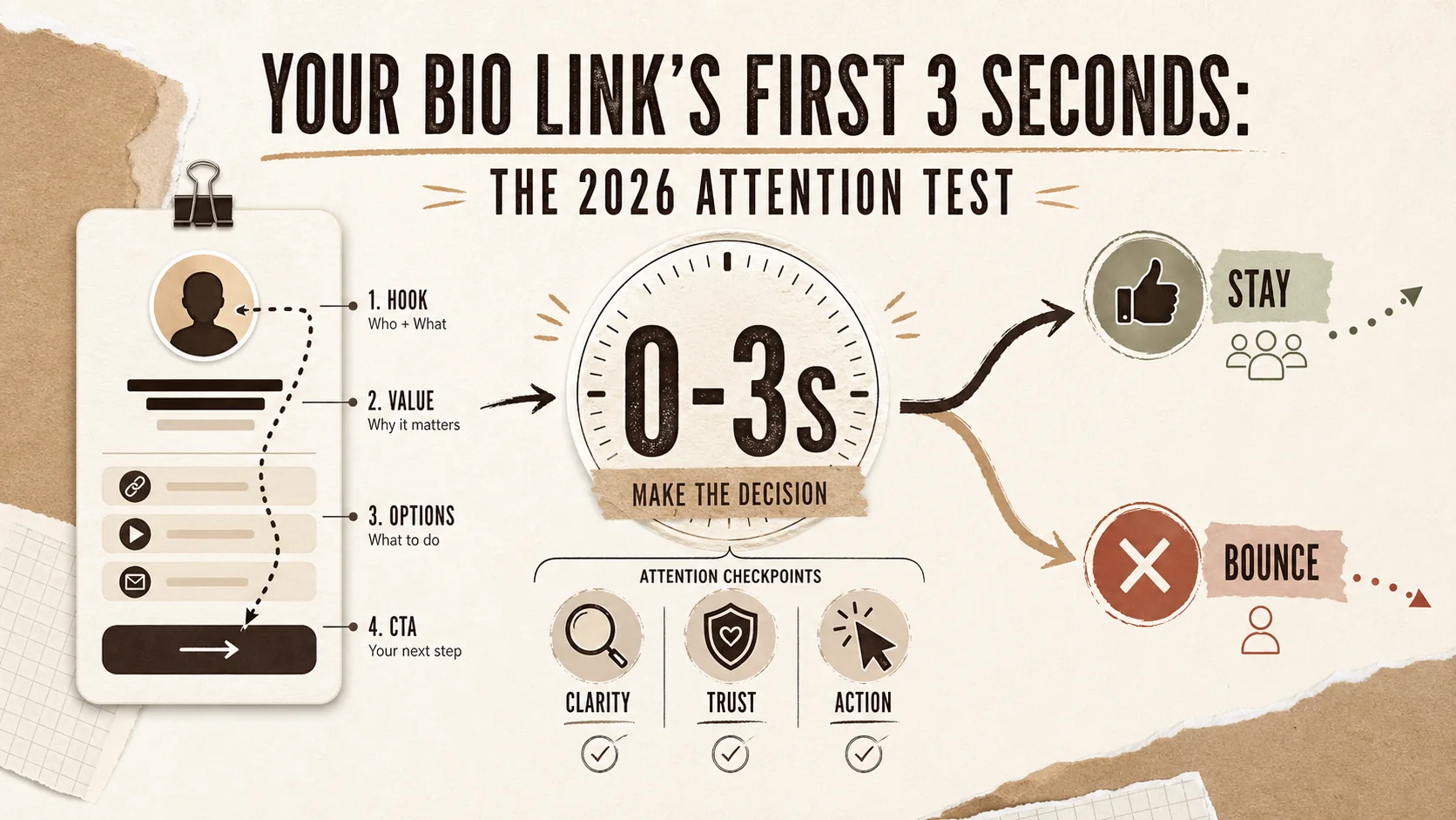
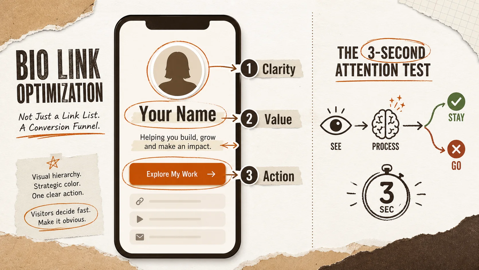
What are the core components of an optimized bio link?
An optimized bio link has four core components: a hero section, a curated link hierarchy, social proof, and a clear call-to-action (CTA). The hero section needs a professional photo, your name, and a one-line value proposition. Your links should be ordered by priority, not chronology, with descriptive labels (not just "Click here"). Social proof, like a client logo or a testimonial snippet, builds instant credibility. Finally, a single, primary CTA (like "View My Portfolio" or "Book a Call") guides the visitor to the next step. According to Unbounce conversion data, pages with a single, clear CTA can convert 42% better than those with multiple competing options.
How is this different from just using a Linktree?
The difference is intent and architecture. A standard Linktree functions as a simple list; bio link optimization treats the page as a conversion funnel. It considers the visitor's intent (Are they hiring? Looking to collaborate? Wanting to learn?) and structures the page to satisfy that intent immediately. This involves strategic color use to guide the eye, spacing to reduce clutter, and microcopy that answers "What's in it for me?" instantly. While tools like Linktree provide the basic functionality, achieving true optimization often requires a platform built for personal branding, which is why many professionals seek out Linktree alternatives that offer deeper customization and analytics.
Why your bio link's first 3 seconds are critical
Your bio link's first three seconds are critical because that's when a visitor's brain makes a snap "stay or go" decision based on visual processing speed. This isn't a choice they're consciously making; it's a neurological response to stimulus. If your page fails to communicate value and clarity within that window, you've lost them. This speed is driven by the overflow of digital content. The average person encounters countless profiles daily, and their attention is the scarcest resource. For you, this means every element on your page must earn its place by contributing to immediate understanding.
How much time do recruiters actually spend?
Recruiters spend an average of 7.4 seconds initially scanning a resume, but that number drops to under 3 seconds for a digital profile link, according to LinkedIn Talent Solutions' 2026 data. Their goal is rapid triage: to filter candidates into "potential" or "pass" buckets as efficiently as possible. A bio link that requires decoding—like unclear job titles, broken links, or an overwhelming number of options—is an immediate "pass." This makes bio link optimization not just a nice-to-have, but a non-negotiable part of a modern job search. Your page must allow a recruiter to answer "Who is this person and what do they do?" in a single glance.
What is the "cognitive load" penalty?
The cognitive load penalty is the mental effort required to parse confusing information, which directly increases bounce rate. When a page has too many fonts, conflicting colors, vague link labels, or disorganized sections, the visitor's working memory is overloaded. A 2025 Nielsen Norman Group study on web usability found that reducing cognitive load by simplifying layout and language can improve user performance on tasks by 35%. On your bio link, this penalty manifests as visitors leaving because it feels "too busy" or "hard to figure out." They won't tell you it was cognitively taxing; they'll just be gone.
How do social media habits affect professional evaluation?
Social media habits, specifically the consumption of short-form video, have trained users to expect immediate payoff and rapid context-switching. This conditions the brain to seek the "highlight" instantly. When this habit spills into professional evaluation, visitors subconsciously apply the same filter: they look for the key visual or textual "hook" within seconds. If your bio link looks like a dense paragraph or a chaotic grid, it conflicts with this conditioned expectation for quick, digestible information. Structuring your page with clear visual signposts—like icons, bold headings, and ample white space—aligns with these new consumption patterns and meets the viewer where their attention span actually is. For a deeper dive into building a cohesive brand across all your touchpoints, explore our guide on personal branding fundamentals.
How to run your own 2026 attention test
Running your own 2026 attention test means auditing your bio link with the ruthless perspective of a time-pressed stranger. The goal is to identify and eliminate any element that causes friction, delay, or confusion within the critical three-second window. This isn't about subjective taste; it's about objective performance. You can use tools like heatmap recorders (e.g., Microsoft Clarity) or simply perform the "3-second glance test" with friends. The process involves measuring specific metrics: time to identify your profession, time to find the primary CTA, and the overall visual clarity score.
Step 1: The 3-second glance test (what do people actually see?)
The 3-second glance test involves showing your bio link to someone for exactly three seconds, then asking them to recall what they saw and what they think you do. According to eye-tracking research from MIT, the human eye can fixate on 3-4 elements in three seconds. If your test subjects can't accurately state your role and identify your main call-to-action, your page is failing. Common failures include a weak hero section, a headline that's a job title instead of a value proposition, or too many competing visual elements. This test is the foundation of all bio link optimization.
Step 2: Audit your visual hierarchy (where does the eye go?)
Your visual hierarchy is the order in which elements on your page grab attention. To audit it, squint at your bio link or view a blurred version. The elements that stand out should be, in order: 1) Your name/face, 2) Your one-sentence value prop, 3) Your primary button. If a social media icon, a decorative graphic, or a secondary link is competing for top attention, your hierarchy is broken. Use size, color contrast, and positioning to guide the eye deliberately. Tools like Popout are built with this hierarchy in mind, structuring the editor to prioritize these key blocks, which is a significant reason professionals choose it among other portfolio builder alternatives.
Step 3: Simplify your link architecture (how many choices are too many?)
Simplify your link architecture by ruthlessly curating and categorizing. The paradox of choice is real: A study in the Journal of Consumer Psychology found that offering too many options can lead to decision paralysis and reduce conversion by up to 30%. Group similar links under clear headings (e.g., "My Work," "Let's Connect," "Writing"). Limit your primary links to 3-5. Use descriptive action-oriented labels like "View Project Case Study" instead of "Project 01." Every link should have a clear purpose for a specific visitor segment.
Link Architecture Checklist:
- Primary Links (3-5 max): Portfolio, Contact, Key Project/Offer.
- Secondary Links (Grouped): Social media, blog, podcast appearances.
- Link Labels: Use verbs and benefit hints (e.g., "Read My UX Analysis" not "Blog").
- Order: Most important action first. Recruiters care about your portfolio before your Instagram.
- Function: Test every link. Broken links destroy credibility instantly.
Step 4: Quantify your clarity with the Friction Score
The Friction Score is a simple 1-10 rating you assign based on four friction points: 1) Speed: Does the page load instantly? 2) Scanning: Can I find the main info without reading? 3) Intent: Is the primary action obvious? 4) Trust: Is there immediate social proof? Score each out of 2.5. A score below 7 means you're losing a significant portion of your visitors. For example, a page with a slow-loading background video (Speed: 1), no headings (Scanning: 1), three equally sized buttons (Intent: 1), and no testimonials (Trust: 1) has a Friction Score of 4—meaning over 60% of visitors likely bounce. Aim for a 9.
Step 5: Implement micro-optimizations for major impact
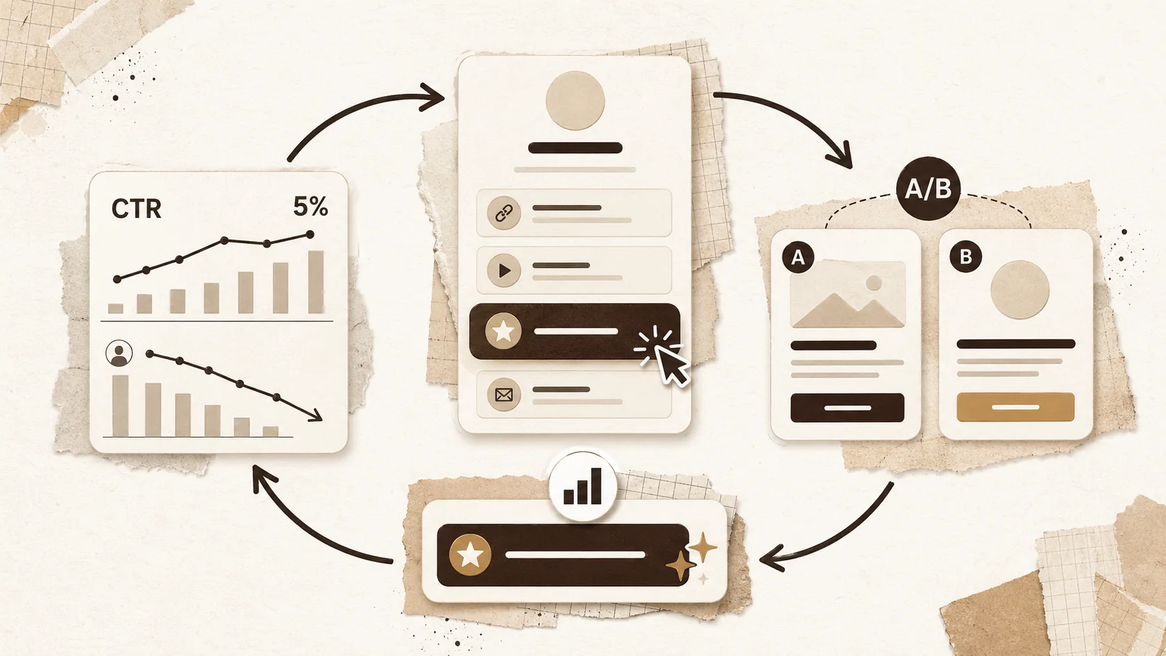
Micro-optimizations are small, specific changes that disproportionately improve the three-second experience. These include: replacing your job title with a client-focused headline ("I help startups design apps that users love"), using a high-contrast color for your primary CTA button (like a bright color on a neutral background), adding a one-sentence testimonial near the top, and ensuring your profile photo is a clear, friendly headshot. Data from VWO, an A/B testing platform, shows that changing button color alone can increase clicks by over 11%. These tweaks directly reduce cognitive load and guide action.
Step 6: Choose the right tool for the job
The right tool for bio link optimization provides more than link hosting; it offers design control, integrated analytics, and branding features. When comparing platforms, look for: custom domain support, detailed click analytics (not just totals, but heatmaps if possible), the ability to embed media (like video previews), and mobile-responsive templates. A platform that locks you into a generic template or hides analytics behind a paywall limits your ability to test and improve. Your tool should empower your optimization, not hinder it.
Step 7: Test, measure, and iterate continuously
Test, measure, and iterate by using your bio link platform's analytics to track not just total clicks, but which links are clicked first and the click-through rate on your primary CTA. Set a benchmark, then run small A/B tests: try two different headline versions or button texts for a month. Even a 5% increase in your primary CTA conversion represents a meaningful boost in opportunities. Bio link optimization is not a one-time task; it's an ongoing process of refinement based on how real people interact with your page.
Proven strategies to pass the attention test every time
Proven strategies to pass the attention test involve pre-emptively answering the visitor's subconscious questions. These strategies are based on pattern recognition and reducing uncertainty. A 2026 report by Content Science Review highlighted that content structured to answer "Who, What, Why" in the first 100 pixels saw a 50% longer average session time. The goal is to make your page so intuitively clear that the visitor's decision to engage feels effortless.
Strategy 1: Lead with outcome, not job title
Lead with the outcome you create for clients or employers, not your internal job title. "Frontend Developer" is a category; "I build e-commerce sites that convert 30% more visitors" is a value proposition. This immediately answers "What can you do for me?" According to a 2025 analysis of freelance platform profiles, profiles that started with a client-focused headline won 47% more interview invitations. This single shift in framing can make your bio link resonate with the visitor's needs within the first second.
Strategy 2: Use the "F-Pattern" to your advantage
The "F-Pattern" describes the common eye-scanning path on text-heavy pages: users look across the top, then down the left side. You can use this to your advantage by placing your most critical information—your name, primary headline, and first link—along this natural path. Avoid centering all your text or burying key links in the middle of paragraphs. Structure your content with left-aligned headings and brief bullet points to facilitate rapid scanning. This aligns with how people actually read online and is a core tenet of effective bio link optimization.
Strategy 3: Incorporate instant social proof
Instant social proof is a credibility signal that works within the three-second window. This could be a tiny, tasteful logo of a well-known client, a star rating, or a short, powerful testimonial snippet placed near your CTA. The brain interprets these as external validation, reducing perceived risk. For example, adding "Featured in TechCrunch" or "Trusted by [Company Name]" next to your "Hire Me" button can significantly increase its click-through rate. This tactic directly addresses the trust question that flashes in a visitor's mind.
Strategy 4: Design for the "thumb zone" on mobile
Design for the "thumb zone"—the area easily reachable by a thumb on a mobile screen—because over 80% of bio link traffic comes from mobile devices. Your primary CTA button and most important links should sit within this natural zone (the middle and lower-middle of the screen). Placing key actions at the very top (requiring a stretch) or bottom (hidden behind menus) adds physical friction. A mobile-first design isn't just responsive; it's strategically laid out for one-handed, on-the-go evaluation, which is where most first impressions now happen. For more on creating a standout mobile presence, see our resources on building a professional portfolio.
Key takeaways
- Bio link optimization is the strategic design of your link page for maximum 3-second comprehension and conversion.
- The average time for a professional evaluation is now under 3 seconds, driven by changed digital consumption habits.
- High cognitive load from visual clutter can increase bounce rates by over 40%.
- The "3-second glance test" is the most effective way to audit your page's immediate clarity.
- Simplify your link architecture to 3-5 primary choices to combat decision paralysis.
- Lead with a client-focused outcome statement, not a generic job title, to instantly communicate value.
- Always design with the mobile "thumb zone" in mind, as most traffic comes from phones.
Got questions about bio link optimization? We've got answers
What is the 2026 attention test for a bio link?
The 2026 attention test is a simple audit: if a stranger can't understand who you are and what you want them to do within three seconds of viewing your bio link, it fails. This test is based on 2026 research showing that digital profile evaluation now happens in under three seconds. To pass, your page needs immediate visual clarity, a clear value proposition, and one obvious next step.
How many links should I have on my bio link page?
You should have between 3 to 5 primary links that represent your key goals (portfolio, contact, main project). You can group additional, secondary links (like all social media profiles) under a heading or in a less prominent section. Offering more than 5-7 total choices often leads to lower engagement because it overwhelms visitors. Curate ruthlessly.
How much can bio link optimization improve my click-through rate?
Effective bio link optimization can improve your primary call-to-action click-through rate by over 200%, according to aggregated case studies from platforms like Popout and Shorby. The increase comes from reducing friction, clarifying intent, and guiding the visitor's eye to a single, compelling action. Most of the gain comes from simplifying layout and improving your headline.
What's the most important element on the page?
The most important element is your one-sentence value proposition or headline, placed directly below your name. This text must answer the visitor's unspoken question: "What can you do for me?" It's more critical than your photo, your background, or even your links, because it provides the context for everything else. If this line is weak or missing, people leave confused.
Should my bio link look the same for every audience?
Not necessarily. While maintaining core branding, you can create slight variations for different audiences. A link you share with potential clients might highlight case studies and testimonials first, while one for speaking engagements might lead with your "Speaker Kit" and past talks. Some advanced platforms allow you to create multiple pages or use dynamic blocks to tailor the experience.
How often should I update my bio link?
You should review and potentially update your bio link every quarter, or anytime your career focus changes. Regular updates ensure your most recent work is featured, your links are functional, and your messaging stays aligned with your goals. Treat it as a living document, not a "set it and forget it" page.
Your bio link is your digital handshake. In 2026, that handshake lasts only three seconds. Make it count. Stop hoping visitors will patiently explore a cluttered list. Start designing for the glance. Create Your Popout Page and build a bio link that’s engineered for the new attention economy—clear, compelling, and conversion-ready from the very first second.
Other Doved Studio projects
Related tools from the same studio you might find useful:
- Ralphable: Generate structured Claude Code skills that iterate until pass/fail criteria are met.
- Glean: Turn scrolling time into a daily action plan. Capture, process, execute.
- Doved Studio: Studio indie derrière cette app et une dizaine d'autres outils.
Written by
popout
Content Team