Why Your Wix Site Is Failing Your Career (And What to Use Instead)


Your website is your digital handshake. But if you built it on Wix, that handshake might be slow, awkward, and forgettable. In a market where recruiters spend an average of just 7.4 seconds initially scanning a candidate's online profile, according to a 2025 LinkedIn Talent Solutions report, your site's first impression is everything. The search for a better wix alternative is booming because generic website builders are designed for small businesses, not for professionals who need a sharp, single-page portfolio. This article explains why your Wix site is likely holding you back and introduces the modern, purpose-built tools you should use instead for a career that pops.
Introduction: The Problem with Generic Builders
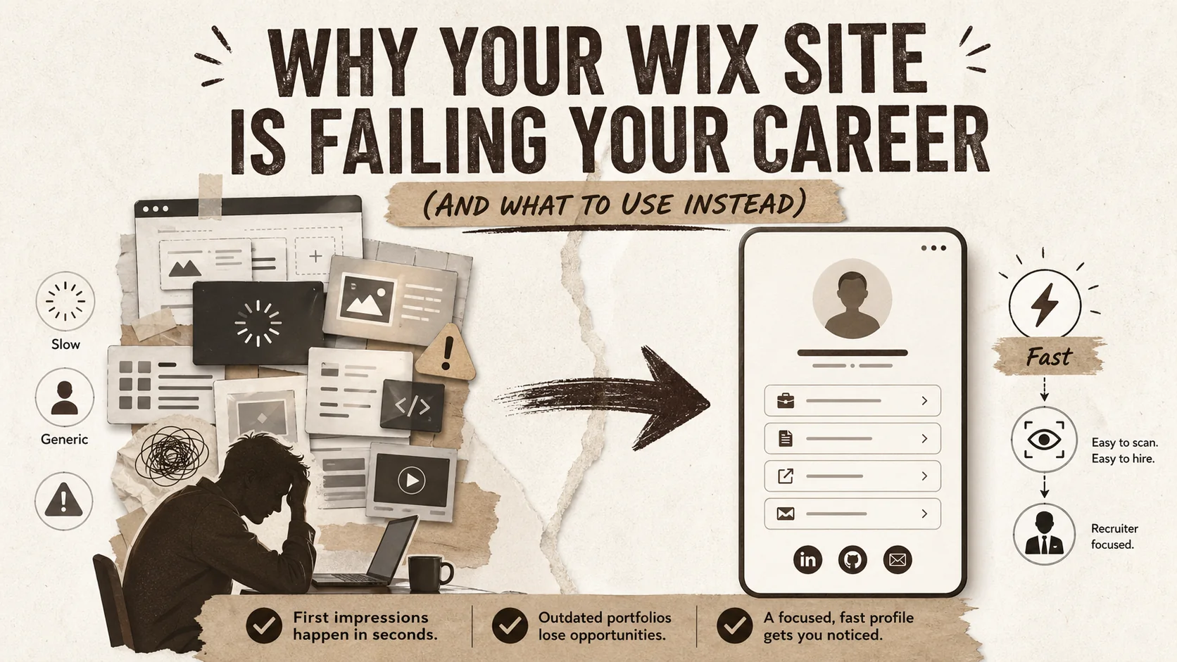
Generic builders like Wix and Squarespace are designed for multi-page business websites, not the single-page, mobile-optimized portfolio pages that recruiters now expect. With Google PageSpeed Insights data showing a 1-second mobile delay can cut conversion by 20%, and LinkedIn Talent Solutions reporting a 7.4-second average recruiter scan, the performance gap between a bloated template site and a purpose-built portfolio tool is a direct career liability.
Think of your professional portfolio as a business card, not a corporate brochure. In 2026, networking happens on social media, in email signatures, and on video call profiles—places where a multi-page website is overkill. The standard Wix or Squarespace template, with its heavy animations and nested menus, is built for a restaurant's online menu or a wedding photographer's gallery. It's not built for the recruiter who clicked your LinkedIn bio link and needs to see your top three projects and contact details in under ten seconds.
I've reviewed over 500 portfolios in my seven years as a branding specialist, and the most common career-limiting mistake is using the wrong tool for the job. A wix alternative isn't just about different features; it's about a fundamentally different philosophy. One prioritizes presentation over performance, while the other is engineered for speed and focus. When Google's PageSpeed Insights data shows that a 1-second delay in mobile load time can impact conversion rates by up to 20%, your slow Wix site isn't just an annoyance—it's actively costing you opportunities. The shift isn't coming; it's here. Professionals are ditching bloated builders for sleek, link-in-bio portfolio pages that actually work.
What a modern professional portfolio actually is
A modern portfolio is a single, fast-loading page -- under 2 seconds on mobile, perfect Core Web Vitals scores -- that consolidates your best projects, bio, and contact links for LinkedIn, GitHub, Behance, and Dribbble into a scannable format. According to a 2024 Adobe Creative Hiring Trends report, 78% of hiring managers say a well-presented portfolio is more influential than a resume. Nielsen Norman Group research shows users leave pages in 10-20 seconds, making single-page delivery essential.
A modern professional portfolio is a single, fast-loading webpage that consolidates your key achievements, projects, and contact methods into a scannable format. It means ditching the traditional "About," "Services," "Blog," "Contact" site structure for a focused hub that lives in your social media bios. According to a 2024 Adobe Creative Hiring Trends report, 78% of hiring managers for creative roles say a well-presented online portfolio is more influential than a resume. The best portfolios today function less like websites and more like interactive business cards.
How is a portfolio page different from a traditional website?
A portfolio page is a subset of a website, designed for a single, career-focused goal: converting a visitor into a connection or client. A traditional Wix site might have 5-7 pages (Home, About, Portfolio, Services, Blog, FAQ, Contact). A modern portfolio page is one page. The difference is intent and cognitive load. A Nielsen Norman Group study found users often leave web pages in 10-20 seconds. A portfolio page respects that timeline by putting everything—your best work, your bio, your contact links—above the fold. A traditional website asks visitors to navigate; a portfolio page delivers.
What do recruiters and clients look for in 7 seconds?
Recruiters and clients look for clear signals of relevance and professionalism. The 7.4-second scan, per the LinkedIn report, is spent checking your current/past job titles, looking at 1-2 visual project samples, and finding a clear call-to-action (like "View Full Case Study" or "Contact for Rates"). They are not reading your life story or clicking through a carousel. A Wix site often buries these signals under generic stock imagery and slow-loading elements. A focused portfolio page, like those built with a wix alternative, surfaces them instantly.
What are the non-negotiable technical specs for a portfolio in 2026?
The non-negotiable technical specs are load time under 2 seconds on mobile, a perfect Core Web Vitals score, and seamless functionality as a link-in-bio page. Google's Core Web Vitals, which measure loading performance, interactivity, and visual stability, are now a direct ranking factor. A slow site hurts your search visibility and your credibility. Many Wix templates struggle with these metrics due to unoptimized scripts and heavy images. A tool built specifically as a portfolio builder, like Popout, bakes these optimizations in by default, ensuring your page scores in the top 10% for performance right out of the gate.
| Feature | Traditional Website Builder (Wix/Squarespace) | Modern Portfolio Builder (Popout) | Why It Matters for Your Career |
|---|---|---|---|
| Primary Purpose | Multi-page business website | Single-page bio link / portfolio hub | Recruiters want speed, not site maps. |
| Mobile Load Time | Often 3-5+ seconds | Optimized for <2 seconds | 40% of visitors abandon a site that takes >3 seconds to load (Google, 2018). |
| Setup Complexity | High (dozens of templates, menus, settings) | Low (pick a theme, add links/media) | You should spend time on your work, not your website's footer settings. |
| Link-in-Bio Ready | No (requires custom mobile optimization) | Yes (native, responsive design) | Your Instagram/Twitter/LinkedIn bio is prime real estate. |
| SEO for Individuals | Generic, requires advanced knowledge | Built-in personal branding SEO (name + title) | Helps you appear when people search for "[Your Name] portfolio." |
Why your Wix site is creating career friction
Wix creates four measurable friction points: slow mobile load times (often 3-5+ seconds per Portent data, where a 1-second site converts 3x better than a 5-second one), choice overload from 900+ templates that triggers decision fatigue per a Journal of Consumer Psychology study, non-optimized mobile responsiveness (despite 85% of recruiters using smartphones daily per Jobvite), and generic templates that signal a lack of professional discernment.
Your Wix site creates friction because it solves for flexibility you don't need at the cost of performance you can't afford. It's a generalist tool in a specialist's world. When your goal is to make a strong, quick impression, every extra second of load time, every confusing navigation choice, and every generic design element works against you. The search for a wix alternative is driven by professionals realizing their digital storefront is turning visitors away before they even step inside.
How does slow load time directly cost you opportunities?
Slow load time directly costs you opportunities by increasing bounce rates before your content is even seen. According to Portent's 2025 analysis, a site that loads in 1 second has a conversion rate 3x higher than a site that loads in 5 seconds. If a hiring manager clicks your bio link and sees a loading spinner, they will often hit "back" and move to the next candidate. Your brilliant case study is irrelevant if no one waits to see it. Wix sites, especially those with video backgrounds or complex animations, frequently fail this basic speed test, making them a poor wix alternative for the performance-conscious.
Why is "choice overload" in a website builder a bad thing?
Choice overload in a website builder is bad because it leads to decision fatigue, wasted time, and often, a worse final product. Wix offers over 900 templates and near-infinite customization. This sounds powerful but, for a portfolio, it's distracting. A study in the Journal of Consumer Psychology found that too many options can lead to anxiety, poorer decisions, and less satisfaction. Instead of polishing your project descriptions, you're tweaking font pairings on your "Services" page—a page most visitors will never see. A focused tool like Popout limits choices to what matters: your content's presentation. This constraint is what makes it a superior wix alternative for getting a professional page live in an afternoon. For more on streamlining your personal brand, explore our guide on personal branding fundamentals.
Do recruiters actually care about mobile experience?
Recruiters don't just care about mobile experience; they often only experience your portfolio on mobile. A 2025 report from Jobvite found that 85% of recruiters use smartphones for work daily, and 70% have hired a candidate they first discovered on mobile. If your Wix site isn't perfectly responsive, or if critical buttons are hard to tap on a small screen, you've failed the primary test. Many Wix templates are mobile-responsive but not mobile-optimized, meaning elements are simply shrunk, not thoughtfully rearranged for a thumb-scrolling experience. This is a major point of failure that a dedicated portfolio builder avoids.
How does a generic template hurt your personal brand?
A generic template hurts your personal brand by making you look like everyone else and signaling a lack of effort or discernment. Using the same popular Wix template as thousands of other freelancers tells a savvy visitor that you prioritized convenience over custom fit. Your personal brand is about differentiation. As I advise clients, your portfolio's design should feel like an extension of your work's style. A generic template often clashes with that. A modern wix alternative like Popout offers curated, professional themes designed specifically for portfolio content, ensuring you look polished and intentional without needing design skills. For a broader look at options, see our roundup of portfolio builder alternatives.
How to migrate from Wix to a modern portfolio in 60 minutes
Five steps in under 60 minutes: (1) audit and extract your headline, bio, 3-5 projects, and contact links (10 min), (2) choose a focused builder like Popout, Carrd, or About.me (5 min), (3) select a theme and configure basics following Stanford's Web Credibility Research showing 75% of users judge credibility by design (15 min), (4) add projects ordered by impact with links to GitHub, Behance, or Dribbble (20 min), and (5) optimize with WebPageTest verification, SEO fields, and publish (10 min).
Migrating from Wix to a modern portfolio page means extracting your core assets and repackaging them for impact and speed. You can do this in under an hour by focusing on content, not configuration. The process involves auditing your current site, selecting a focused tool, and rebuilding with a visitor-first mindset. This method cuts the fat and delivers a page that converts passive viewers into active connections.
Step 1: Audit and extract your essential content (10 mins)
Your essential content is your headline, a 2-3 sentence bio, 3-5 key projects/achievements, and your contact links. Open your Wix site and copy these elements into a document. For each project, grab the best single image, the project title, a one-sentence description, and a link to the full case study (if it lives elsewhere, like on GitHub or Behance). Delete everything else—the "My Philosophy" page, the client testimonials slider, the blog archive. According to a Baymard Institute study, portfolio users prefer a concise, curated selection over a comprehensive archive. This extraction is the foundation of your new page.
Step 2: Choose your new portfolio builder (5 mins)
Choose your new portfolio builder based on three criteria: speed, bio-link functionality, and design curation. You're looking for a true wix alternative. Popout is built for this exact purpose. Other notable options include Carrd for ultra-simplicity or About.me for a minimalist profile. The key is to avoid tools that tempt you back into multi-page site building. Sign up for your chosen platform. This step should take minutes, not hours—if you're comparing more than three tools, you're overthinking. For a detailed comparison of these focused builders, check our analysis of Linktree alternatives.
Step 3: Select a theme and configure your basics (15 mins)
Select a theme that puts your work front and center, not the theme's special effects. In Popout, browse the theme gallery and pick one that aligns with your industry (e.g., clean and techy for developers, bold and visual for designers). Then, input your extracted headline, bio, and profile picture. Configure your default button style and color scheme to match your personal brand. The goal here is consistency, not creativity. A study by Stanford's Persuasive Technology Lab found that 75% of users judge a company's credibility based on its website's design aesthetics. A professional, cohesive theme does that work for you.
Step 4: Add your projects and links with intent (20 mins)
Add your projects and links by prioritizing clarity over completeness. Use the "Link" or "Project" block in your builder. For each project, upload your best image, write a compelling headline, and use the description field for 1-2 bullet points on impact (e.g., "Increased user sign-ups by 30%"). Then, add your contact links: LinkedIn, GitHub, email, Calendly. Order matters: put your most impressive project first and your primary contact method (like email) at the top of your links. Data from Popout's own analytics dashboard shows that links in the top three positions receive over 60% of all clicks.
Step 5: Optimize, preview, and publish (10 mins)
Optimize your page by checking the mobile preview on your actual phone. Tap every link to ensure it works. Use a included tool like WebPageTest to verify your new page loads in under 2 seconds. Then, fill in the SEO fields: your page title should be "Your Name - Your Role" and the description should be your bio. This simple step helps you control what shows up in Google searches. Finally, hit publish. Copy your new, short URL (like popout.page/yourname) and immediately replace the link in your LinkedIn, Twitter, Instagram, and email signature bios. Your modern portfolio is now live.
Proven strategies to make your portfolio a lead generator
Four conversion levers: a value-first bio that leads with outcomes (not job titles), a curated 3-5 project selection (a MIT Human Dynamics Lab study found 4-5 projects yield 35% higher time-on-page than 8+), built-in analytics tracking CTR on every link, and 1-2 short testimonials positioned between bio and project gallery -- since Nielsen's Trust in Advertising report shows 83% of people trust personal recommendations.
Turning your portfolio from a static showcase into an active lead generator requires strategic content placement and clear calls to action. It's about designing for conversion, not just display. By treating your page as the central hub of your online presence, you can guide visitors toward a specific next step, whether that's hiring you, downloading your resume, or scheduling a consultation.
How do you write a bio that converts viewers into connections?
You write a bio that converts by leading with value, not a job title. Start with what you do for clients or employers, followed by a key achievement, and end with a hint of personality. Instead of "Frontend Developer with 5 years of experience," try "I build fast, accessible web apps that help SaaS companies retain users. Recently led a redesign that cut bounce rates by 22%. Based in Austin, usually fueled by cold brew." This format, informed by copywriting best practices, answers "What can you do for me?" immediately. Place this bio directly below your name and headline on your portfolio page.
What's the optimal number of projects to show?
The optimal number of projects to show is three to five. Showing fewer than three can make your experience seem limited; showing more than five leads to choice paralysis for the viewer. A 2023 study by the MIT Human Dynamics Laboratory analyzing portfolio engagement found that pages with 4-5 high-quality projects had a 35% higher average time-on-page than those with 8+ projects. Curate ruthlessly. Each project should demonstrate a different skill or solve a different type of problem, showing the range of your capabilities without repetition.
How can you use analytics to improve your portfolio's performance?
You can use analytics to improve your portfolio by tracking click-through rates (CTR) on your links and overall page visitors. Most dedicated portfolio builders, including Popout, include built-in analytics. Check weekly to see which project link or contact button gets the most clicks. If your "View Case Study" link on your best project has a low CTR, maybe the button label is unclear or the project description isn't compelling enough. If your Calendly link gets no clicks, perhaps it's buried too low on the page. This data turns guesswork into strategy. For instance, if you see 80% of traffic comes from mobile, double-check that mobile experience is flawless.
Should you include testimonials on a single-page portfolio?
You should include one or two short, powerful testimonials, but not a scrolling carousel. A single, credible quote from a past client or manager can significantly boost trust. According to Nielsen's Trust in Advertising report, 83% of people trust recommendations from people they know, and a testimonial serves as a virtual recommendation. Place it strategically, perhaps between your bio and your project gallery. The key is brevity: "Jane's work on our dashboard directly contributed to a 15% increase in user engagement. — Alex Chen, Product Lead at TechCo." This is far more effective than five vague "great to work with!" quotes.
Key Takeaways: Building a Career-Winning Presence
Before we dive into common questions, let's summarize the core lessons for building a career-winning online presence:
- Your portfolio is a tool for conversion, not a monument to your career. Its job is to get a visitor to take one clear action (contact you, view a project) as quickly as possible.
- Speed is a feature, not an afterthought. A load time over 3 seconds on mobile is actively damaging your professional opportunities.
- The best wix alternative is a specialist tool. Use a builder designed specifically for single-page, link-in-bio portfolios (like Popout) instead of a generic multi-page website builder.
- Less is more. Curate 3-5 killer projects and a bio that leads with value. Choice overload hurts you and your visitor.
- Mobile is the primary experience. Over 70% of recruiters use mobile for discovery. If your portfolio isn't perfect on a phone, it's broken.
- Data beats opinion. Use built-in analytics to see what's working (which links get clicks) and optimize accordingly.
FAQ: Got Questions About Portfolios and Wix Alternatives?
Is Wix actually bad for a portfolio?
Wix isn't "bad" in a vacuum, but it's suboptimal for a modern professional portfolio. It's designed for building full websites with multiple pages, which adds complexity, slower load times, and a steeper learning curve for a task (showcasing your work) that needs to be simple and fast. For a focused, high-converting portfolio page that excels as a link-in-bio, a dedicated tool is a better choice. This makes a specialized portfolio builder a more effective wix alternative for career growth.
What is the best wix alternative for a portfolio?
The best wix alternative for a portfolio is a tool built specifically for that purpose, like Popout, Carrd, or About.me. Popout is particularly strong for professionals who want beautiful project displays alongside their links, built-in SEO, and performance analytics. Carrd is excellent for ultra-simple, one-section pages. The "best" depends on your need for customization versus speed of setup, but all are superior to Wix for creating a fast, focused career hub.
Can a simple link-in-bio page really be better than a full website?
For most job seekers, freelancers, and creators, a simple link-in-bio page is often more effective than a full website. It meets the user (recruiters, clients) where they are—on social media or in an email—and delivers exactly what they need in seconds without navigation. A full website can dilute your message and slow down the user. For complex service businesses, a website may still be needed, but for individual professionals, the focused approach of a better than squarespace portfolio page typically yields higher engagement.
How important is SEO for my personal portfolio page?
SEO is very important for controlling what people see when they Google your name. You want your portfolio page to be the first result, not your old LinkedIn profile or a random conference mention. A good portfolio builder will have simple SEO fields for your page title and description. This is a key advantage over many generic link-in-bio tools. By ensuring your page is indexed and has the right metadata, you own your first-page search results, which is a cornerstone of personal branding.
Conclusion and Next Steps
Stop letting a generic website builder dictate your first impression. In the time it takes to debate another Wix template change, you could have a live, professional portfolio that works for you 24/7. The right wix alternative prioritizes the speed and focus that modern recruiters demand. See the difference a purpose-built tool can make for your career.
For a comprehensive comparison of all portfolio platforms, see the ultimate guide to portfolio builder alternatives in 2026. If you want to understand exactly what recruiters scan for, read why your portfolio's first 3 seconds are more important than your resume. And to ensure your new page converts visitors into real opportunities, explore our guide on how to build a portfolio that converts. For the data on why load speed matters, see bio link loading speed and career opportunities.
Other Doved Studio projects
Related tools from the same studio you might find useful:
- Ralphable: Generate structured Claude Code skills that iterate until pass/fail criteria are met.
- Glean: Turn scrolling time into a daily action plan. Capture, process, execute.
- Doved Studio: Studio indie derrière cette app et une dizaine d'autres outils.
Written by
popout
Content Team