The 2026 Portfolio 'First Impression' Gap: Why Your Bio Page Is Failing Before You Even Click 'Apply'

Imagine this: You've spent weeks perfecting your resume, tailoring your cover letter, and finally hit "submit" on a dream job application. You wait, hopeful. But the rejection email arrives in 48 hours. What happened? The answer, increasingly, is that you never made it past the first, silent gatekeeper: your public portfolio or bio link.
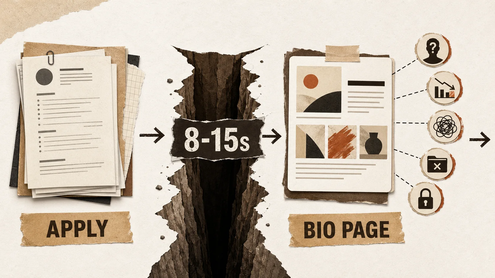
The hiring landscape has undergone a quiet but seismic shift. According to LinkedIn's 2026 Global Talent Trends report, the average time from application to initial screening has collapsed to under 48 hours in competitive sectors like tech, design, and marketing. To cope with this velocity, recruiters have developed a new pre-screening ritual. Before they ever open your PDF resume, they perform a "portfolio-first" evaluation. They Google your name, click the link in your LinkedIn bio, or visit the personal website URL on your application. In 8-15 seconds, they form a decisive first impression. This is the Portfolio First Impression Gap—the chasm between how you perceive your online presence and how a time-pressed recruiter actually evaluates it.
This article will dissect this new reality. We'll explore the data behind pre-application screening, identify the five fatal flaws that cause instant rejection, and provide a tactical framework to build a bio page that doesn't just exist, but actively works to pass this critical first test.
The New Hiring Funnel: Your Bio Page Is the First Interview
In 2026, your bio page is the first interview -- recruiters now scan your LinkedIn bio link, GitHub profile, or portfolio site for 8-15 seconds before ever downloading your resume, according to LinkedIn's 2026 Global Talent Trends report.
The traditional hiring funnel started with a resume screen. The 2026 funnel adds a crucial, earlier step.
[Discovery] -> [Bio Link/Portfolio Scan (8-15 sec)] -> [Resume Download] -> [Phone Screen] -> [Interview]
This "pre-screen" is not about deep analysis. It's a rapid assessment of professionalism, clarity, and relevance. Recruiters are looking for red flags and green lights. A discussion thread on the professional forum Blind in late 2025 highlighted this trend, with a tech hiring manager stating: "If I see a GitHub link, I'm looking at the README and commit history before the resume. If it's a portfolio site, I need to understand what they do in the first scroll. If I'm confused, I move on. I have 50 more applications to get through today."
The implication is stark: a weak bio page can disqualify you before your meticulously crafted resume even gets a chance. Your portfolio is no longer a supplementary "nice-to-have"; it is the front door to your candidacy.
The 5 Fatal First Impression Flaws (And How to Fix Them)
The five flaws are: (1) vague "mystery meat" navigation with no value proposition, (2) link overload causing decision fatigue, (3) broken mobile layouts, (4) no recent activity signaling a "ghost town," and (5) missing proof of work -- each fixable with targeted adjustments to your Behance, Dribbble, or portfolio page.
Based on analysis of recruiter behavior and hundreds of portfolio reviews, these are the most common mistakes that create an instant negative impression.
1. The "Mystery Meat" Navigation
The Flaw: A visitor lands on your page and has no immediate idea who you are, what you do, or what you want them to do next. The headline is vague ("Welcome to My Space!"), the bio is non-existent or overly poetic, and links are poorly labeled. The Recruiter's Thought: "I don't have time to decode this. Next." The Fix: The 3-Second Value Proposition. Your page must communicate three things instantly:
- Who you are: Your name and professional title.
- What you do: Your specific skill or industry (e.g., "Frontend Developer specializing in React & UX," "Product Marketing Manager for SaaS").
- What you want: A clear primary call-to-action (e.g., "View My Work," "Read My Case Studies," "Contact for Opportunities").
2. The "Everything But the Kitchen Sink" Approach
The Flaw: Linking to every social profile, side project, article, and playlist. This creates visual clutter and decision fatigue. The Recruiter's Thought: "This person lacks focus. I can't tell what's important." The Fix: Curate for the Audience. Prioritize links based on your goal. For a job search:
- Primary: Resume, Portfolio/Project Gallery, LinkedIn.
- Secondary: Relevant GitHub/Behance/Dribbble, Writing/ Blog.
- Tertiary (Optional): Calendly link for scheduling, a personal blog if relevant. Hide or remove links to casual social media, music profiles, or outdated projects. Quality over quantity. For more on strategic curation, see our guide on building a portfolio that actually converts.
3. The "Desktop-Only" Experience
The Flaw: A page that looks perfect on a laptop but breaks, has tiny text, or has misaligned elements on a smartphone. Over 70% of LinkedIn traffic is mobile, and recruiters often scan profiles between meetings. The Recruiter's Thought: "This person doesn't pay attention to detail or modern user experience." The Fix: Design Mobile-First. Test your page on multiple devices. Ensure:
- Text is readable without zooming.
- Buttons and links are easily tappable.
- The layout remains clean and logical.
- Images load quickly on cellular data.
4. The "Ghost Town" or "Time Capsule" Syndrome
The Flaw: No recent activity. The latest project is from 2022, the blog hasn't been updated in years, or the "Current Role" listed is outdated. The Recruiter's Thought: "Are they still active? Is this career information current?" The Fix: Show Momentum. Even small updates signal professionalism and engagement.
- Add a "Recently" section with a new project, article, or certification.
- Ensure your headline/bio reflects your current role or goal.
- If you have a blog, consider showing the date of your latest post. Stagnation breeds doubt.
5. The Missing "Proof of Work"
The Flaw: Relying solely on a resume link. A resume lists responsibilities; proof of work demonstrates capability. The Recruiter's Thought: "I see what they say they did, but can I see what they actually made or achieved?" The Fix: Show, Don't Just Tell. Integrate your work directly onto your bio page.
- For Creators/Designers: Embed a gallery of key images or videos.
- For Developers: Link to live projects or key GitHub repositories with clear descriptions. A research note from Stack Overflow's 2025 Developer Survey found that 63% of hiring managers prefer a linked repo with a strong README over a downloadable code sample.
- For Marketers/Writers: Feature thumbnails and snippets linking to case studies or published articles.
- For Everyone: Use metrics. "Increased engagement by 30%," "Reduced load time by 1.5s," "Managed a $50K budget." This transforms claims into evidence.
The 2026 Bio Page Blueprint: A Framework for Success
A high-converting bio page follows a three-section structure: a hero header (name, tagline, CTA) for the first 3 seconds, curated proof links (LinkedIn, GitHub, Behance, case studies) for seconds 3-10, and social proof (testimonials, skill badges) for engaged visitors who stay past 10 seconds.
Building a page that passes the 8-second scan requires structure. Follow this blueprint.
Section 1: The Hero Header (0-3 Seconds)
- A professional, friendly headshot.
- Your name in a clear, large font.
- Your professional tagline: "Senior Product Designer | UX Strategy & Design Systems"
- A one-sentence bio: "I help B2B SaaS companies translate user pain points into intuitive, conversion-focused interfaces."
- A single, prominent primary button: "View My Portfolio" or "Download My Resume."
Section 2: Curated Links & Proof (3-10 Seconds)
Organize links in a clear, logical order. Use descriptive labels, not just icons.
1. 📄 Download Resume (PDF)
2. 🎨 Featured Case Study: Redesigning Acme Corp's Dashboard
3. 🔗 LinkedIn Profile
4. 💻 GitHub (React & Python Projects)
5. ✍️ Latest Blog Post: "2026 UX Trends"
6. 📅 Schedule a Chat (Calendly)
Section 3: Strategic Content & Social Proof (10-15+ Seconds)
This is for the recruiter who is positively engaged and wants to learn more.
- A brief "Featured Work" section with 2-3 key projects, using images and outcome-focused blurbs.
- A short testimonial from a colleague, client, or manager.
- A list of core skills or technologies, presented cleanly.
This structured approach guides the recruiter's eye and provides depth on demand. It turns a simple link list into a compelling career narrative. For a deeper dive into optimizing for that critical first click, explore our analysis of the 2026 portfolio first-click test. If your page looks polished but hasn't been touched in months, your last updated date may already be costing you job offers.
Beyond the Page: Integrating Your Bio Link into Your Job Search
Place your bio link in five high-traffic touchpoints: your LinkedIn headline, email signature, resume header, application form "Website" fields, and networking conversations -- each placement multiplies the recruiter-reach of your optimized page.
Your perfect bio page is useless if no one sees it. Make it an active part of your application strategy.
- The LinkedIn Bio Line: Replace "https://linktr.ee/..." with a clean, custom URL (e.g., popout.page/janedoe). This immediately looks more professional.
- Email Signature: Include the link under your name in all professional correspondence.
- Resume Header: Place the URL prominently next to your contact information.
- Application Forms: Whenever there's a "Website," "Portfolio," or "Additional Links" field, use it.
- Networking Conversations: "You can see some of my recent projects at [yourlink]." It's more effective than "I can send you my resume."
Closing the Gap: Your Action Plan for Next Week
A seven-day sprint -- audit flaws, write your 3-second value proposition, curate links, add proof of work, test mobile, update stale info, and deploy everywhere -- closes the first impression gap without requiring a full portfolio rebuild.
This isn't about a complete overhaul; it's about strategic fixes.
- Day 1: Audit your current page against the "5 Fatal Flaws." Be brutally honest.
- Day 2: Craft your 3-second value proposition (Headline + Bio).
- Day 3: Ruthlessly curate your links. Cut anything not serving your primary job search goal.
- Day 4: Add one piece of "Proof of Work"—a project image, a case study link, a metric.
- Day 5: Test the mobile experience on your phone. Fix any glaring issues.
- Day 6: Update one outdated piece of information (role, date, etc.).
- Day 7: Deploy your updated link everywhere (LinkedIn, resume, email signature).
The goal is to create a cohesive, professional, and scannable hub that makes a recruiter's job easier. When you do that, you don't just pass the first impression test—you ace it, compelling them to click "Download Resume" with genuine interest.
The competition is no longer just for the job interview; it's for the 8 seconds of attention that gets you the interview. Close the First Impression Gap, and you start every application miles ahead. For the broader context of why your portfolio now outweighs your resume, see our data-backed analysis of why your portfolio will get you hired in 2026, not your resume. And if you're worried about hiding too much, learn why you should stop hiding your side hustle and turn passion projects into career capital.
Ready to build a bio page designed for 2026's hiring reality? Create Your Popout Page in minutes—a tool built specifically for crafting professional, mobile-optimized link hubs that make the right first impression.
Frequently Asked Questions (FAQ)
1. I'm not a designer or developer. Do I really need a portfolio bio page?
Absolutely. While visual portfolios are standard for creatives, every professional benefits from a centralized hub. For marketers, it can link to campaign case studies, blog posts, and LinkedIn articles. For project managers, it can link to certifications, detailed project summaries, or testimonials. For anyone, it's a cleaner, more professional alternative to a long list of social links, and it provides crucial context before a recruiter dives into your resume. Platforms like Dribbble for designers or GitHub for developers can link directly from your hub to prove domain expertise. It's about controlled personal branding. Explore more ideas in our portfolio hub.
2. What's the single most important element on the page?
The 3-Second Value Proposition at the very top. If a visitor cannot instantly understand who you are and what you do, they are likely to leave. This combination of a clear headline/title and a one-sentence bio is non-negotiable. Everything else supports this core message.
3. Should I buy a custom domain (e.g., janedoe.com) for my bio page?
It's a strong signal of professionalism and makes your link more memorable (e.g., "Visit janedoe.com"). However, a clean, branded subdomain from a reputable service (like popout.page/janedoe) is also perfectly professional and is a great starting point. The priority is having a functional, well-designed page. A custom domain is a valuable upgrade, but not having one is not a deal-breaker if your page content is excellent.
4. How often should I update my bio page?
Aim for a light review every 1-3 months, and a significant update whenever you change roles, complete a major project, or shift your career focus. At a minimum, ensure your current role and contact information are always accurate. Adding a "Recently" section can make small updates easy and visible.
5. Is it okay to link to my Instagram or Twitter?
It depends on the content and your goals. If your Instagram is a professional showcase of your photography, design work, or industry insights, it can be a valuable addition. If it's purely personal, it's generally better to omit it. For most professional job searches, LinkedIn, GitHub (for devs), Behance/Dribbble (for designers), and a resume are the core links. Always curate for your audience.
6. How does this fit with my overall career strategy?
Your bio page is the lynchpin of your digital career footprint. It connects your resume (the formal document) with your social proof (your work, your network). It's a dynamic asset for active job searching, networking, and freelance/client outreach. Think of it as your always-on, 24/7 professional pitch. For more on integrating this into a broader plan, check out our career advice hub.
Other Doved Studio projects
Related tools from the same studio you might find useful:
- Ralphable: Generate structured Claude Code skills that iterate until pass/fail criteria are met.
- Glean: Turn scrolling time into a daily action plan. Capture, process, execute.
- Doved Studio: Studio indie derrière cette app et une dizaine d'autres outils.
Written by
popout
Content Team