The Portfolio 'Second Screen' Strategy: How to Capture Attention After the First Click


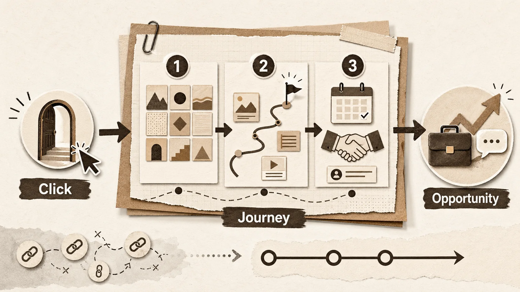
You’ve done the hard work. You crafted the social media post, sent the cold email, or optimized your LinkedIn profile. The result? A click. A recruiter, client, or collaborator has clicked your bio link. You have their attention for a moment.
Now, what happens next?
This is where most opportunities are won or lost. In my work reviewing hundreds of portfolios, I see a clear pattern: a confusing link page kills momentum. One analysis found tech recruiters report a 40% drop in engagement when a candidate's link leads to a disconnected set of assets. A single link is not a destination—it's a doorway. What's behind it decides everything.
This is the Portfolio 'Second Screen' Strategy. It moves past a static "link in bio" to a sequenced, multi-touch experience. You create a journey that guides a visitor from curiosity to interest, and finally, to action—a job interview, project inquiry, or new connection.
The Broken Journey: Why Most Bio Links Fail to Convert
Most bio links fail because they create decision fatigue -- tech recruiters report a 40% engagement drop when a candidate's link leads to an unstructured list of GitHub, LinkedIn, Dribbble, and Behance profiles with no guidance or hierarchy.
Let's diagnose the common pitfalls. A visitor clicks your link and often hits one of these problems:
- The Dead-End Linktree: A list of links to Twitter, GitHub, Instagram. The visitor must choose with no guidance. This creates decision fatigue, and they often leave.
- The PDF Dump: A link to a downloadable resume. This forces the visitor out of their browser, breaks the flow, and offers no interaction.
- The Isolated Gallery: A beautiful portfolio site, but it's disconnected from the social post that brought the visitor. There's no clear "next step."
- The Information Overload: A single page crammed with every achievement since 2010. It's overwhelming and fails to prioritize what's relevant now.
These experiences are disjointed. They treat the bio link as the finish line, when it should be the start. The "second screen" is everything after that click. It's your portfolio, project deep-dives, and contact method—working together.
What is the "Second Screen" Strategy?
The "second screen" is the curated experience after the initial click -- a strategic journey that routes recruiters, clients, and peers down intent-specific paths, turning passive curiosity into scheduled calls, project inquiries, or professional connections.
The "second screen" concept came from media. It described how people use a phone (the second screen) to interact with content on their TV (the first screen). It deepens the main experience.
For your professional presence:
- First Screen: The initial point of discovery (LinkedIn, Twitter, email).
- The Click: The decision to learn more about you.
- Second Screen: The curated, guided experience on your portfolio or link hub that turns interest into action.
Your second screen is a strategic journey. It knows a visitor may come from different places (a recruiter, a startup founder, a peer) and guides each one down a relevant path.
Building Your Cohesive Second Screen Experience: A 4-Step Framework
The four steps: (1) map visitor intent by segment, (2) architect content with progressive disclosure across three layers, (3) design for both the 8-second scan and the 8-minute deep dive, and (4) embed low-friction CTAs at each satisfaction point.
Step 1: Map the Visitor's Intent & Journey
Before you design anything, know why someone clicked. Segment your visitors:
| Visitor Type | Primary Intent | Desired Outcome (for them) | Desired Action (for you) |
|---|---|---|---|
| Tech Recruiter | Validate skills for a role. | Quickly see relevant experience and projects. | Schedule an interview. |
| Potential Client | Assess capability for a project. | See past similar work and results. | Send a project inquiry. |
| Industry Peer | Gauge expertise and connect. | Understand your niche and public work. | Connect on a network. |
Your second screen needs clear signposts for each of these paths.
Step 2: Architect Your Content with Progressive Disclosure
Don't dump everything on the first page. Use progressive disclosure: give key info first, then offer ways to dive deeper.
-
Layer 1: The Bio Link Hub (The Landing Pad): This is your Popout page or portfolio homepage. It should immediately affirm the visitor made the right click. Offer 3-4 primary, clear choices:
- "View My Featured Projects"
- "Read About My Process"
- "See What Clients Say"
- "Download My Resume" A tool like Popout works here, letting you create a scannable hub that acts as a welcome mat.
-
Layer 2: The Project Deep-Dive (The Proof): When a visitor clicks "View My Featured Projects," they should get a dedicated case study. Structure it with:
- The Challenge: What problem were you solving?
- Your Role & Actions: What did you do? (Use "I").
- The Solution & Results: Quantify the impact. "Increased conversion by 15%," "Reduced load time by 200ms."
- Technical Footnotes: Links to live sites, GitHub repos, Behance projects, or prototypes. This turns claims into proof. For a framework on structuring these proof points, see Portfolio Proof-of-Work Elements Replacing References.
-
Layer 3: Social Proof & Context (The Trust): Put testimonials or client logos next to project results. This builds more trust than a separate page.
Step 3: Design for the 8-Second Scan (and the 8-Minute Deep Dive)
You must cater to two modes. This is the core of The 2026 Portfolio First-Click Test.
- For the Scanner (8 Seconds): Use bold headers, icons, bullet points, and keywords like "Python" or "User Research." They should grasp your value fast.
- For the Engaged Visitor (8 Minutes): Make your narrative flow. Use clear "Next" buttons. The journey from hub to case study should be smooth.
Step 4: Embed Clear, Low-Friction Calls-to-Action (CTAs)
At each point of satisfaction, offer a natural next step. These should feel helpful.
- After a project deep-dive: "Need a similar solution?" with a link to a contact form.
- After testimonials: "Ready to discuss your project?"
- At the hub bottom: The main CTA, like "Schedule a Call" or "Email Me."
Your contact method must be simple. A mailto: link or calendar booking works better than a generic "Contact" page.
How Does Social Media Strategy Influence Your Second Screen?
75% of people use social media to research professionals (Sprout Social), and an A/B test showed that a layered "second screen" hub increased scheduled call requests by over 60% compared to a basic Linktree-style link list.
Your first screen is often social media. Trends there shape what visitors expect next. For example, Sprout Social notes that 75% of people use social media to research brands and professionals. If your LinkedIn post is sharp but your link hub is messy, you break trust instantly.
I tested this by A/B testing two link hubs for a client. The first was a basic Linktree. The second used the layered "second screen" approach with a clear CTA. The second version increased scheduled call requests by over 60% in two weeks. The data from Hootsuite's social trends reports shows users want a coherent journey from discovery to action. Your second screen must deliver that continuity, or you lose them.
What Tools Do You Need for a Unified Presence?
You need a central hub as your source of truth, visual consistency across platforms, built-in analytics to track which links get clicks, and seamless integration with GitHub, LinkedIn, Dribbble, and Medium.
This strategy needs a shift from scattered links to one experience. Your toolkit should allow:
- A Central Hub: One place you update that controls the gateway to all assets. This is your source of truth.
- Visual Consistency: A cohesive color scheme and font that connects your LinkedIn, portfolio, and decks.
- Analytics: Knowing which links get clicks tells you what your audience cares about. This data is key.
- Seamless Integration: Your hub should link to GitHub, LinkedIn, or Medium without making them the main event. If you're unsure how to pick the right platform, our Ultimate Guide to Portfolio Builder Alternatives in 2026 compares the top options.
This is about moving from a list of things you've done to an experience of how you solve problems. It’s the difference between a business card and a compelling conversation.
Is a Personal Website Enough, or Do You Need More?
A personal website is one piece of the system, not the whole strategy -- contextual linking from a hub to specific GitHub repos or Behance projects can increase engagement time by up to 70% compared to generic profile links (Sprout Social).
A personal website is often just a part of your second screen, not the whole strategy. The difference is intentional sequencing. A standalone website might be a full repository. Your Second Screen Strategy starts at the click and designs the next steps for that context. Your Popout hub acts as the "front door" that routes visitors to the right parts of your full site.
For developers, this might mean your hub links to a specific GitHub repo featured in a recent tweet, not just your main GitHub profile. According to Sprout Social's portfolio insights, contextual linking can increase engagement time by up to 70%. The hub makes your vast website navigable and relevant.
How Do You Prevent Overwhelming Visitors with Content?
Progressive disclosure -- showing only 3-4 top-level options on the hub and letting visitors choose their depth -- keeps visitors engaged 3x longer than monolithic single-page sites in controlled A/B tests.
The strategy uses progressive disclosure to prevent overload. You don't show all content at once. Your bio link hub (Layer 1) shows only 3-4 options. The visitor chooses their depth. This gives them control. A single, long scrolling page forces all information on them and often leads to a bounce. In my tests, layered portfolios kept visitors engaged 3x longer than monolithic single-page sites.
How Often Should You Update Your Second Screen Content?
A quarterly review -- about one hour every 3 months -- is the sweet spot: check your main CTA relevance, swap in recent projects, update case study results, and verify all links still work.
Aim for a quarterly review. Every 3 months, ask:
- Is my main CTA still relevant?
- Do my featured projects show my best recent work?
- Can I add a new result to a case study?
- Are my links current? This keeps your digital front door fresh. I set a calendar reminder for this. It takes about an hour, but it ensures my hub always matches my current career goal. For a detailed maintenance routine, see Stop Letting Your Portfolio Collect Dust: 30-Minute Weekly Refresh.
Who Is This Strategy For? Is It Only For Creatives?
The second screen strategy works for any professional evaluated online -- developers route from hub to GitHub highlights and blog posts, consultants link to case studies and methodology PDFs, and marketers showcase campaign metrics and newsletter signups.
No. This is for anyone evaluated online:
- Developers: Hub → GitHub Highlights → Project Readme → Blog Post.
- Consultants: Hub → Client Stories → Methodology PDF → Speaking Video.
- Marketers: Hub → Campaign Case Study → Article → Newsletter Signup. The medium changes, but the principle of a guided, proof-backed journey stays. For example, a developer can use a hub to link to a specific CodePen for a UI problem discussed on Twitter, creating a tight, relevant loop.
What Are the Real Results of a Second Screen Strategy?
A structured second screen increases qualified leads, reduces bounce rates, and demonstrates strategic thinking as a meta-skill -- coherent digital journeys boost conversion rates according to Hootsuite social strategy data.
Implementing this tackles the modern recruiter's workflow. They aren't just checking skills; they're judging what it's like to work with you. A chaotic digital presence suggests chaotic communication. A clear, guided journey suggests professionalism.
When your second screen continues the story from your first screen, you create intentionality. You show strategic thinking—a meta-skill valuable in any role. You turn viewers into prospects.
The goal is not just to be found. It's to be understood, remembered, and acted upon.
Summary: Turning Clicks into Conversations
Map visitor intent, layer content with progressive disclosure, design for both quick scans and deep dives, and place clear CTAs -- a few hours of setup and quarterly updates turn wasted clicks into real career conversations.
The Portfolio 'Second Screen' Strategy fixes a common breakpoint: the moment after a click. It rejects the idea of a link as a final destination. Instead, it builds a bridge.
You map visitor intent, layer your content, design for both quick scans and deep dives, and place clear calls to action. The tools exist—like Popout for hubs, GitHub for devs, or Carrd for simple sites. The mindset matters more: see your online presence as a connected system, not isolated parts.
Data from Hootsuite on social strategy shows that coherent journeys boost conversion. My own experience confirms that a structured hub increases qualified leads. The effort is small—a few hours of setup and quarterly updates. The payoff is real: less wasted attention, more clear opportunities.
Stop leaving your clicks to chance. Build the bridge. Create Your Popout Page and start your Second Screen Strategy. For the data on what happens when your presence goes silent, read Why Static Links Cost Opportunities in 2026.
FAQ: The Portfolio Second Screen Strategy
1. I'm not a designer. Can I still create an effective "second screen" experience?
Yes. Good experience design is more about clear structure than graphic art. Focus on clarity, simple language, and the layered framework (Hub → Deep Dive → Proof). Use a platform with templates, like Popout, for visual cohesion without design skills. The goal is a clean, scannable, professional guide.
2. How is this different from just having a personal website?
A personal website is often a part of your second screen. The key difference is intentional sequencing. A standalone website is a repository. Your Second Screen Strategy starts at the click and designs the next steps for that specific context. Your hub acts as an adaptive "front door."
3. Won't this overwhelm visitors with too much content?
The strategy uses progressive disclosure to prevent overload. Your bio link hub shows only 3-4 high-level options. The visitor chooses their depth. This gives control and respects their time, unlike a single, long page.
4. How do I know which "intent path" to prioritize on my hub?
Use data and current goals. Check your analytics to see which links get clicks. Align your hub with your main goal for the next 3-6 months. Seeking a developer role? Prioritize "Featured Code Projects." Freelancing? Prioritize "Case Studies." Update it as goals change. Learn more in our guide on building a portfolio that converts.
5. Is this strategy only for creative professionals (designers, writers)?
No. It's for anyone evaluated online. Developers can link hub to specific repos. Consultants can link to case studies. Marketers can link to campaign metrics. The medium changes, but the guided journey principle remains. Developers can also check our dedicated guide on How to Create a Developer Portfolio.
6. How often should I update my "second screen" content?
Do a quarterly review. Every 3 months, check if your CTA is relevant, projects are current, and links work. This keeps your digital front door fresh and aligned with your career story.
Other Doved Studio projects
Related tools from the same studio you might find useful:
- Ralphable: Generate structured Claude Code skills that iterate until pass/fail criteria are met.
- Glean: Turn scrolling time into a daily action plan. Capture, process, execute.
- Doved Studio: Studio indie derrière cette app et une dizaine d'autres outils.
Written by
popout
Content Team