The 5 Most Common Portfolio Mistakes That Make You Look Unprofessional (And How to Fix Them)


In today's hyper-competitive job market, your portfolio isn't just a collection of past work—it's your primary career asset. It’s the first impression you make on recruiters, potential clients, and collaborators. Yet, a February 2026 study by CareerBuilder Insights revealed a startling reality: 68% of hiring managers dismiss a candidate within 30 seconds of viewing a portfolio due to what they perceive as an "amateurish" presentation or an unclear value proposition.
We're in the midst of a "credibility crisis" in online portfolios. With the proliferation of AI-generated content and cookie-cutter templates, standing out authentically has never been harder—or more important. The smallest misstep can signal a lack of attention to detail, poor communication skills, or a disconnect from professional standards, leading to immediate disqualification.
Your portfolio should open doors, not close them. Let's dive into the five most common—and often subtle—portfolio mistakes that undermine your professionalism and learn the actionable fixes to transform your online presence from a liability into your greatest asset.
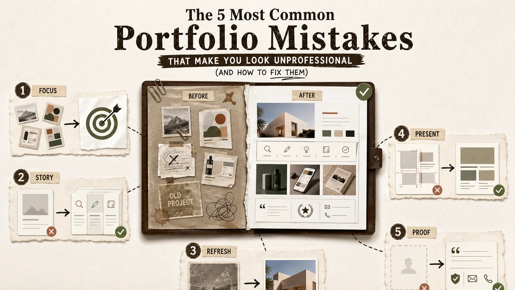
Mistake #1: The "Mystery Box" Navigation & Lack of Clear Value Proposition
A vague headline or cryptic navigation forces recruiters to decode your role, and Nielsen Norman Group research confirms users abandon pages within 10 seconds when the value proposition is unclear. The fix is a direct "Role + Impact" headline placed immediately below your name, supported by standard navigation labels like "Work," "About," and "Contact."
You have three seconds to tell a visitor who you are and what you offer. The most common mistake is burying this critical information or making it confusing to find.
The Problem: Visitors land on your portfolio and are immediately confronted with a beautiful but cryptic hero image, a clever tagline that doesn't clarify your role, or a navigation menu with vague labels like "Creations" or "Stuff." They have to hunt to understand if you're a UX designer, a backend developer, a content strategist, or a photographer. In a world of infinite scrolling and short attention spans, this hunt ends with the back button.
A recruiter with 50 portfolios to review doesn't have time for puzzles. If they can't instantly grasp your professional identity and the value you bring, you've lost them.
The Fix: Lead with Clarity.
-
Craft a Powerful Headline: Directly beneath your name, state your professional title and core value in one line.
- Weak: "Digital Creator | Thinker | Maker"
- Strong: "Senior Product Designer | Transforming User Problems into Intuitive Digital Experiences"
- Strong: "Full-Stack JavaScript Developer | Building Scalable Web Applications for Startups"
-
Write a Compelling "About" Summary: At the top of your page, include a 2-3 sentence bio that expands on your headline. Mention your expertise, who you help, and the outcomes you drive.
- Example: "I'm a data visualization specialist who helps SaaS companies turn complex metrics into clear, actionable insights. I combine expertise in React D3.js with a background in business analytics to build dashboards that drive decision-making."
-
Simplify Navigation: Use clear, standard labels. "Work" or "Projects" is better than "Portfolio." "About" is essential. "Contact" should be obvious. Consider a "Skills" or "Services" page if relevant. Tools like Popout are built for this clarity, allowing you to structure your bio link page with a logical flow that puts your value proposition front and center.
Pro Tip: Ask a friend outside your industry to look at your portfolio for 10 seconds. Then, ask them: "What do I do, and who do I help?" If they can't answer accurately, you need more clarity. For a tactical framework on what must be visible in those opening moments, see our first 5 seconds rule guide.
Mistake #2: Showcasing Tasks, Not Impact & Outcomes
Listing tasks ("Built a website with React") tells a recruiter you were present but not why you were valuable. The PAR method (Problem-Action-Result) reframes every project around measurable outcomes, which is why top portfolio platforms like Notion, GitHub Pages, and Behance all encourage structured case study templates over bare project lists.
Anyone can list what they did on a project. "Built a website with React." "Designed a mobile app." "Wrote blog posts." This is a task list, not a portfolio. It tells me you were present, but not why you were valuable.
The Problem: This approach focuses on features, not benefits. It fails to answer the only question a potential employer or client cares about: "What was the result of your work?" Did the website increase conversions? Did the app improve user retention? Did the blog posts drive qualified leads?
The Fix: Frame Every Project with the PAR (Problem-Action-Result) Method.
For every project in your portfolio, structure its description to highlight your strategic thinking:
- Problem/Context: What was the challenge or goal? "The company's landing page had a 90% bounce rate and failed to explain the product's core value."
- Action (Your Role): What did you specifically do? "I led a UX redesign, conducting user interviews to identify pain points and prototyping a new information architecture focused on clarity."
- Result (The Impact): What was the measurable outcome? Use numbers whenever possible. "The redesigned page launched and reduced bounce rate by 40% and increased demo sign-ups by 25% within the first quarter."
Example Transformation:
- Before (Task): "Designed and coded the company blog."
- After (Impact): "Redesigned and developed the company blog to improve organic reach. By implementing a responsive design, optimizing for core topic clusters, and improving page speed, the blog's organic traffic grew by 300% in 6 months, generating a consistent pipeline of marketing-qualified leads."
This shift from "what I built" to "what I achieved" is what separates a junior from a senior professional. It demonstrates business acumen and results-oriented thinking. For developers, this is especially crucial; learn how to articulate impact in our guide on how to create a developer portfolio that gets noticed. If you want to track which project descriptions actually drive recruiter engagement, our guide on the portfolio feedback loop shows how to use analytics for evidence-based iteration.
Mistake #3: Inconsistent Branding & Visual Noise
Visual inconsistency -- mismatched fonts, clashing colors, blurry assets -- signals low attention to detail, which a Stanford Web Credibility Research study found causes 75% of users to judge a company's credibility based on visual design alone. The fix is a mini-brand guide: one heading font, one body font, 2-3 colors, and a consistent image style enforced across your site and linked profiles on LinkedIn, Dribbble, and GitHub.
Your portfolio is an extension of your personal brand. Inconsistency screams "unorganized" and "unreliable."
The Problem: This manifests in several ways:
- Visual Chaos: Using five different fonts, a clashing color palette, and low-resolution images.
- Tone Deafness: Writing your bio in formal, third-person corporate speak but your project descriptions in casual, meme-filled slang.
- Template Tell: Using a popular portfolio template without any customization, making you look identical to hundreds of other candidates.
- Sloppy Assets: Blurry screenshots, un-cropped photos, inconsistently sized logos, or placeholder text left in ("lorem ipsum").
These errors suggest you lack a keen eye for detail—a death knell for any creative or technical role.
The Fix: Establish and Enforce a Mini-Brand Guide.
You don't need a 50-page document. Just define the basics and stick to them across your entire site and linked social profiles.
- Typography: Choose one font for headings and one for body text. Use them consistently.
- Color Palette: Limit yourself to 2-3 primary colors and 1-2 accent colors. Use them for buttons, links, and highlights.
- Image Style: Use high-quality, well-lit, and consistently styled images. If using screenshots, ensure they are crisp and browser frames are uniform.
- Voice & Tone: Decide on your professional voice (e.g., "approachable expert," "technical authority," "creative storyteller") and maintain it in all written content.
- Polish Everything: Proofread meticulously. Test all links. Ensure images load quickly. A tool designed for personal branding, like Popout, helps enforce this consistency by providing elegant, cohesive themes that you can customize without needing a design degree, ensuring your page looks polished and professional from the start.
Mistake #4: The "Black Hole" Contact Experience
A generic contact form or bare email address creates friction at the highest-intent moment of a recruiter's visit. Calendly booking links convert 3x better than contact forms for professional outreach, and offering multiple channels -- scheduling link, professional email, and key profiles on LinkedIn and GitHub -- reduces drop-off by giving visitors their preferred path.
You've impressed a visitor. They want to reach out. They click your "Contact" link... and are taken to a generic contact form with no confirmation, or worse, just an email address. The momentum is lost.
The Problem: A poor contact experience creates friction and uncertainty. A generic form feels impersonal. Just an email address puts the burden of drafting a formal email on the visitor. There's no guidance on what to say next or what to expect.
The Fix: Create a Frictionless, Guided Pathway to Conversation.
Make it incredibly easy and inviting for people to take the next step with you.
- Offer Multiple, Clear Channels: Don't rely on just one method. Provide:
- A calendly link (or similar) to book a brief introductory call directly. This is the gold standard for professionals.
- A professional email address (not
coolguy94@email.com). - Links to key professional social profiles (LinkedIn, GitHub for devs, Behance for designers).
- Set Expectations: Next to your contact options, add a short line. "Prefer to schedule a chat? Book a 15-minute intro call below." or "For project inquiries, email me at hello@yourname.com."
- The Power of a Link-in-Bio Tool: This is where a dedicated bio link platform shines. Instead of a static "Contact" page, you can use a tool like Popout to create a dynamic hub that houses all your contact pathways, your latest project, your resume, and your socials in one scannable, beautiful page. You get one link (e.g., popout.page/yourname) that you can put in your Instagram bio, your Twitter profile, your email signature, and your resume, guiding everyone to a complete, actionable hub of your professional world. Create Your Popout Page to see how it works.
Mistake #5: Being a "Set-and-Forget" Static Page
A portfolio whose most recent project is 12+ months old signals stagnation. LinkedIn data shows profiles updated within the last 90 days appear 2x more in recruiter searches than dormant ones. Quarterly 30-minute audits -- testing links, refreshing your bio, and adding recent work -- keep your presence current and algorithmically visible.
The portfolio you built after your last job hunt two years ago is a relic. It doesn't reflect your current skills, your evolved interests, or the latest trends in your industry.
The Problem: An outdated portfolio suggests stagnation. It shows you're not actively engaged in your craft, not learning, and not building. If your most recent project is from 2024, a recruiter in 2026 will wonder what you've been doing since.
The Fix: Adopt a Mindset of Continuous Curation.
Treat your portfolio as a living document, not a one-time project.
- Schedule Quarterly "Portfolio Audits": Every 3 months, block 30 minutes to review your site.
- Update: Add new, relevant projects. Remove older, weaker, or less relevant work.
- Refresh: Update your bio, skills list, and current title.
- Test: Click every link. Check loading speed on mobile.
- Show Your Process & Learning: Consider adding a small section or occasional update that shows you're active. This could be a link to a recent talk you gave, a case study you wrote on Medium, or a personal coding experiment on GitHub. It demonstrates passion and continuous growth.
- Leverage Built-in Analytics: If your portfolio platform offers analytics (like Popout does), use them! See which links get the most clicks. Is everyone downloading your resume but not looking at your projects? That's a data point you can use to rearrange your page for better results. Understanding your audience's behavior is a key professional skill. For a deeper look at tools that enable this, explore our analysis of the ultimate guide to portfolio builder alternatives in 2026.
Bringing It All Together: Your Portfolio Checklist
Before you hit publish or send your next link, run through this quick checklist:
- Clarity: Can a stranger instantly understand what I do and who I help from my headline and bio?
- Impact: Does every project description highlight a specific problem and a measurable result (using the PAR method)?
- Consistency: Are my fonts, colors, image quality, and tone of voice uniform throughout the site?
- Action: Do I provide a clear, low-friction way for people to contact me (preferably with a booking link)?
- Freshness: Is my most recent work from within the last 12-18 months? Are all links and technical details current?
Avoiding these five mistakes isn't about being a perfect designer or developer; it's about being a conscious communicator. It's about respecting your visitor's time and clearly articulating the unique value you provide. In an era of digital noise, a professional, clear, and impactful portfolio is no longer a nice-to-have—it's the baseline requirement for being taken seriously.
If you're worried these mistakes are costing you opportunities right now, check whether your portfolio's last updated date is already working against you, and learn how proof-of-work elements can replace the traditional references section that most portfolios get wrong.
Ready to build a portfolio that reflects your true professional caliber? Start with a platform built for clarity and impact. Create Your Popout Page today and build your stunning, professional hub in minutes.
Frequently Asked Questions (FAQ)
How often should I update my portfolio?
You should conduct a minor review and update every quarter (3 months). Add new significant projects, refresh your bio or skills, and test all functionality. A major overhaul or redesign might be needed every 1-2 years as your career evolves or design trends shift. The key is to never let it become a stale, forgotten page.
Is it better to have a few great projects or many good ones?
Quality always trumps quantity. It is far more impressive to have 3-5 deeply detailed, high-impact case studies than 15 shallow project listings. Recruiters and clients look for depth of thinking, problem-solving skills, and measurable results. Curate ruthlessly—only include work that you are proud of, that is relevant to the roles you want, and that you can speak about in detail.
Should my portfolio be a custom-coded site or use a builder (like Popout, WordPress, etc.)?
This depends entirely on your goals and skills.
- Custom-Coded: Essential if you are a front-end developer applying for developer roles, as the site itself is a testament to your coding ability. However, it requires significant time and maintenance.
- Portfolio Builder (Recommended for most): Platforms like Popout, Squarespace, or Webflow are perfect for non-developers and even many developers who want a professional, polished, and SEO-friendly presence quickly. They handle responsiveness, hosting, and updates, allowing you to focus on content (your projects and story). The best tool is the one that lets you showcase your work effectively without getting bogged down in technical debt. Explore the portfolio builder alternatives in 2026 to find your fit.
What's the single most important element of a portfolio?
The "About" / Summary section. This is where you connect the dots for your visitor. Your projects show what you've done, but your bio explains who you are, how you think, and why you do it. It's your chance to tell your story, express your professional philosophy, and make a human connection. Don't rehash your resume here; write a compelling narrative.
How can I make my portfolio stand out if I'm just starting out and have no client work?
Showcase passion projects, coursework, and detailed case studies. Redesign an existing app you think has poor UX and document your process. Build a tool that solves a personal problem. Participate in a hackathon and write about the experience. The goal is to demonstrate your skills, process, and thinking. A well-documented case study on a personal project is infinitely more valuable than a vague mention of an internship. For developers, we have specific strategies in our guide on how to create a developer portfolio with limited experience.
Do I need a separate resume if I have a detailed portfolio?
Yes, absolutely. Your portfolio and resume serve different purposes and are used in different contexts.
- Portfolio: For deep engagement. It's visual, narrative-driven, and shows the how and why behind your work. It's your personal website.
- Resume: For quick scanning. It's a concise, chronological (or functional) document formatted for Applicant Tracking Systems (ATS) and quick reviews by recruiters. It provides a snapshot of your experience, education, and skills. Always have a well-formatted, up-to-date PDF resume readily available for download on your portfolio's contact or about page.
Other Doved Studio projects
Related tools from the same studio you might find useful:
- Ralphable: Generate structured Claude Code skills that iterate until pass/fail criteria are met.
- Glean: Turn scrolling time into a daily action plan. Capture, process, execute.
- Doved Studio: Studio indie derrière cette app et une dizaine d'autres outils.
Written by
popout
Content Team