Why Your Portfolio's 'Digital Body Language' Is Sabotaging Your Job Search


You spent weeks perfecting your portfolio. The projects are your best work, the copy is sharp, and the design is clean. You hit submit on a job application, confident it will stand out. A week later, you get the automated rejection email. No feedback, no explanation. What went wrong?
The answer might not be in what you said, but in how you said it. Just like a nervous handshake or averted gaze in an interview, your online presence has a digital body language. It’s the sum of all the subtle, non-verbal cues your portfolio sends through its design, structure, and interaction patterns. Recruiters and hiring managers, often trained by new AI-assisted tools, are learning to read these signals at a glance. They’re not just evaluating your work; they’re subconsciously assessing your professionalism, attention to detail, and cultural fit based on the silent conversation your site is having with them.
A recent Harvard Business Review article highlighted that as hiring becomes more remote and digitally-mediated, these implicit signals are becoming primary data points. Your portfolio’s digital body language can scream "disorganized," "unconfident," or "out of touch" before a recruiter even reads your bio. This article will break down the five most common signals that sabotage creators and provide a concrete framework to audit and align your portfolio’s non-verbal communication with your professional goals. It’s time to stop letting your site whisper the wrong things behind your back.
What Is Digital Body Language in a Portfolio?
Digital body language is the unspoken psychological layer of your online presence -- the UX, design, and interaction patterns that shape how visitors feel. It operates on three levels: explicit content (your words), implicit design (typography, color, spacing), and interactive behavior (load speed, working links, intuitive navigation). When these layers conflict, recruiters experience cognitive dissonance that triggers rejection.

Digital body language is the unspoken, psychological layer of your online presence. In face-to-face interaction, body language—posture, eye contact, gestures—makes up over half of our communication. Online, that translates to the user experience (UX) and design choices that shape how a visitor feels while navigating your site. It’s the difference between a portfolio that feels like a confident, organized professional briefing and one that feels like a chaotic, frantic sales pitch.
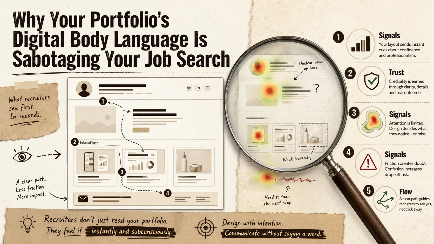
Think of it this way: your projects and text are the script. Your digital body language is the actor's delivery, timing, and stage presence. A great script delivered poorly falls flat. For recruiters spending an average of 7.4 seconds initially scanning a resume or portfolio (a statistic backed by numerous eye-tracking studies), these non-verbal cues form a rapid, gut-level assessment. They’re looking for signals of competence, trustworthiness, and ease of collaboration.
The concept is gaining formal traction. Platforms like LinkedIn have incorporated "digital body language" into their sales and networking training for years, teaching users how email response times and profile completeness send signals. Now, that analysis is being applied upstream to hiring. Tools used by recruiters -- including HireVue and Greenhouse -- can analyze design consistency, information hierarchy, and even color psychology to generate candidate fit scores.
| Traditional Body Language Cue | Digital Portfolio Equivalent | Signal It Sends |
|---|---|---|
| Confident posture & eye contact | Clean layout, clear visual hierarchy, prominent "About" section | Professionalism, clarity of thought |
| Fidgeting, avoiding gaze | Cluttered pages, auto-playing media, broken links | Anxiety, lack of attention to detail |
| Organized, prepared materials | Easy-to-find contact info, logical project navigation, fast load times | Reliability, respect for the viewer's time |
| Enthusiastic, engaged tone | Interactive elements, thoughtful case studies, personalized content | Passion, investment in craft |
The Three Pillars of Digital Communication
Your portfolio communicates on three distinct levels, and most creators only focus on the first one.
- Explicit Content: This is the words and images you intentionally choose—your project descriptions, job titles, and "About Me" text. It's what you mean to say.
- Implicit Design: This is how that content is presented. It includes typography, color scheme, spacing, and imagery. A dark, moody aesthetic might implicitly signal creative depth for a filmmaker but could signal a lack of clarity for a data analyst. The choice of a generic template over a custom design implicitly communicates something about your investment in your brand.
- Interactive Behavior: This is how the site responds to the user. Does it load quickly? Do links work? Is the navigation intuitive or confusing? Does a contact form submit with a satisfying confirmation, or does it fail silently? This layer speaks directly to your technical competence and user-centric thinking.
A misalignment between these layers creates cognitive dissonance for the viewer. Your explicit content might say "detail-oriented UX designer," but if your site has inconsistent button styles and a confusing menu, your implicit and interactive signals are screaming the opposite. For a deeper dive into structuring these layers effectively, our guide on portfolio builders breaks down the tools that help or hinder this alignment.
Why This Isn't Just About "Good Design"
It's tempting to dismiss this as simply needing a prettier website. That's a dangerous oversimplification. Good design is a component, but digital body language is about appropriate and authentic communication. A brutally minimalist, text-only portfolio might have "good design" but could signal arrogance or a lack of storytelling ability if you're a visual artist. Conversely, a multimedia-heavy, experimental site might be perfectly authentic for a motion graphics designer but signal disorganization to a corporate hiring manager.
The goal isn't to chase design trends; it's to ensure every aspect of your portfolio's behavior consciously supports the single professional narrative you want to tell. This requires moving from being just a creator of content to being the director of your entire digital presence.
Why Your Portfolio's Silent Signals Matter More Than Ever
A 2025 Greenhouse report found 73% of recruiters rate personal portfolios "very important" (up from 41% in 2019), and 68% have rejected candidates for poor presentation alone. Silent signals erode trust (broken links, expired SSL), create a confidence paradox (weak CTAs vs. aggressive pop-ups), and trigger cultural mismatch -- all before a recruiter reads a single project description.
We're in the middle of a quiet revolution in hiring. The shift to remote and hybrid work didn't just change where we work; it changed how we're evaluated. When an in-person interview isn't guaranteed, your digital footprint becomes your primary audition. Recruiters are overwhelmed, often reviewing hundreds of applications for a single role. They've developed heuristics—mental shortcuts—to filter candidates quickly, and your portfolio's digital body language provides a rich set of data for those snap judgments.
A 2025 report by the hiring platform Greenhouse found that 73% of recruiters now consider a candidate's personal website or portfolio a "very important" factor in the screening process, up from 41% in 2019. More tellingly, 68% admitted to rejecting candidates based on "poor presentation or usability" of their portfolio, even if their resume was strong. Your portfolio isn't just a supplement anymore; it's a gatekeeper.
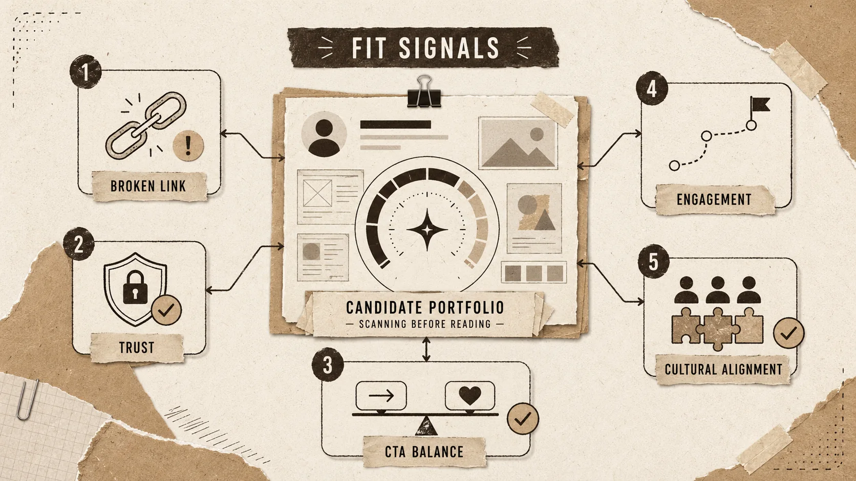
Problem 1: The Trust Gap
The first and most critical signal your portfolio sends is about trust. Can you be relied upon? In the digital realm, trust is built through clarity, consistency, and competence. A portfolio with spelling errors, low-resolution images, or a contact email that bounces doesn't just look unprofessional—it actively erodes trust. It signals carelessness. If you can't be bothered to proofread your own professional showcase, a hiring manager wonders what you'll overlook on the job.
This extends to technical trust. A site that loads slowly (Google’s Core Web Vitals are a public benchmark for this) or has broken "View Project" links signals a lack of technical diligence. For any role involving digital output -- which is most of them today -- this is a direct red flag about your work quality. It’s the digital equivalent of showing up to a client meeting with a corrupted presentation file. Our research on bio link loading speed and career opportunities quantifies exactly how much a slow site costs you.
Problem 2: The Confidence Paradox
Your portfolio should be your biggest advocate, but poor digital body language can make it seem apologetic or insecure. How? Through weak visual hierarchy. If your name is tiny and buried, if your best work is hidden behind three clicks, or if your "Hire Me" call-to-action is a pale, small button in the footer, you're implicitly downplaying your own value.
Conversely, an overly aggressive digital body language can backfire. Autoplaying video or music, pop-up subscription forms before any content is seen, and exaggerated claims ("World's Best Developer!") can signal arrogance or desperation, not confidence. True confidence in a portfolio is quiet and assured. It presents work clearly, makes navigation effortless, and lets the quality speak for itself without gimmicks. Building this kind of confident presence is a core part of effective personal branding.
Problem 3: The Cultural Mismatch
Companies hire for fit as much as for skill. Your portfolio's aesthetic and tone are powerful signals of your cultural alignment. A startup looking for "hackers" and "hustlers" might be put off by a portfolio that feels overly corporate, formal, and risk-averse. A large financial institution might be wary of a portfolio that feels chaotic and overly casual.
Your digital body language broadcasts your work style. Is your portfolio meticulously organized with detailed case studies (signaling process-oriented thinking), or is it a vibrant, chaotic explosion of creativity (signaling ideation and energy)? Neither is wrong, but aligning that signal with your target audience is crucial. A mismatch here leads to that vague feeling a recruiter can't articulate—"just not the right fit"—which is often a verdict on digital body language, not your skills.
The stakes are only getting higher. With the integration of AI tools in recruiting platforms like Pymetrics and HireVue, these signals are being quantified. An AI might score a portfolio's "clarity" based on text structure, "modernity" based on design patterns, and "engagement potential" based on interactive elements. You're not just being judged by a human's gut feeling anymore; you're being pre-screened by algorithms trained to decode these very cues. For a deep dive into what they actually measure, see portfolio metrics that matter to recruiters.
How to Audit and Fix Your Portfolio's Digital Body Language
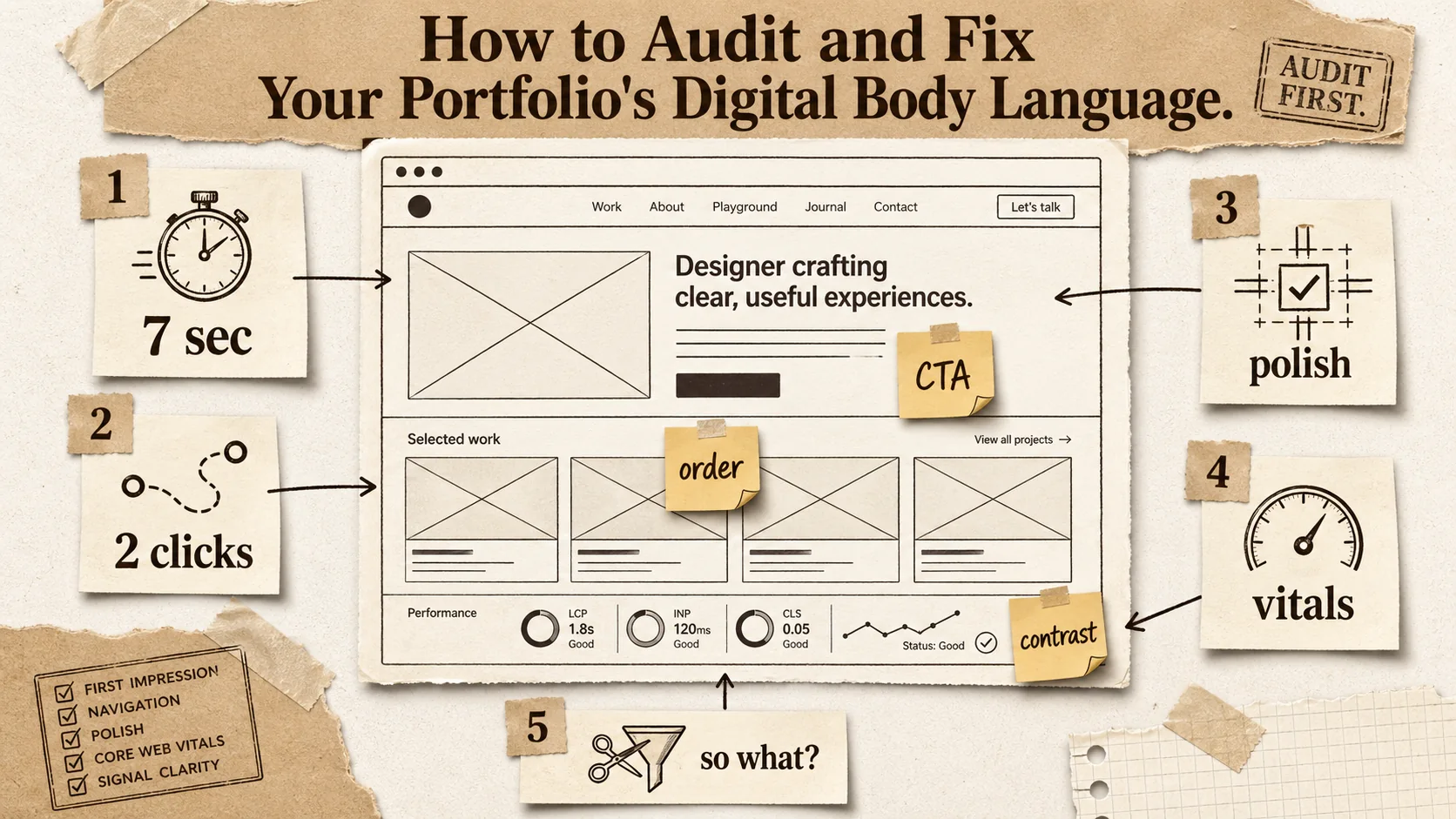
Five steps: (1) run a 7-second first-impression test in incognito, (2) perform a navigation empathy check targeting two-click-max project access, (3) scan for consistency and polish using the W3C Link Checker, (4) hit "Good" on all three Google PageSpeed Insights Core Web Vitals, and (5) apply the "So What?" test to ruthlessly cut every element that doesn't send a positive professional signal.
Fixing your digital body language isn't about a total redesign (though that might help). It's about a systematic, empathetic audit. You need to see your portfolio not as its creator, but as a time-pressed, skeptical recruiter seeing it for the first time. This step-by-step method will guide you through that process.
Step 1: The 7-Second First Impression Test
Set a timer for seven seconds. Open your portfolio homepage in an incognito window (to avoid cached biases) and stare at it. Don't scroll, don't click. When the timer goes off, close the window and immediately write down:
- What is the one dominant message or feeling you got?
- What is the single most prominent visual element?
- Can you immediately tell what this person does?
If your answers are vague ("looks nice," "a big image," "something creative"), you've failed the first impression. The dominant message should be a clear value proposition (e.g., "Product Designer for Fintech" or "Data Journalist Telling Stories with Numbers"). The most prominent element should be your name/headline or your absolute best project. Clarity beats creativity in these first seven seconds.
Tool to use: Use a tool like Hotjar to record anonymous user sessions (you can get a included plan for low-traffic sites). Watching just a few recordings of strangers landing on your page is brutally enlightening. You'll see where they click, where they hesitate, and where they leave. This aligns with the data in your portfolio's first 5 seconds rule.
Step 2: The Navigation Empathy Check
Now, pretend you're a recruiter who has landed on your site from a LinkedIn profile. Your mission: find a specific project mentioned on the resume and then find how to contact this person.
- How many clicks did it take to find the project?
- Was the project page easy to scan? Could you find the problem, solution, and result quickly?
- How obvious was the contact information? Did you have to hunt for it?
Aim for a maximum of two clicks to any major project. Your contact info—a professional email, at minimum—should be in the header or a dedicated, obvious page linked from the main menu. A hidden contact form or a sole reliance on social media DMs signals a barrier to communication, which is a terrible signal to send to someone who might want to offer you a job.
Practical Tip: Ask a friend who is not in your industry to perform this task. Their confusion is your most valuable data. This exercise often reveals the specialized jargon and insider assumptions that make your portfolio impenetrable to outsiders, which includes most recruiters and hiring managers.
Step 3: The Consistency & Polish Scan
This is where you hunt for the small leaks that sink the ship of trust. Go through every page of your site with a fine-toothed comb.
- Broken Links: Use the W3C Link Checker or Dead Link Checker to crawl your site and find every 404 error. Fix them all. If your digital footprint extends across platforms, our guide on digital exhaust and recruiter perception covers the full audit framework.
- Visual Consistency: Are your heading fonts the same size and weight on every page? Are button colors and styles identical? Do your image borders or shadows follow a uniform rule? Inconsistency here signals a lack of systematic thinking. Tools like Figma can help you maintain a design system.
- Content Tone: Read your text out loud. Does the tone shift from overly formal in your bio to casually chatty in your project notes? Find one consistent, professional voice and stick to it.
- Mobile Experience: Over 60% of portfolio traffic now comes from mobile devices. How does your site look and function on a phone? Is text readable without zooming? Do buttons have enough space to be tapped easily? Use Chrome DevTools or a tool like BrowserStack to test on multiple device views.
Each of these polish items might seem minor alone, but together they form a powerful signal of your meticulousness—or lack thereof. For a structured approach to this polish phase, our portfolio hub has checklists and templates that can help.
Step 4: The Speed & Performance Diagnostic
Speed is a non-negotiable component of digital body language. A slow portfolio is an impatient, disrespectful portfolio. It says, "My time is more valuable than yours." Google PageSpeed Insights is the industry standard for this. Run your URL through it.
- Core Web Vitals: Pay special attention to Largest Contentful Paint (LCP - how long it takes to load the main content), First Input Delay (FID - how responsive the site is to clicks), and Cumulative Layout Shift (CLS - how much the page jumps around while loading). A "Good" rating is the target.
- Common Fixes: The report will give you actionable advice. Typically, this involves optimizing images (compress them, use modern formats like WebP), removing unused JavaScript, and leveraging browser caching. If you're using a portfolio builder, choose one that prioritizes performance out of the box.
A fast site signals technical competence and respect for the user. In a competitive job market, it's a simple way to be in the top percentile of candidates before you've even said a word.
Step 5: The "So What?" Test for Every Element
This is the most important step. For every major element on your portfolio—every section, image, button, and paragraph—ask: "What professional signal does this send, and is it the one I intend?"
- That animated background? Signal: "I'm creative and modern." Risk: "I'm distracting and my site might be slow."
- A list of every tool and technology I've ever touched? Signal: "I'm experienced." Risk: "I lack focus and can't prioritize what's relevant."
- No personal photo? Signal: "My work speaks for itself." Risk: "I'm avoiding putting a face to my name, which feels impersonal or insecure."
- Extremely detailed, 2000-word case studies? Signal: "I'm thorough and process-driven." Risk: "I can't synthesize information effectively for a busy audience."
Be ruthless. If an element doesn't send a strong, positive, intentional signal about you as a professional, remove it or change it. Your portfolio should be a curated exhibition, not a storage warehouse for your entire career.
Proven Strategies to Project Confidence and Clarity
Four advanced tactics amplify your digital body language: master the visual hierarchy (name/headline first, then best proof, then CTA), write project descriptions with a point of view and quantified outcomes, design every page for the logical next step with context-aware CTAs, and strategically place specific, powerful social proof -- a single testimonial with a 15% conversion lift metric beats a slider of ten generic "Great to work with!" quotes.
Once you've fixed the leaks, it's time to actively engineer a digital body language that works for you. These advanced tactics go beyond basic fixes to shape perception strategically.
Strategy 1: Master the Hierarchy of Information
A confident portfolio controls the viewer's eye and mind. Use visual hierarchy—size, color, spacing, placement—to tell them what to look at first, second, and third. The formula for most professionals is:
- Who you are and what you do: Large, clear headline + name + maybe a very short tagline.
- Your best proof: A single, stellar featured project or a tight grid of 3-4 top projects.
- How to engage: A clear, action-oriented button ("View My Work," "See Case Studies," "Get in Touch").
- The deeper story: Navigation to your full project archive, about page, and contact.
This isn't just design; it's psychology. It reduces cognitive load for the viewer and projects authority by showing you understand what's important. Tools like Figma or Adobe XD are excellent for mocking up and testing different hierarchies before you commit to code or a builder. For the data behind optimal hierarchy, read how to build a portfolio that recruiters actually click.
Strategy 2: Write with a Point of View, Not Just a Description
Your project descriptions are a goldmine for digital body language. Most people write like a museum placard: "This is a mobile app I built for task management. It uses React Native and Firebase." This is passive and forgettable.
Rewrite with a strong point of view. Lead with the problem or opportunity you identified. "Most task apps overwhelm users with features from day one. I designed [App Name] to combat anxiety by introducing complexity progressively, leading to a 40% higher 30-day retention rate in user testing." This signals strategic thinking, user empathy, and results-orientation. It turns a project showcase into a story of professional judgment.
Strategy 3: Design for the Next Step, Not the Last Step
Your portfolio's ultimate goal is to start a conversation. Every page should be engineered to facilitate the logical next step for your target viewer.
- After your "About" page, the next step should be "See my relevant work" or "Contact me to discuss."
- After a project case study, the next step should be "See another similar project" or "Read about my process."
- Use clear, context-aware calls-to-action. Instead of a generic "Contact" button at the end of a case study, try "Interested in solving a similar problem for your team? Let's talk."
This creates a sense of guided momentum. It makes the recruiter feel like you're anticipating their needs and leading them to a valuable conclusion (hiring you). It's the digital equivalent of a smooth, confident handoff in a conversation.
Strategy 4: Leverage Social Proof as a Trust Accelerator
Testimonials, client logos, or mentions in publications are powerful non-verbal trust signals. They're the equivalent of a friend vouching for you at a party. But use them wisely.
- Placement: A single, powerful testimonial on the homepage is better than a slider of ten mediocre ones.
- Specificity: "Great to work with!" is weak. "Sam's systematic approach to our UX audit uncovered three key friction points we'd missed, leading to a 15% conversion lift" is powerful. It adds credibility to your own claims.
- Visual Integration: Don't just slap logos in a footer. Integrate them into the narrative. "My work has been featured in..." or "I've helped companies like..." frames the social proof as part of your story.
These elements act as external validators, strengthening the confident signals your own content is sending. They help bridge the trust gap with someone who has never met you.
Got Questions About Digital Body Language? We've Got Answers
The most common questions cover audit frequency (twice yearly, plus a 10-minute check per new project), non-designer solutions (use a clean template and apply hierarchy principles), single-element impact (one broken "View Live Project" link can sink your candidacy), and the biggest mistake (adding more instead of subtracting -- confidence is shown by what you leave out).
How often should I audit my portfolio's digital body language?
You should do a full, formal audit like the one outlined here at least twice a year. Your goals and target roles evolve, and design standards shift. More importantly, do a quick 10-minute check every time you add a new major project or update your resume. Ask yourself if the new addition aligns with the overall signals you're trying to send. Consistency over time is a signal in itself.
What if I'm not a designer? How can I get this right?
You don't need to be a designer. You need to be a clear communicator. Start with a template from a reputable portfolio builder that is known for clean, performance-focused designs (this is where doing your research on portfolio builder alternatives pays off). Then, apply the principles in this article: simplify your content, establish a clear hierarchy, and ruthlessly test for usability. A simple, clear, and functional portfolio from a non-designer sends a better signal than a messy, overly complex one trying to look "designed."
Can a single bad page or element really sink my chances?
Absolutely, and it happens more often than you think. For a recruiter using your portfolio as a filter, a single major red flag can be enough for a "no." A broken "View Live Project" link on your featured work completely undermines its credibility. An auto-playing video with sound is so universally disliked it can create immediate negative bias. A missing contact method forces them to work to reach you, which they often won't. Treat every element as critical.
What's the biggest mistake people make when trying to improve their digital body language?
The biggest mistake is focusing on adding more instead of refining what's there. People think they need more graphics, more animations, more pages, more keywords. This almost always adds noise and weakens your signal. Improvement almost always comes from subtraction: removing clutter, simplifying language, deleting weak projects, and streamlining navigation. Confidence is often shown by what you choose to leave out.
Ready to speak the language recruiters understand?
Your portfolio's digital body language is the silent partner in your job search. It can undermine your best work or amplify it to the right people. Popout is built with these psychological principles in mind, offering clean, fast templates and intuitive tools that help you project confidence, clarity, and professionalism from the first click. Stop letting your site whisper the wrong message. Create Your Popout Page and start communicating with intent. For a data-backed simplicity approach, see why simplicity wins in 2026, and to audit your broader digital footprint across GitHub, LinkedIn, Behance, and Dribbble, explore our digital exhaust cleanup framework.
Other Doved Studio projects
Related tools from the same studio you might find useful:
- Ralphable: Generate structured Claude Code skills that iterate until pass/fail criteria are met.
- Glean: Turn scrolling time into a daily action plan. Capture, process, execute.
- Doved Studio: Studio indie derrière cette app et une dizaine d'autres outils.
Written by
popout
Content Team