Blog
Tips, insights, and resources for building your professional portfolio and advancing your career.
Featured
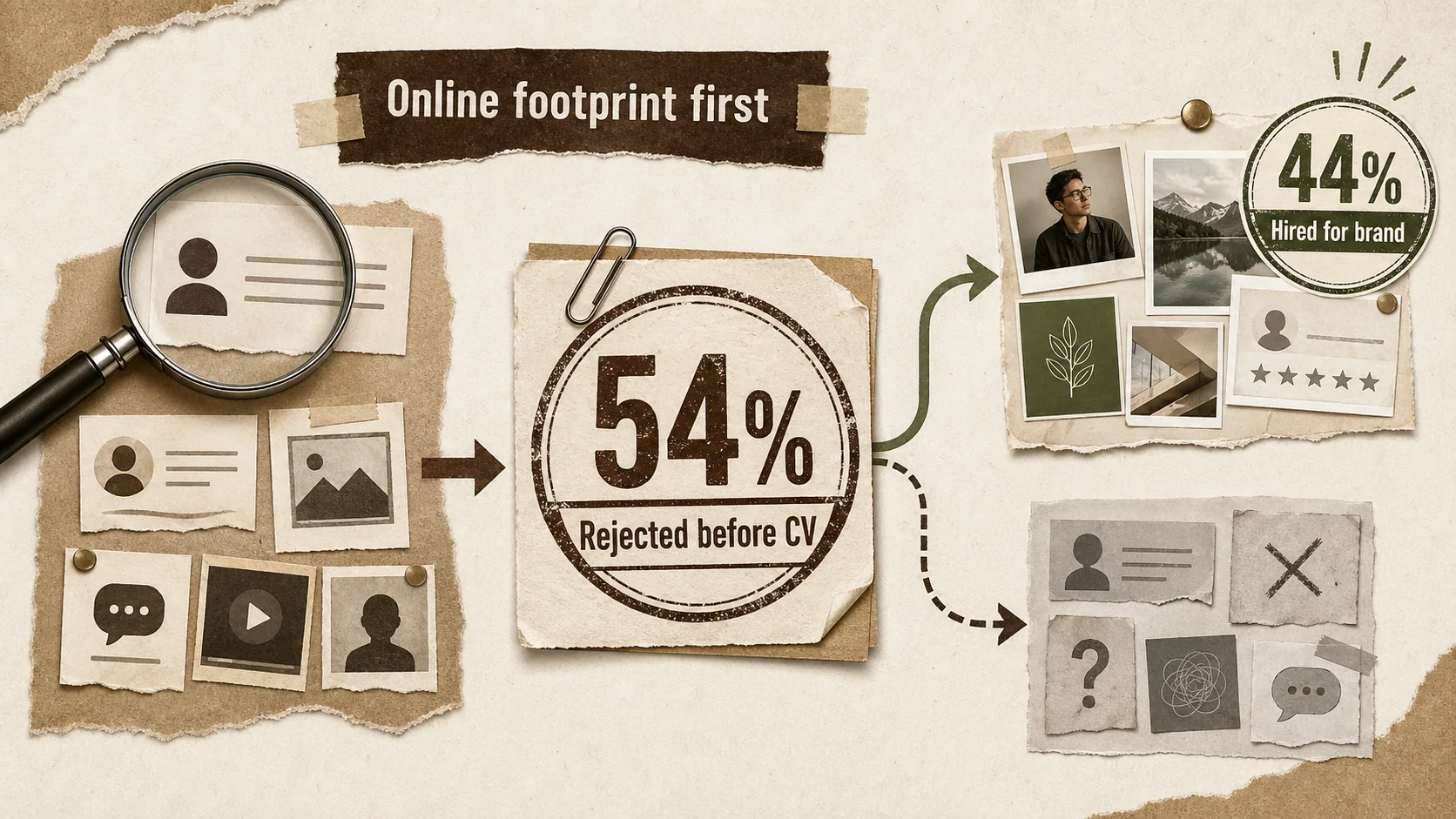
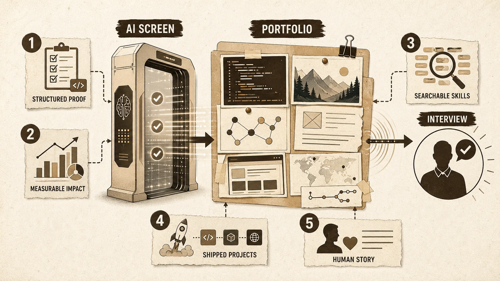
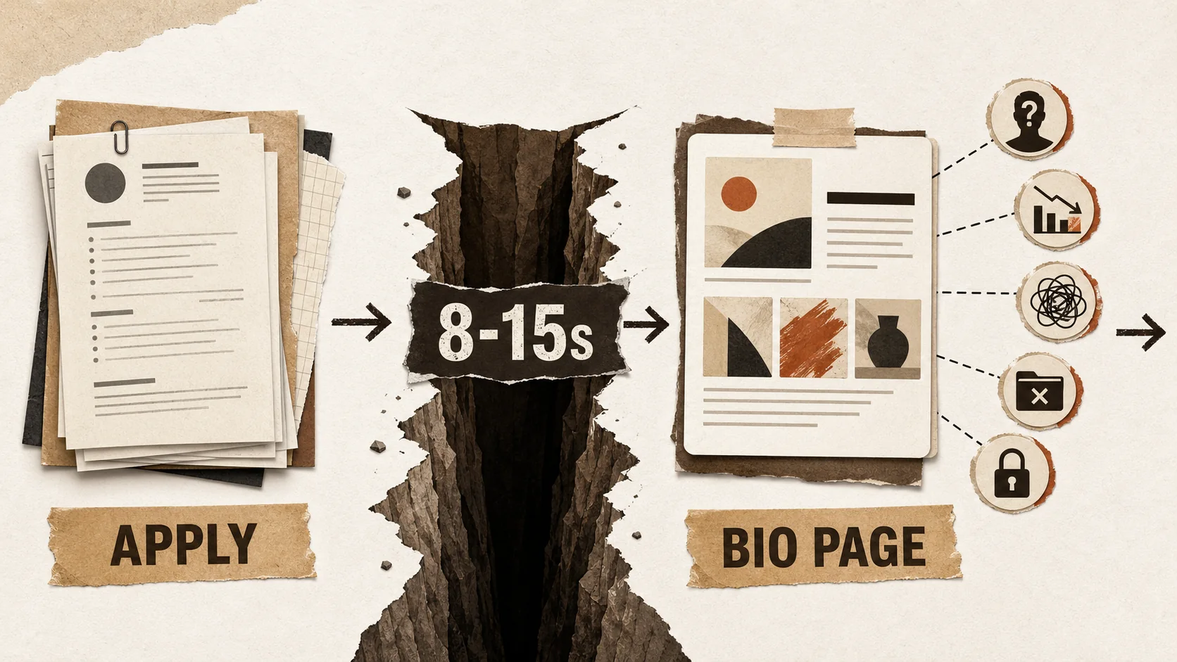
54% of Recruiters Rejected You Before Reading Your Resume — Here's Why
Your resume isn't the first thing recruiters see. Your online presence is. And for 54% of candidates, that's where the story ends.


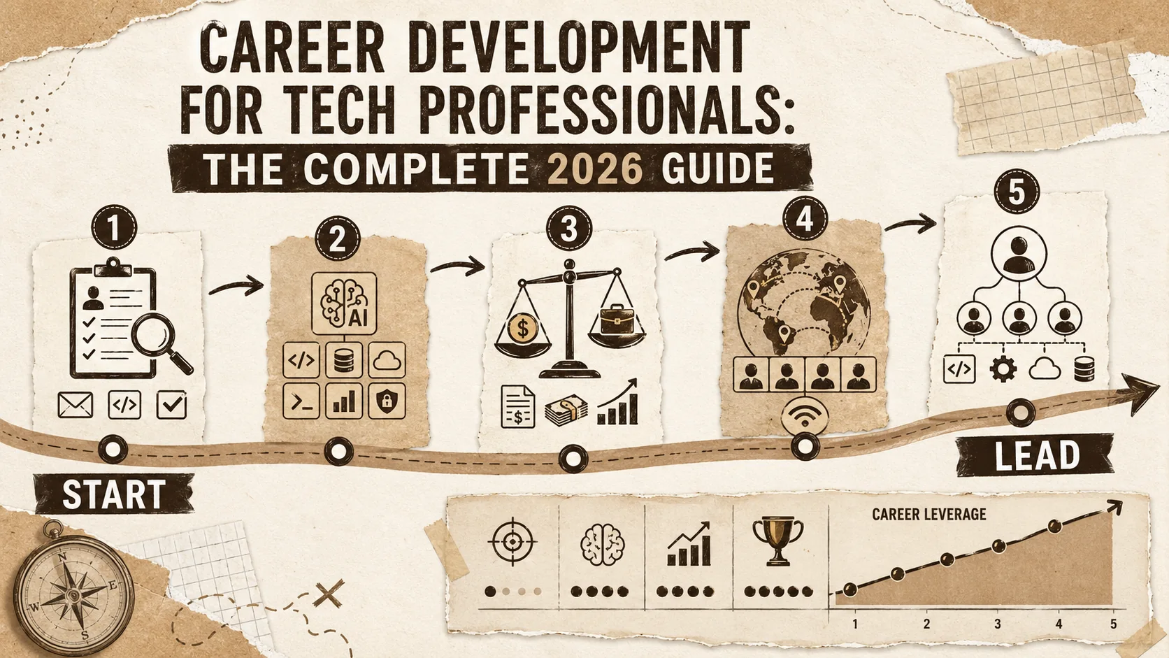
Career Development for Tech Professionals: The Complete 2026 Guide
Accelerate your tech career with proven strategies for job hunting, interviewing, negotiating, and advancing to senior roles. Actionable advice for developers at every stage.
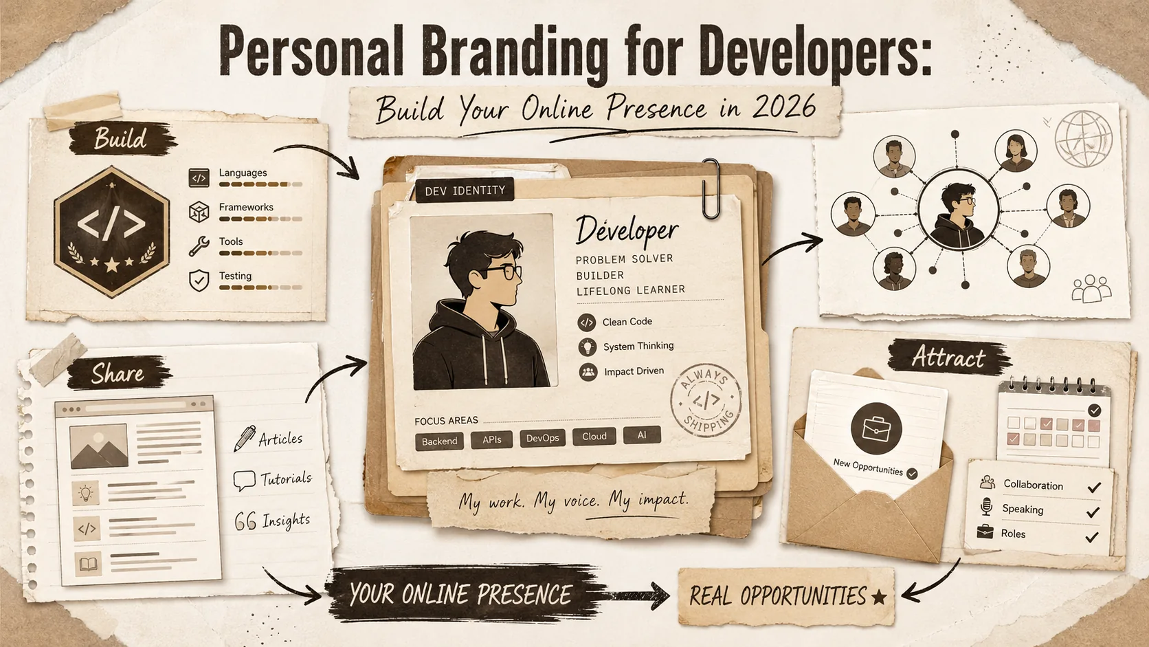
Personal Branding for Developers: Build Your Online Presence in 2026
Transform your online presence into a career accelerator. Learn content strategies, platform optimization, and networking techniques that attract opportunities in the tech industry.
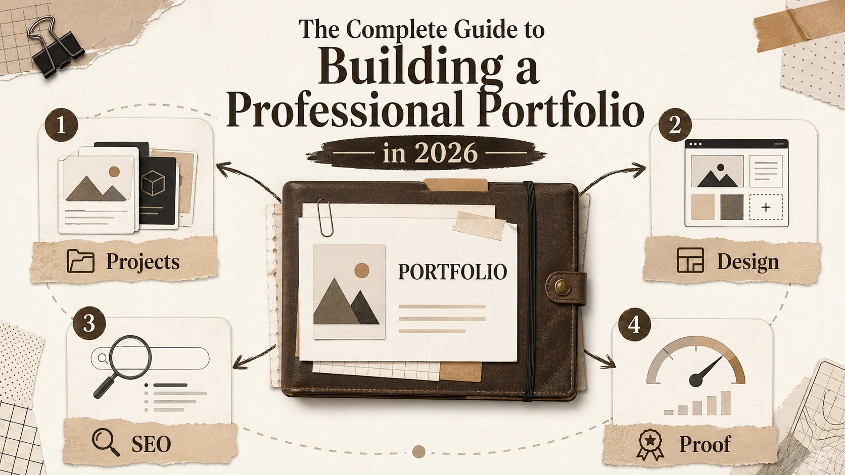
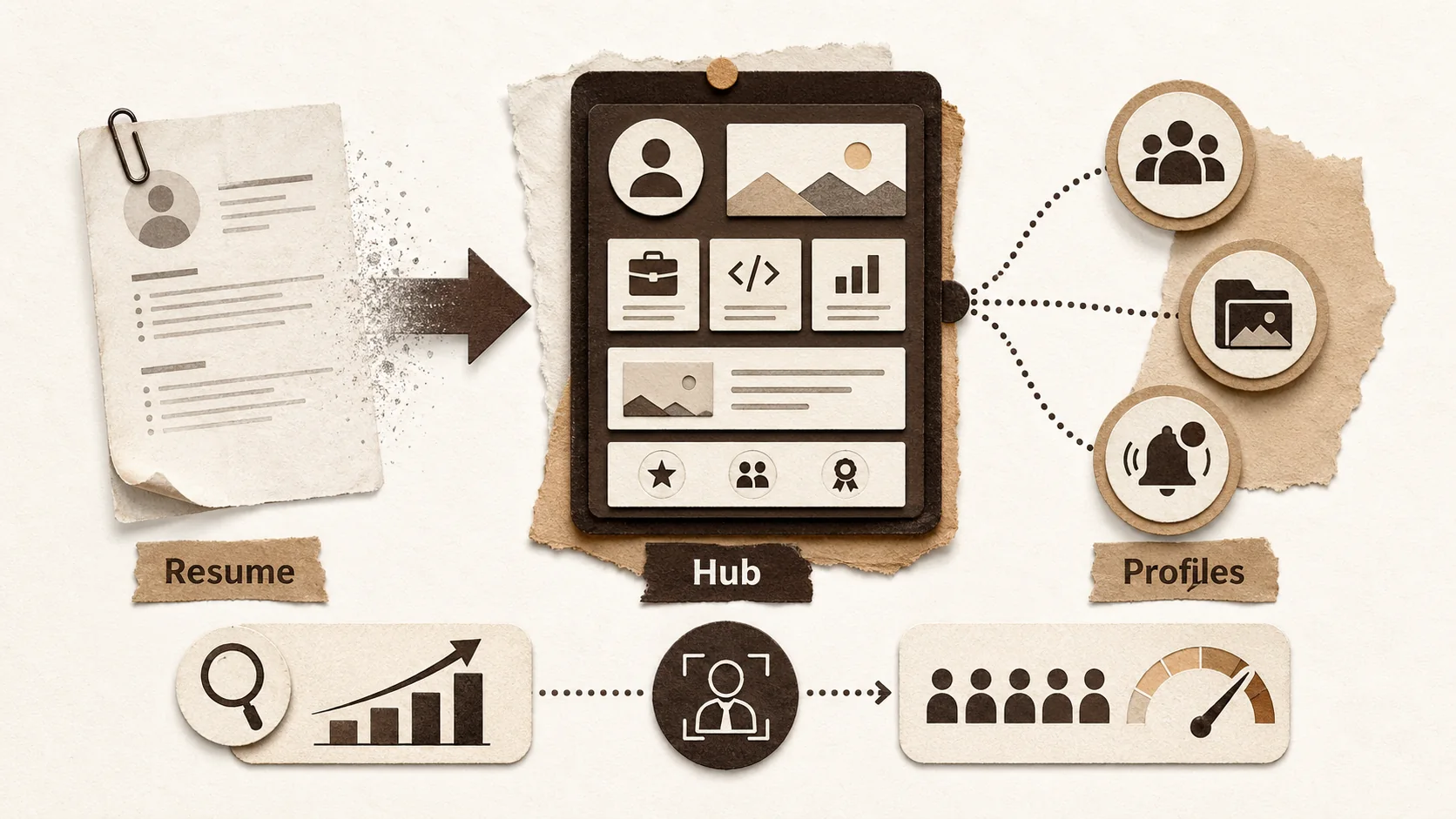
The Complete Guide to Building a Professional Portfolio in 2026
Master the art of portfolio creation with our comprehensive hub. Learn project selection, design principles, SEO optimization, and strategies to get noticed by recruiters and clients.
Latest Posts
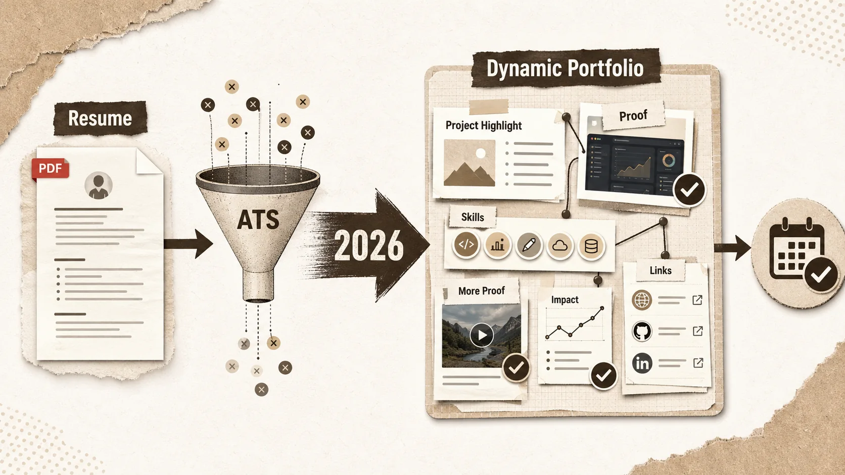
Developer Portfolio 2026: The Complete Guide to Building a Career-Selling Portfolio
Why Your Portfolio Needs a Case Study Section (Not Just a
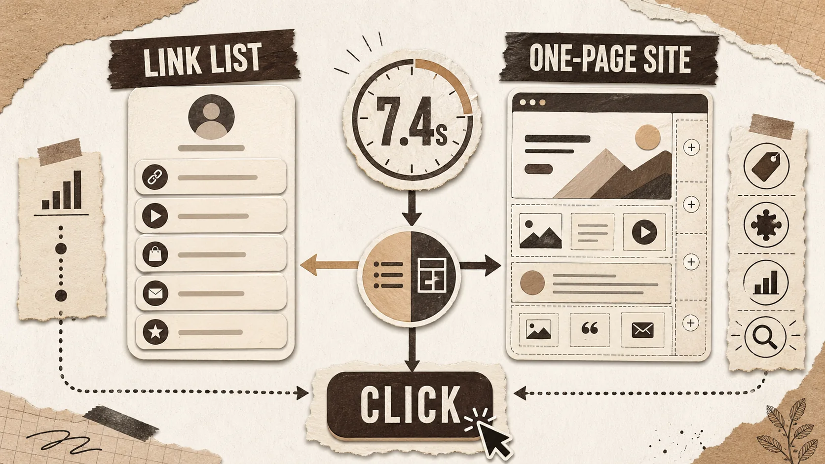
Bio Link Page Best Practices for 2026: Templates, Tools, and Examples That Turn Profile Visitors Into Opportunities

Entertainment writer portfolio examples 2026: clips, beats, bylines, and a contact page editors trust
Bento.me alternatives for 2026: build an owned portfolio that still works in AI search

AI search portfolio homepage: the recruiter-proof structure for 2026
Stan Store Alternative 2026: Creator Store, Link in Bio, or Real Mini-Site?
Compare Stan Store alternatives for creators who need a link-in-bio page, digital products, checkout, bookings, analytics, and a page that feels on-brand.

Bento.me Link in Bio Alternative: When a Portfolio Should Do More Than Look Neat
Searching for a Bento.me link in bio alternative? Compare Bento, Linktree, Carrd, Beacons, and Popout for proof-heavy creator portfolios.

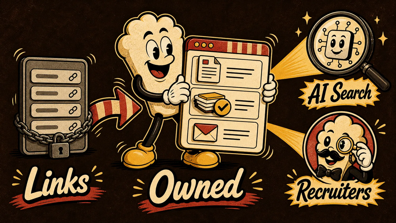
Facebook Is a Search Spike. Your Portfolio Still Needs an Owned Home

Pride Month Is a Search Spike. Your Portfolio Needs a Campaign Calendar

Google Preferred Sources and AI Search: Why Your Portfolio Needs to Be a Source, Not a Link Page

LinkedIn Profile Portfolio Link: 7 Above-the-Fold Examples That Make Recruiters Click

Portfolio Website vs LinkedIn in 2026: Which One Actually Gets You Remembered?

About.me Alternatives 2026: Build a Portfolio Page Recruiters Can Trust
The Layoff-Proof Portfolio: What to Show When Every Applicant Says They Use AI
Linktree Alternatives 2026: Build a Brand Hub, Not Just a Button Stack
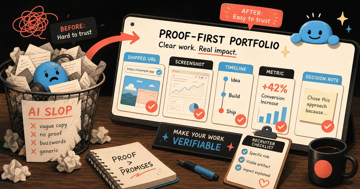
AI slop portfolio cleanup: the proof-first page recruiters can trust in 2026
Linktree Alternatives 2026 for Developers: Portfolio Links That Recruiters Trust

Data Viz Portfolios Recruiters Trust in 2026
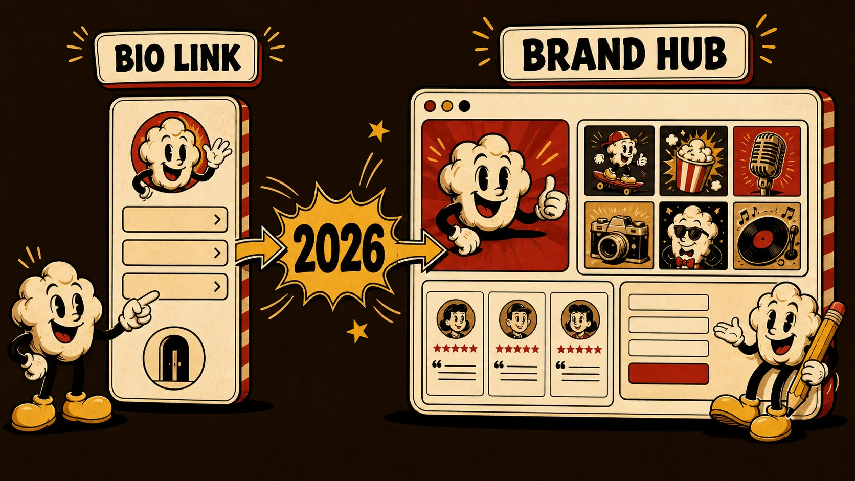
From Bio Link to Brand Hub: 5 Tools That Do More in 2026

Developer Portfolio 2026: The Human Proof Checklist for

AI Portfolio Examples That Recruiters Trust in 2026
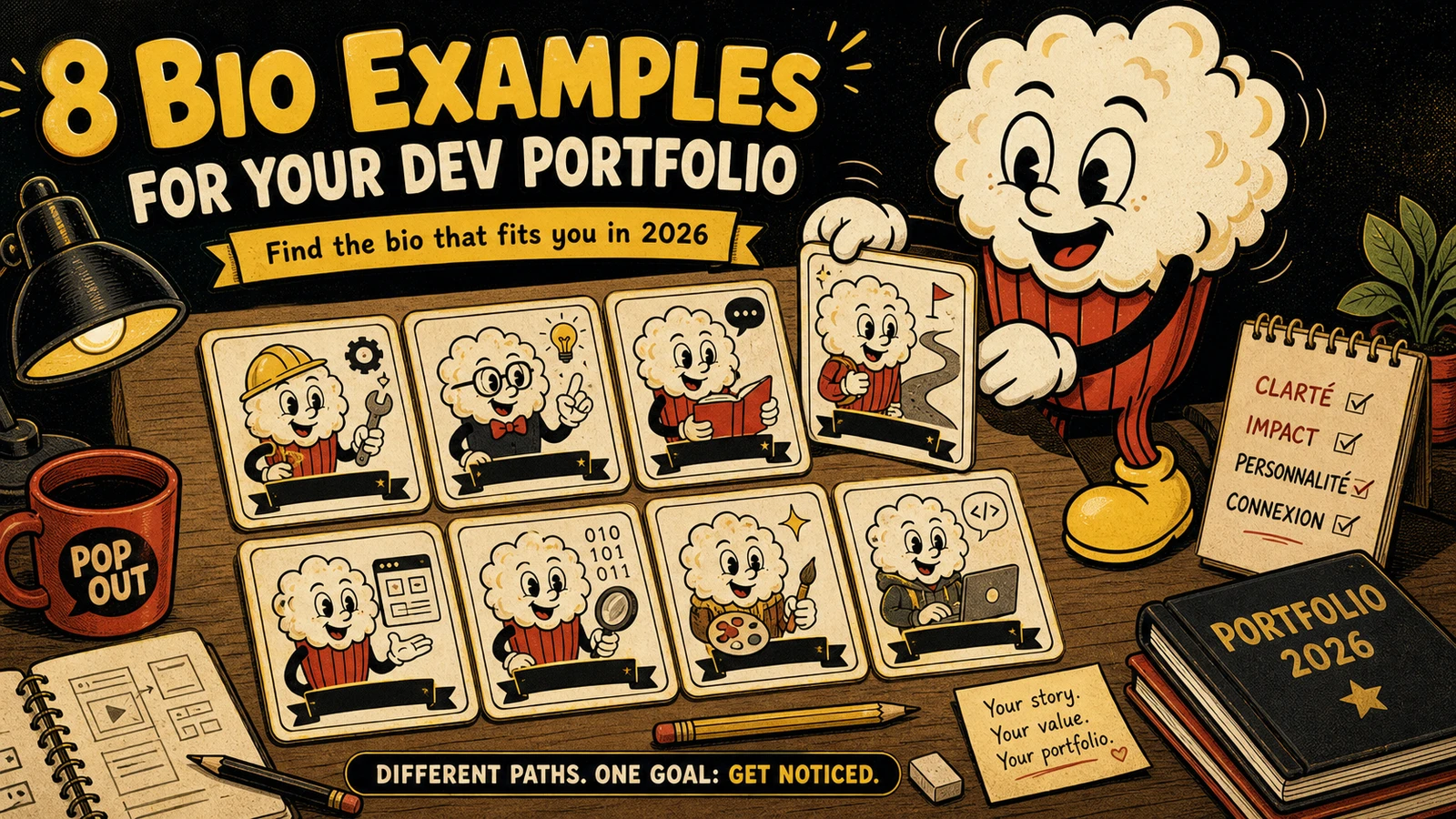
8 Developer Portfolio Bio Examples That Recruiters Actually Read (2026)
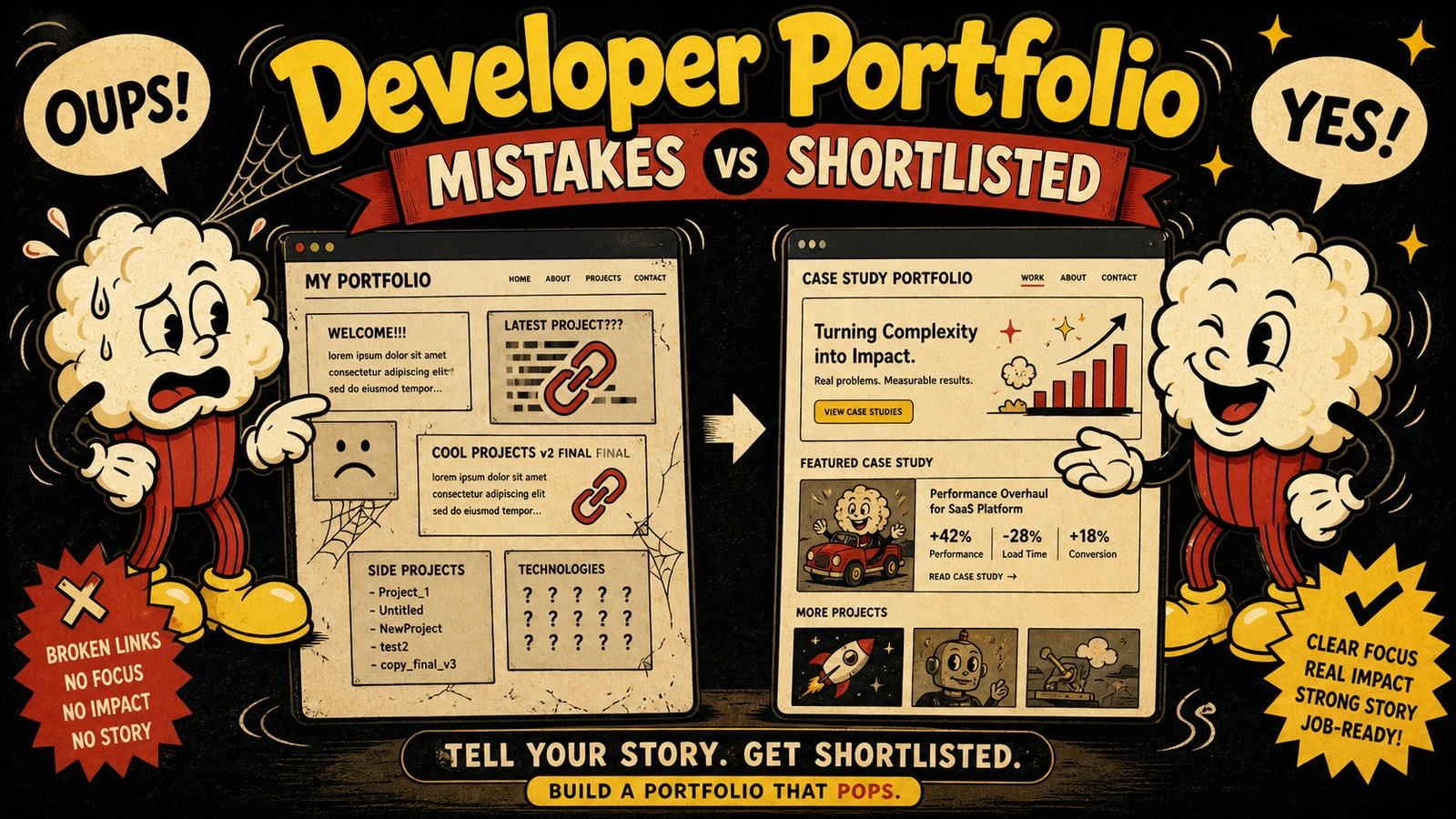
Developer Portfolio Mistakes That Get Rejected — and How to Fix Them with a 3-Step Job-Matching Framework
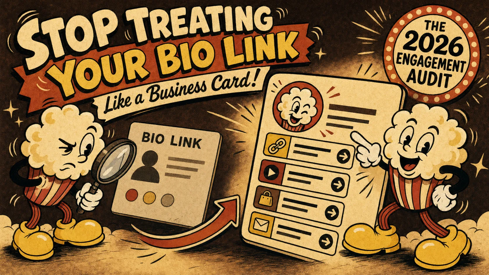
Stop Treating Your Bio Link Like a Business Card: The 2026
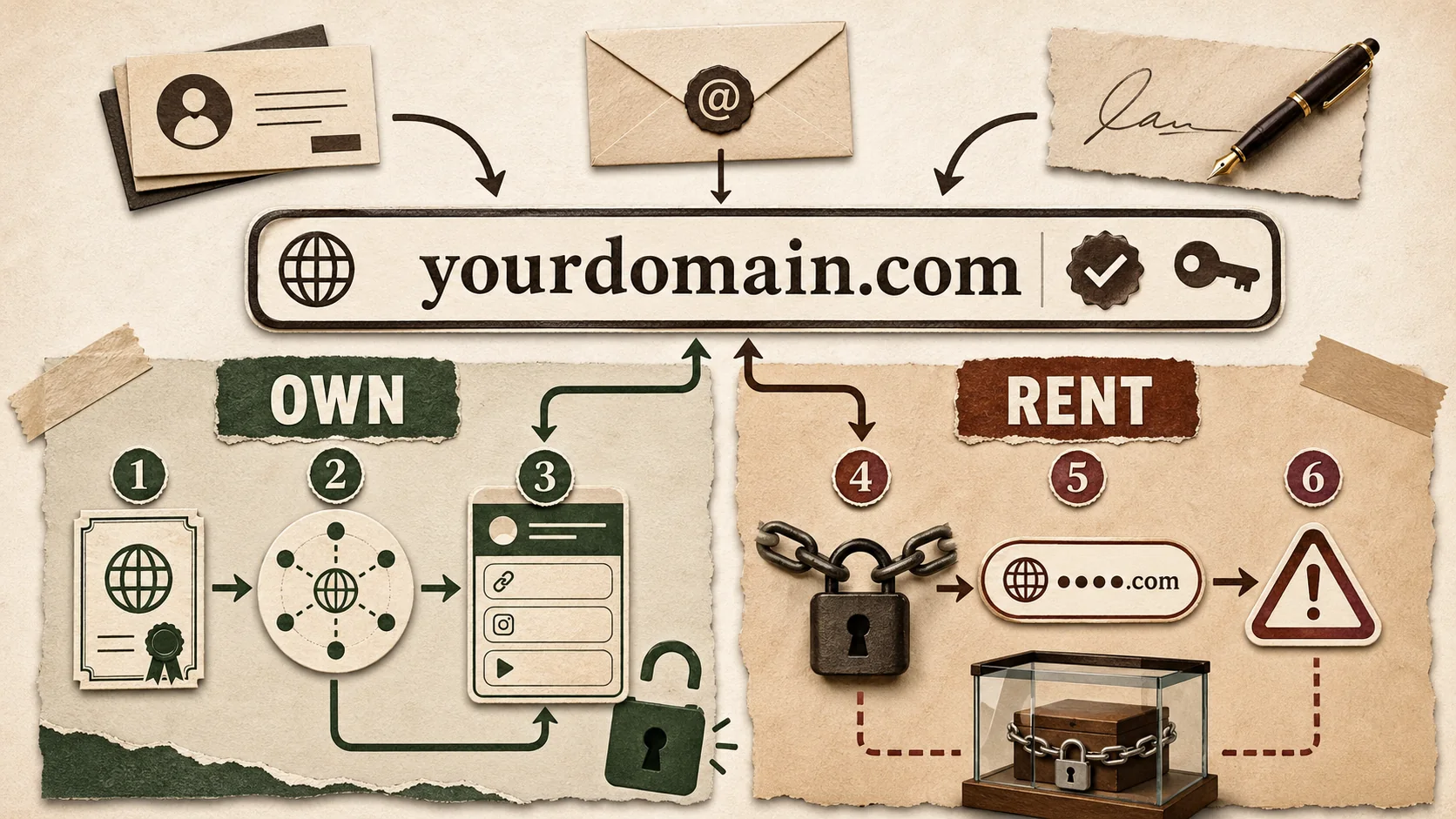
Custom Domains for Bio Links in 2026: The 6 Tools That Actually Let You Own It (vs. The Ones That Lock You In)
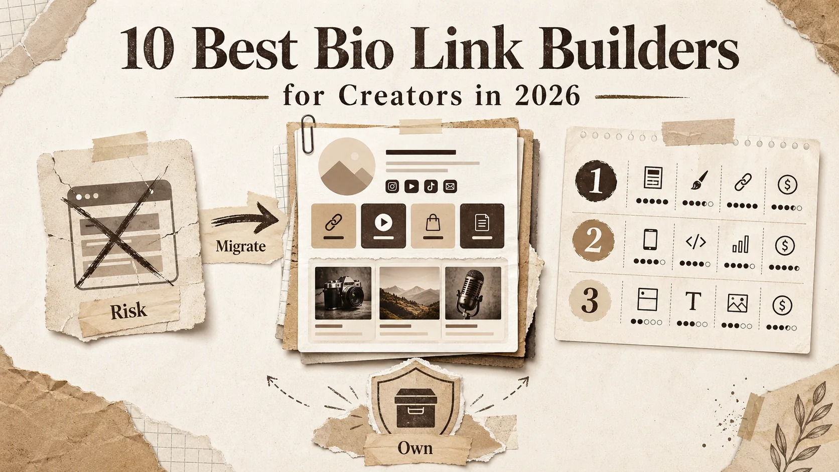
10 Best Bio Link Builders for Creators in 2026

3D Architectural Artist Portfolio Guide (2026)

7 Content Marketing Portfolio Examples That Landed Jobs (2026)
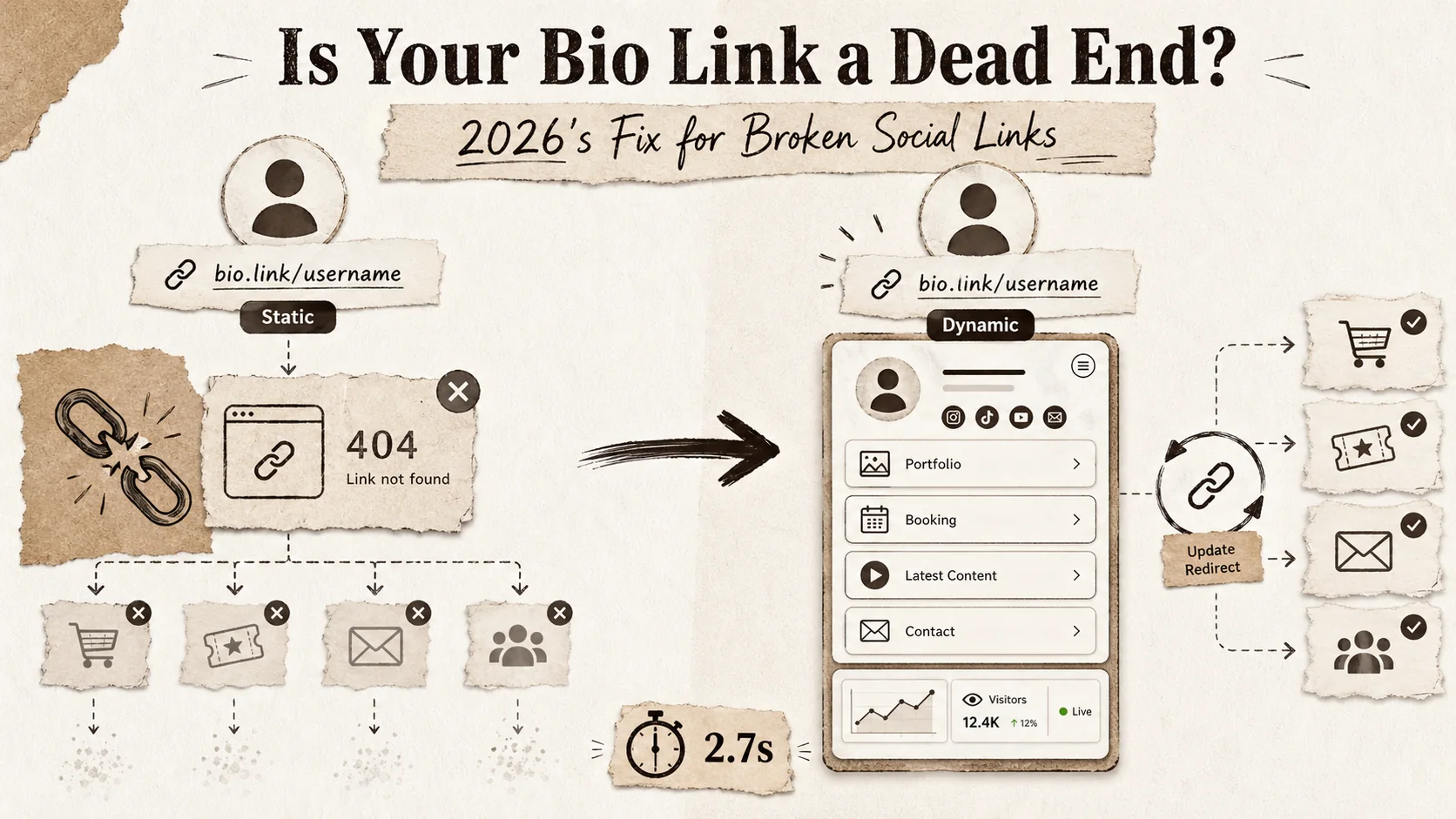
Is Your Bio Link a Dead End? 2026's Fix for Broken Social Links
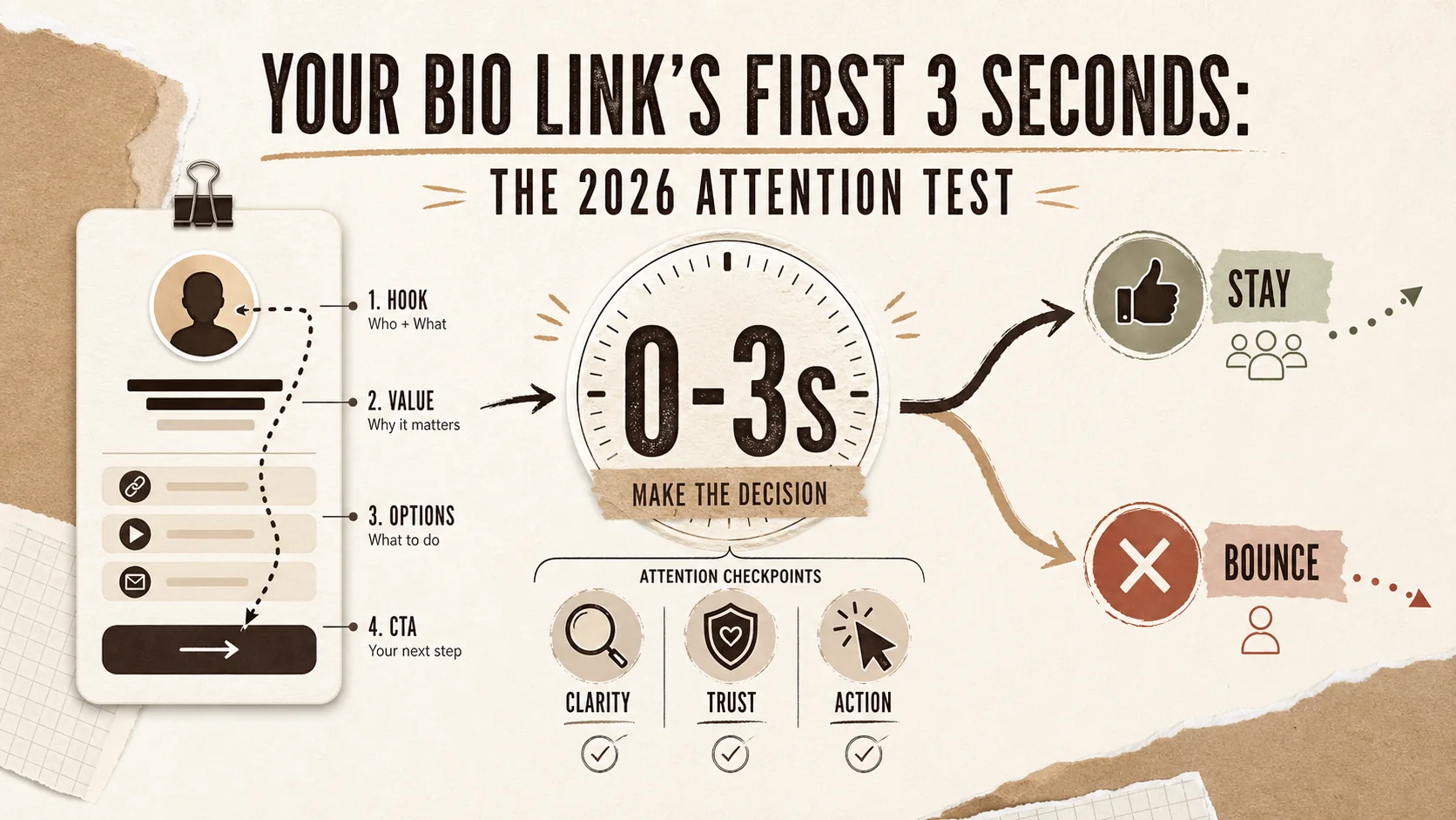
Your Bio Link's First 3 Seconds: The 2026 Attention Test
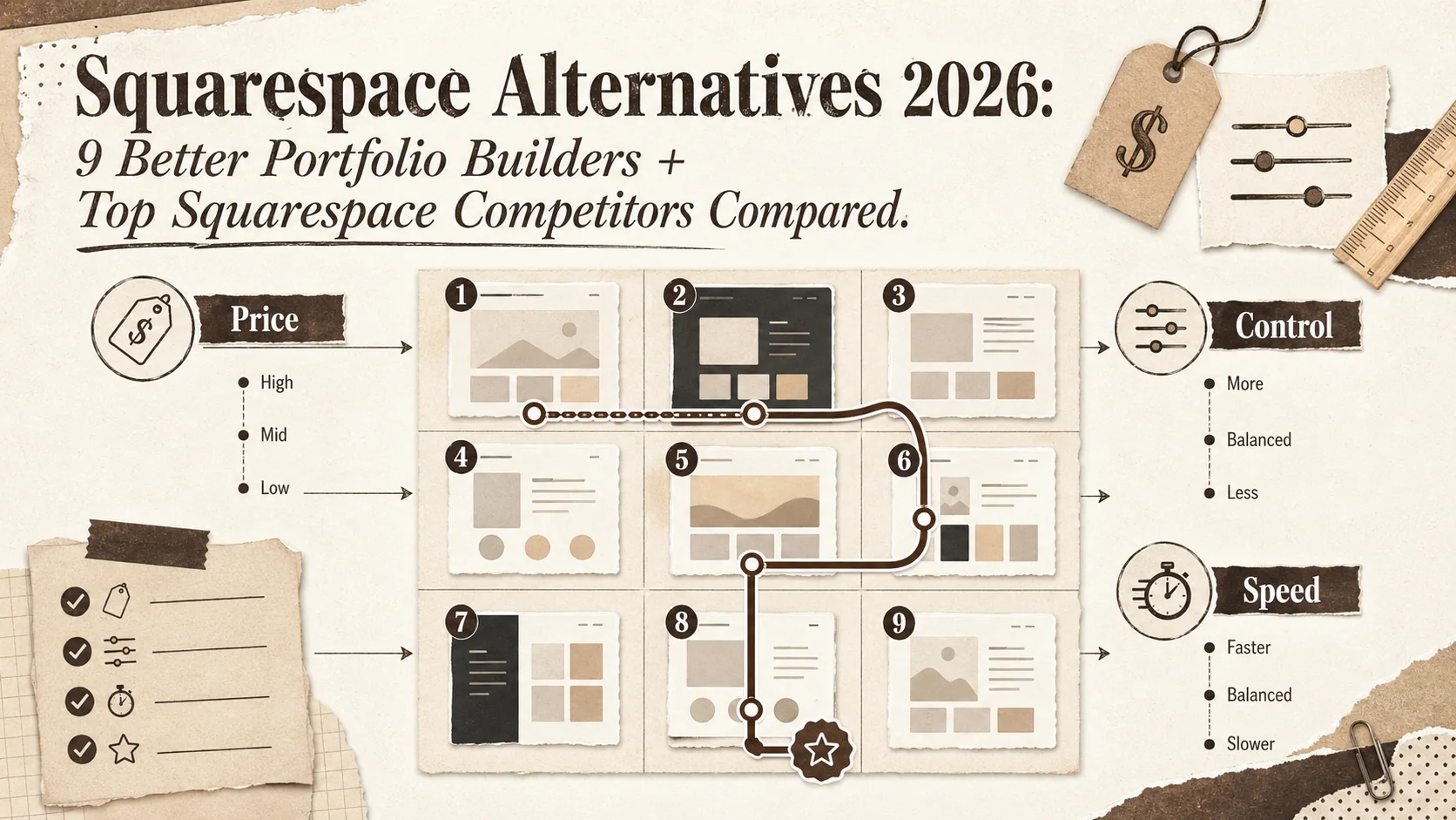
Squarespace Alternatives 2026: 9 Better Portfolio Builders + Top Squarespace Competitors Compared
Stop Using WordPress for Your Bio Page (2026)
The 2026 Developer Portfolio Reality Check: 5 Data-Backed Moves That Actually Land Interviews
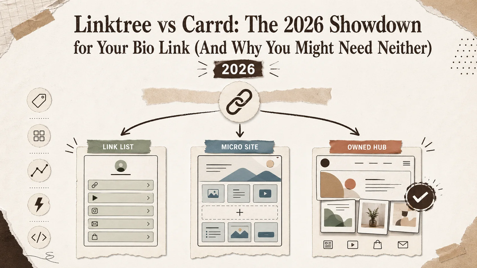
Linktree vs Carrd: The 2026 Showdown for Your Bio Link (And Why You Might Need Neither)
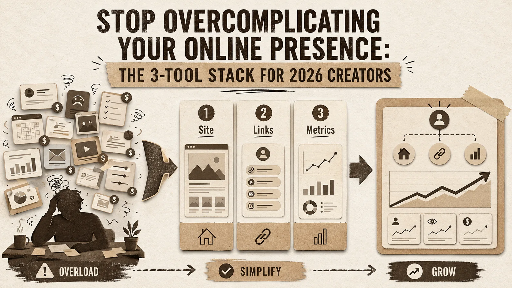
Stop Overcomplicating Your Online Presence: The 3-Tool Stack for 2026 Creators
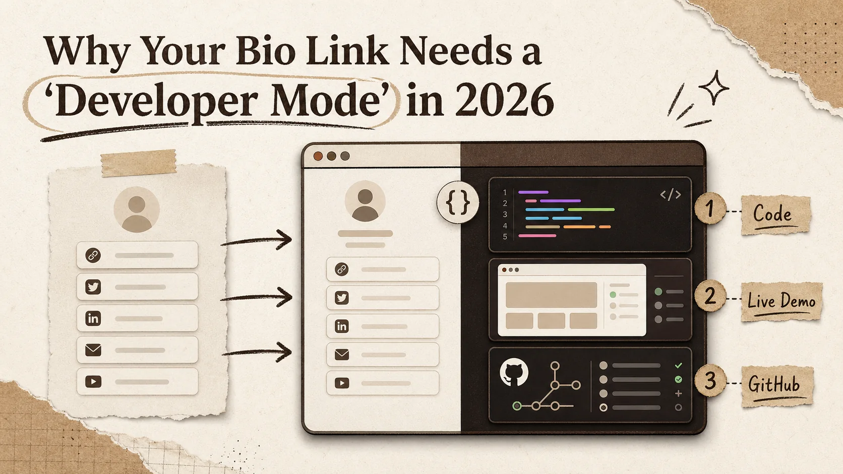
Why Your Bio Link Needs a 'Developer Mode' in 2026
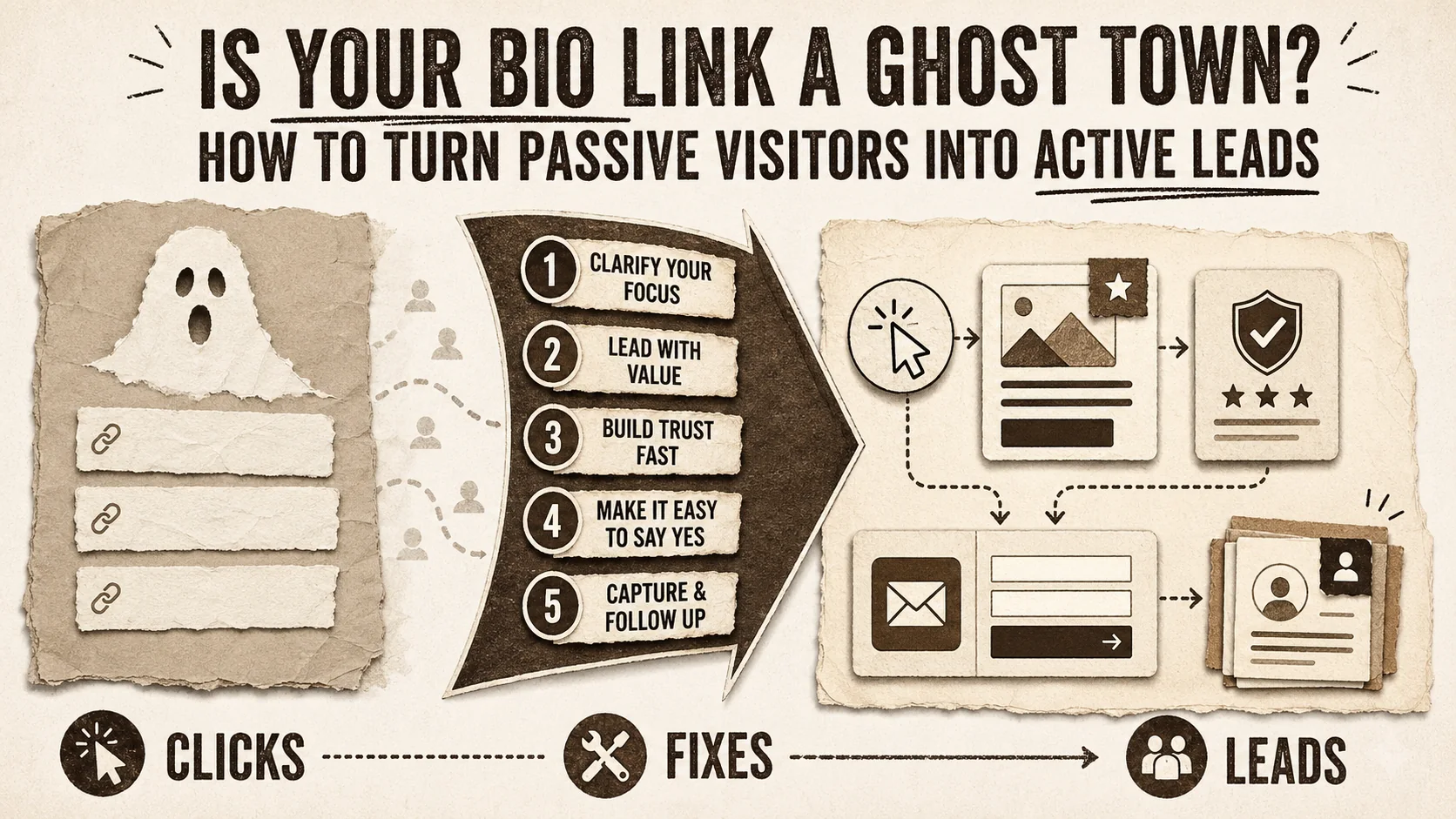
Is Your Bio Link a Ghost Town? How to Turn Passive Visitors into Active Leads
Stop Paying for WordPress Plugins: 5 Included Portfolio Builders That Do More
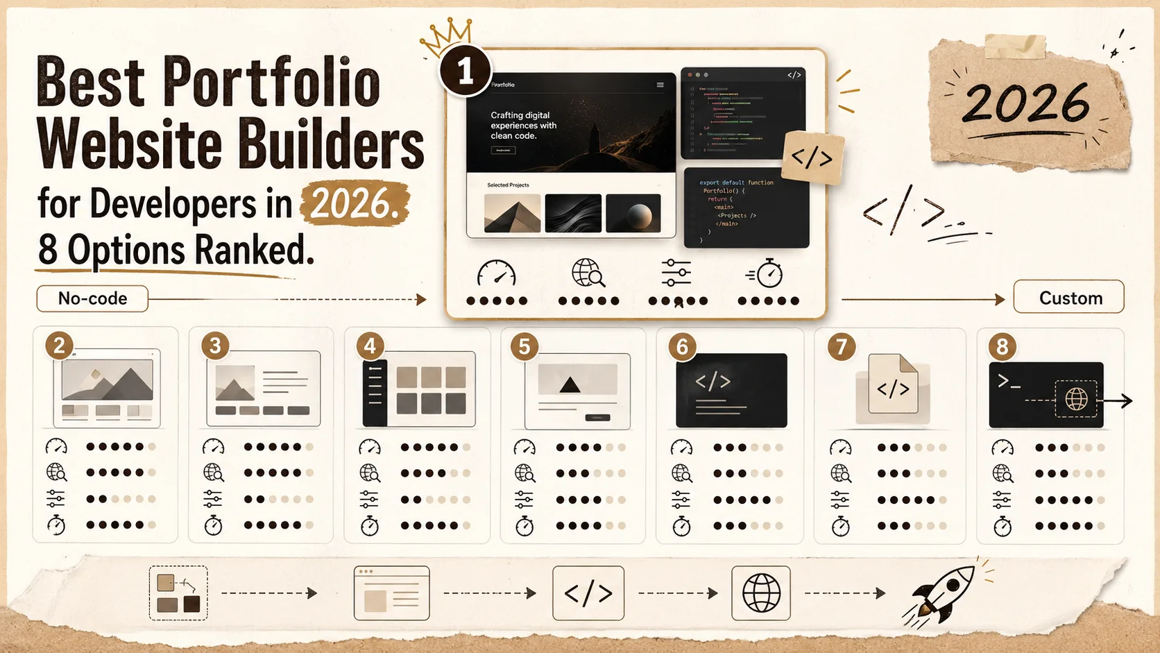
Best Portfolio Website Builders for Developers in 2026: 8 Options Ranked
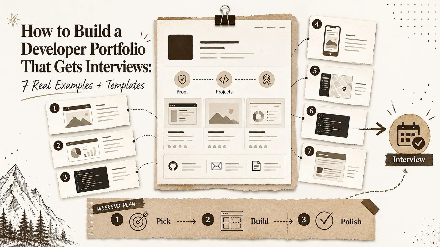
How to Build a Developer Portfolio That Gets Interviews: 7 Real Examples + Templates
Linktree vs Carrd vs Beacons.ai 2026: The Definitive Bio Link Comparison
We tested Linktree, Carrd, and Beacons.ai head-to-head in 2026. Feature-by-feature comparison on pricing, customization, SEO capabilities, analytics, and the hidden limitations each tool doesn't advertise.
7 Developer Portfolio Mistakes That Are Costing You Interviews in 2026
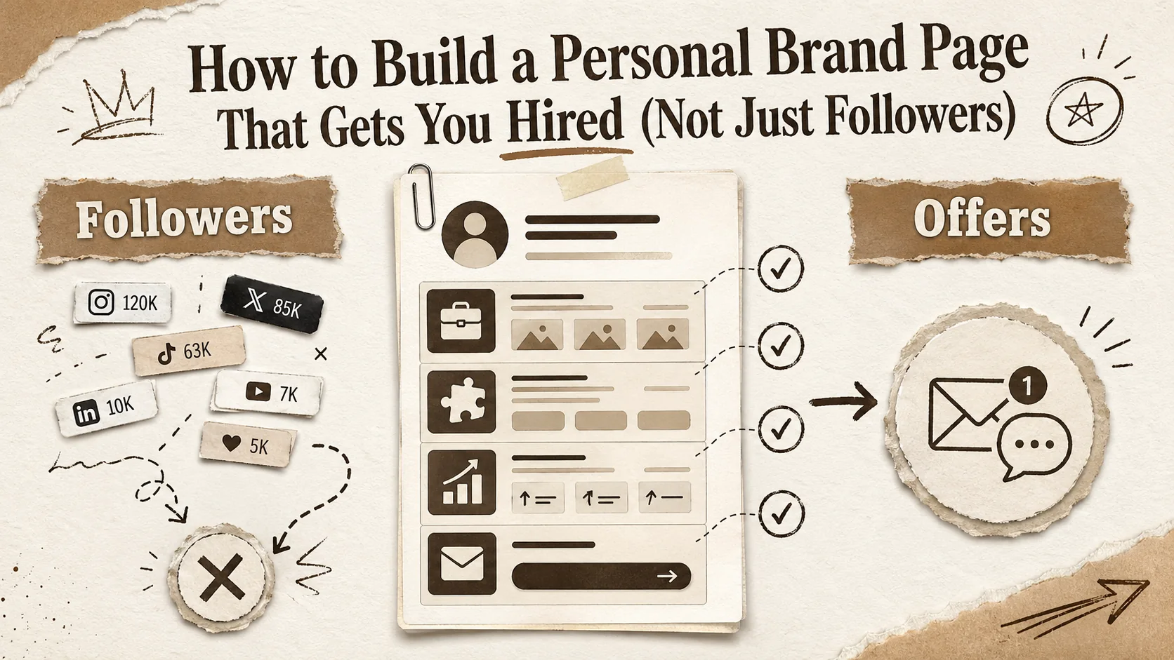
How to Build a Personal Brand Page That Gets You Hired (Not Just Followers)
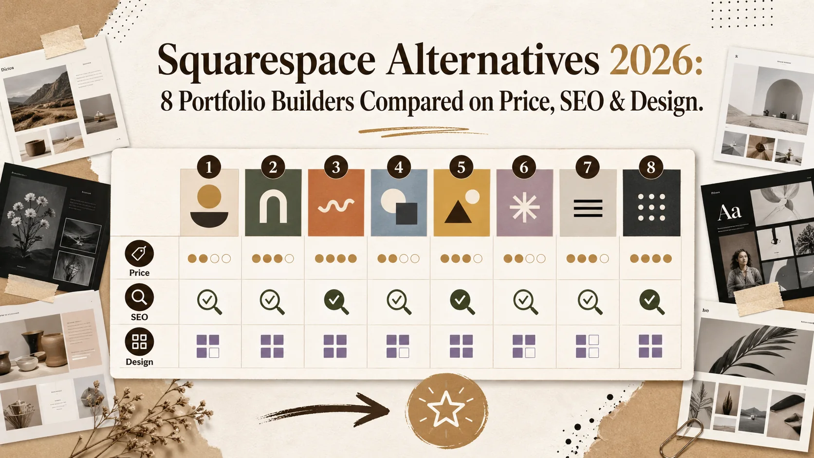
Squarespace Alternatives 2026: 8 Portfolio Builders Compared on Price, SEO & Design
Linktree vs Carrd 2026: Which Bio Link Builder Actually Converts?
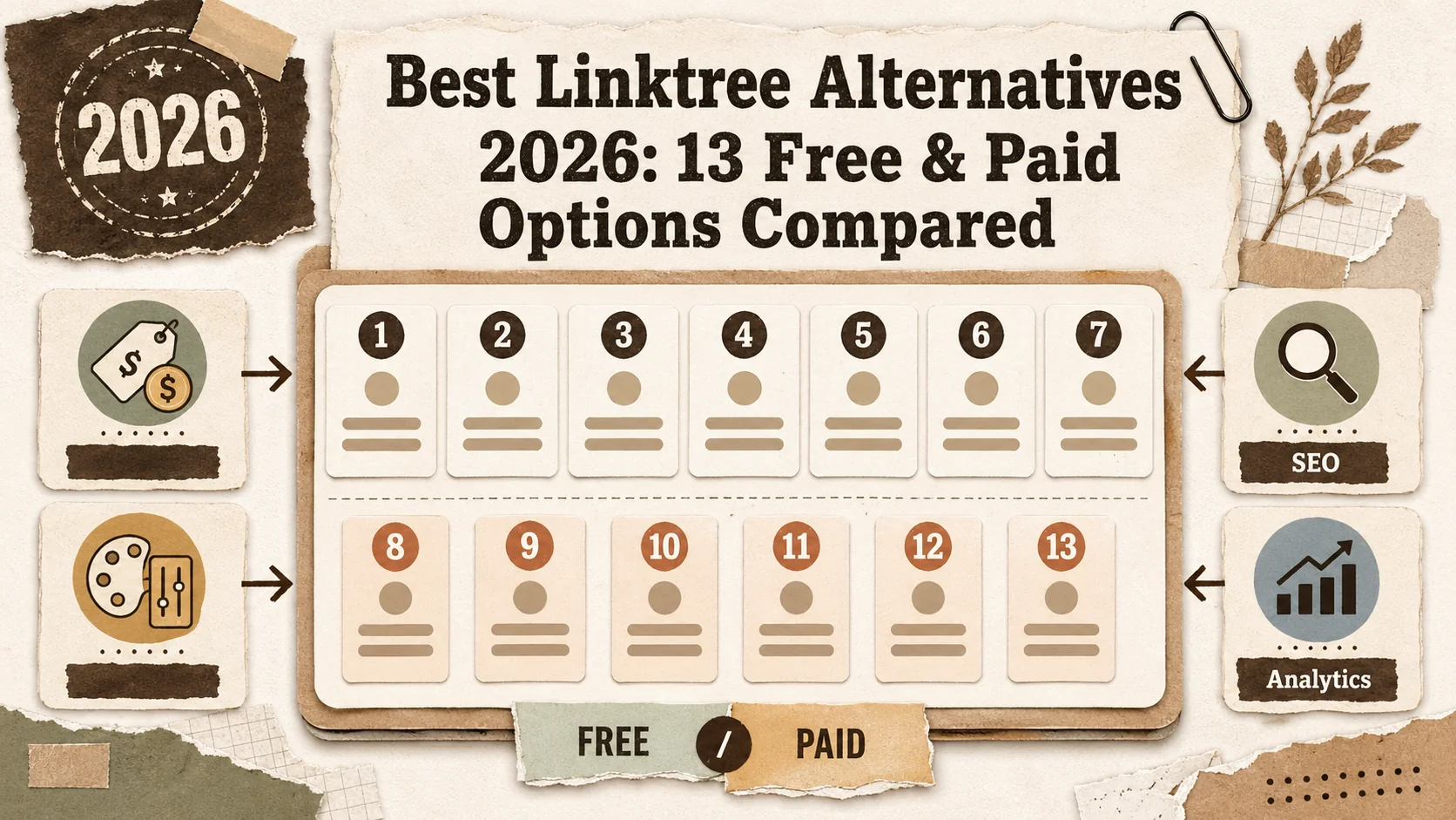
Best Linktree Alternatives 2026: 13 Included & Paid Options Compared
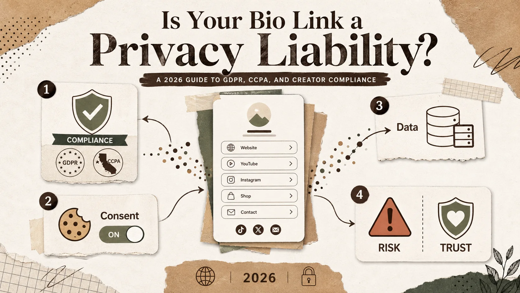
Is Your Bio Link a Privacy Liability? A 2026 Guide to GDPR, CCCPA, and Creator Compliance
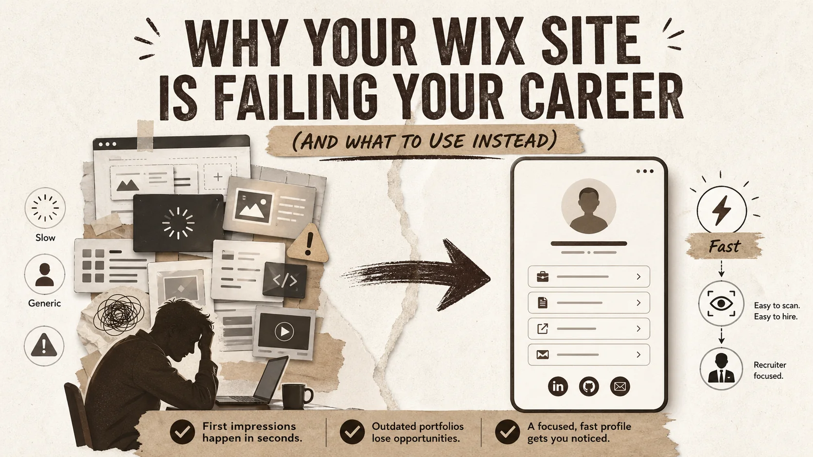
Why Your Wix Site Is Failing Your Career (And What to Use Instead)

Stop Using Your Portfolio as a Trophy Case. It's a Conversation Starter.
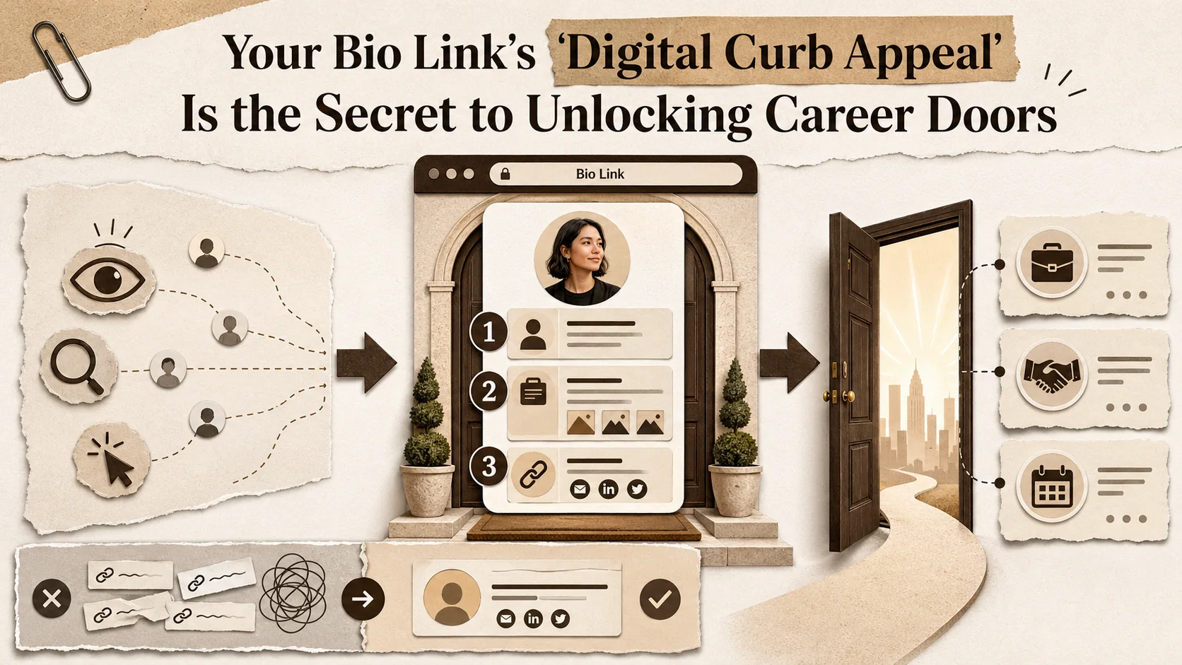
Your Bio Link's 'Digital Curb Appeal' Is the Secret to Unlocking Career Doors
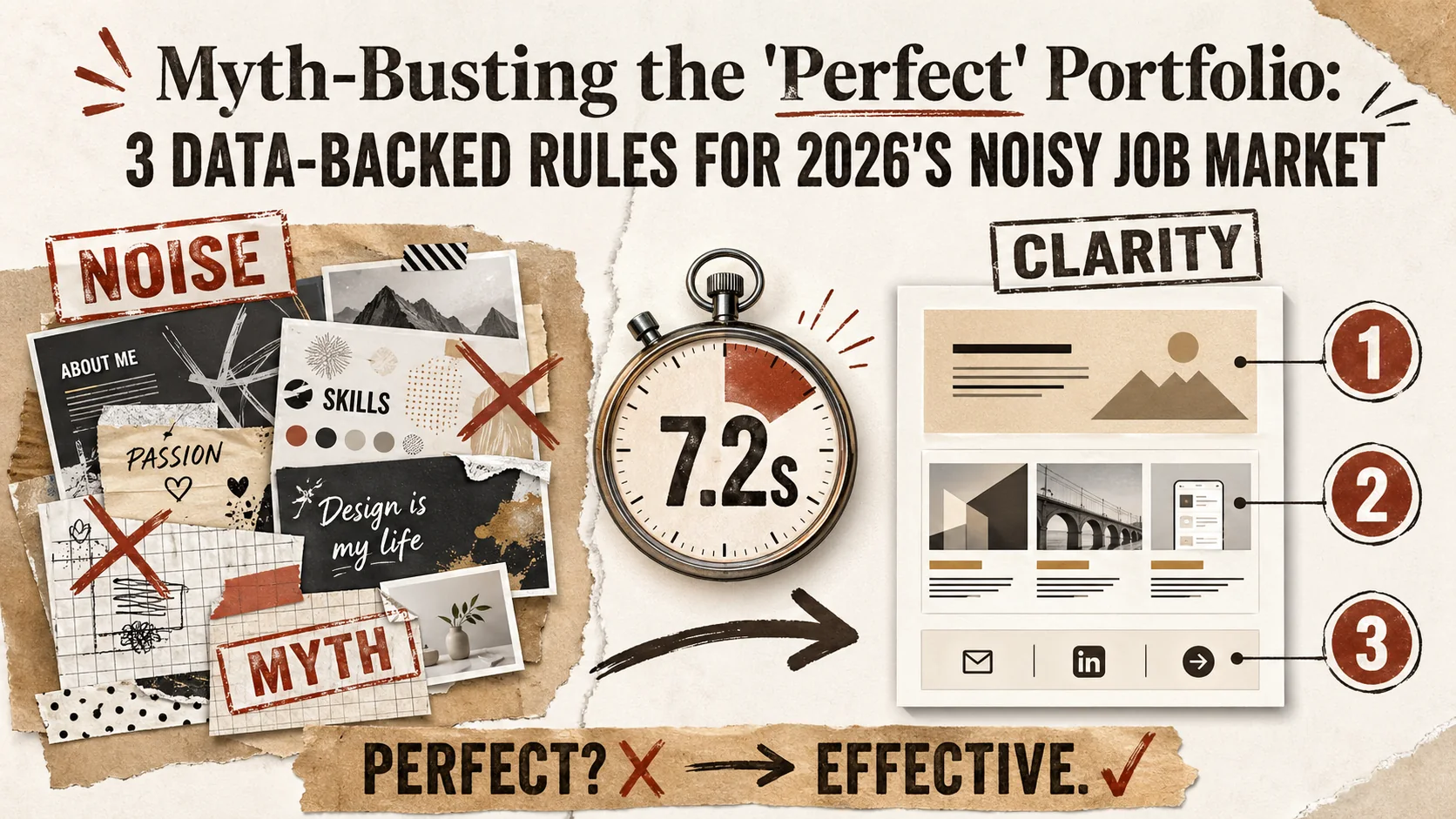
Myth-Busting the 'Perfect' Portfolio: 3 Data-Backed Rules for 2026's Noisy Job Market
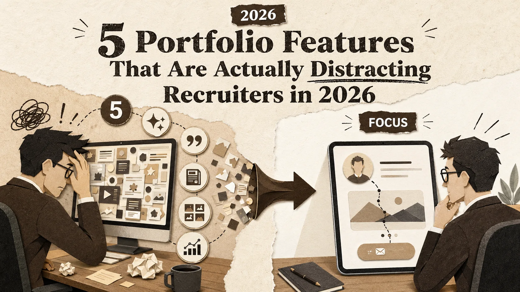
5 Portfolio Features That Are Actually Distracting Recruiters in 2026
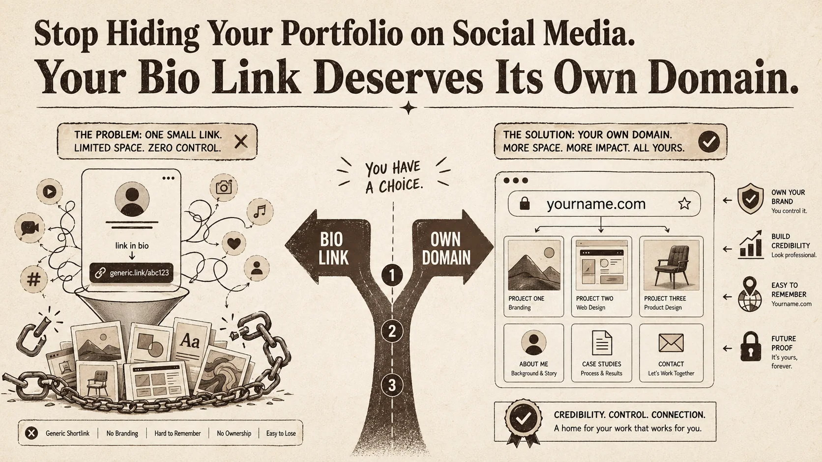
Stop Hiding Your Portfolio on Social Media. Your Bio Link Deserves Its Own Domain.
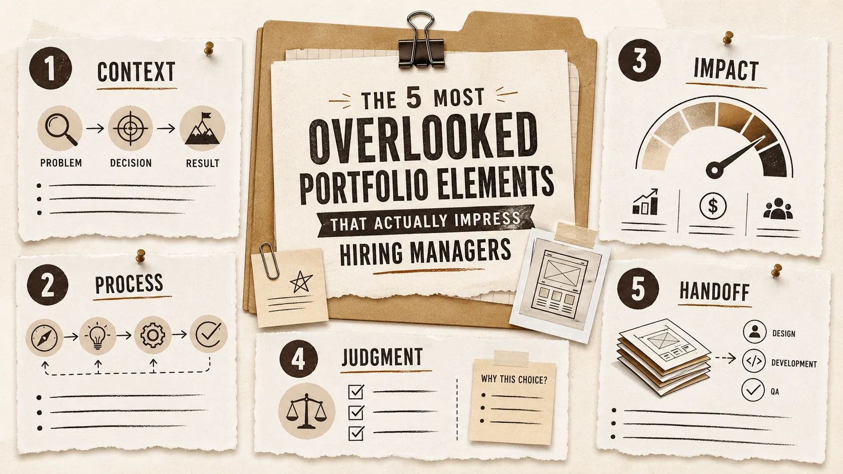
The 5 Most Overlooked Portfolio Elements That Actually Impress Hiring Managers
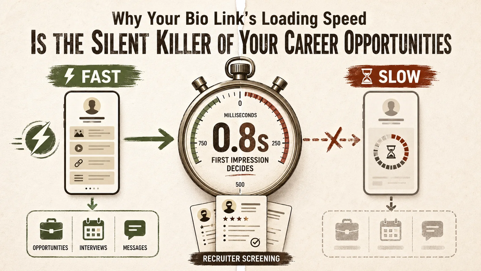
Why Your Bio Link's Loading Speed Is the Silent Killer of Your Career Opportunities
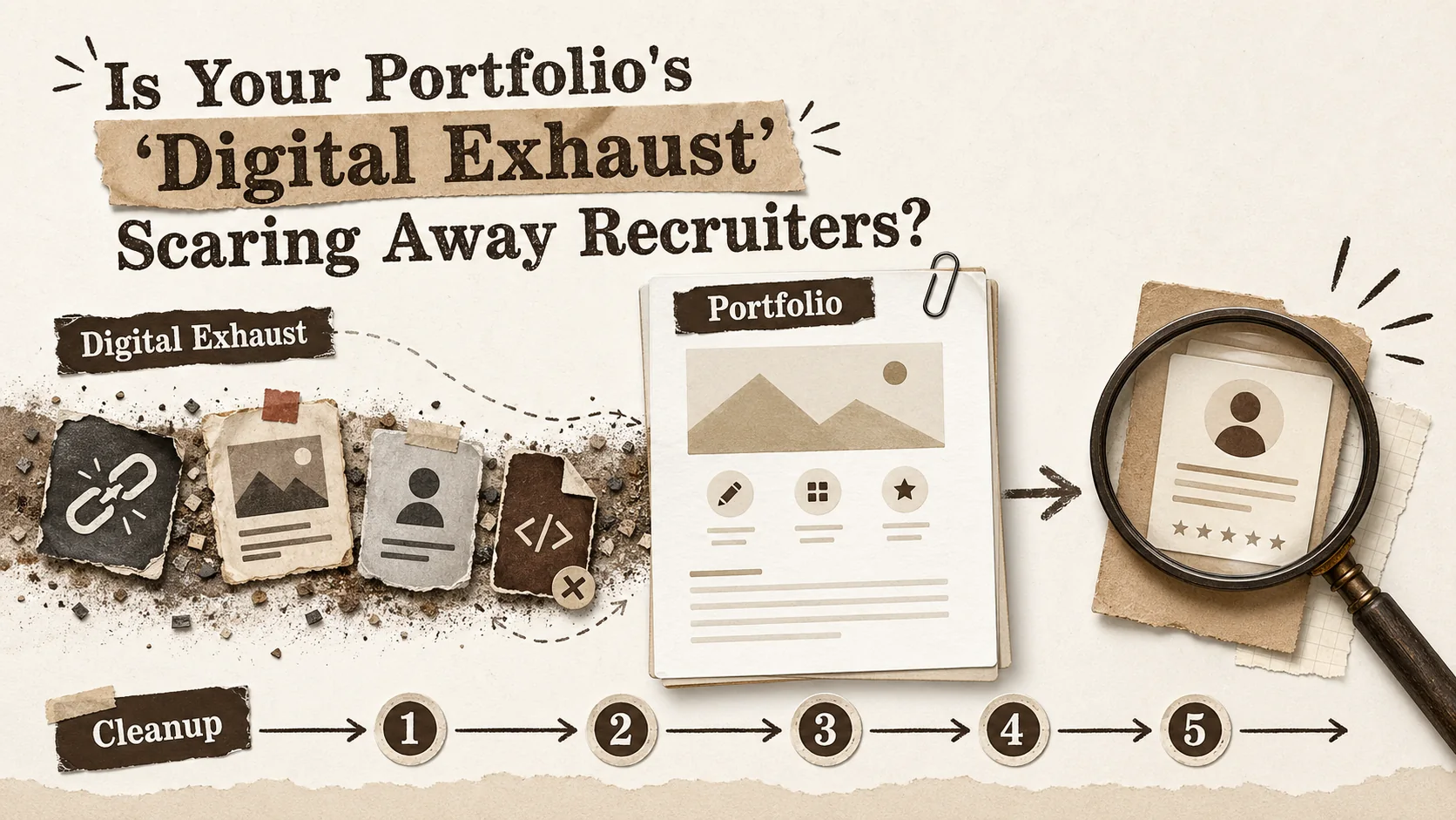
Is Your Portfolio's 'Digital Exhaust' Scaring Away Recruiters?
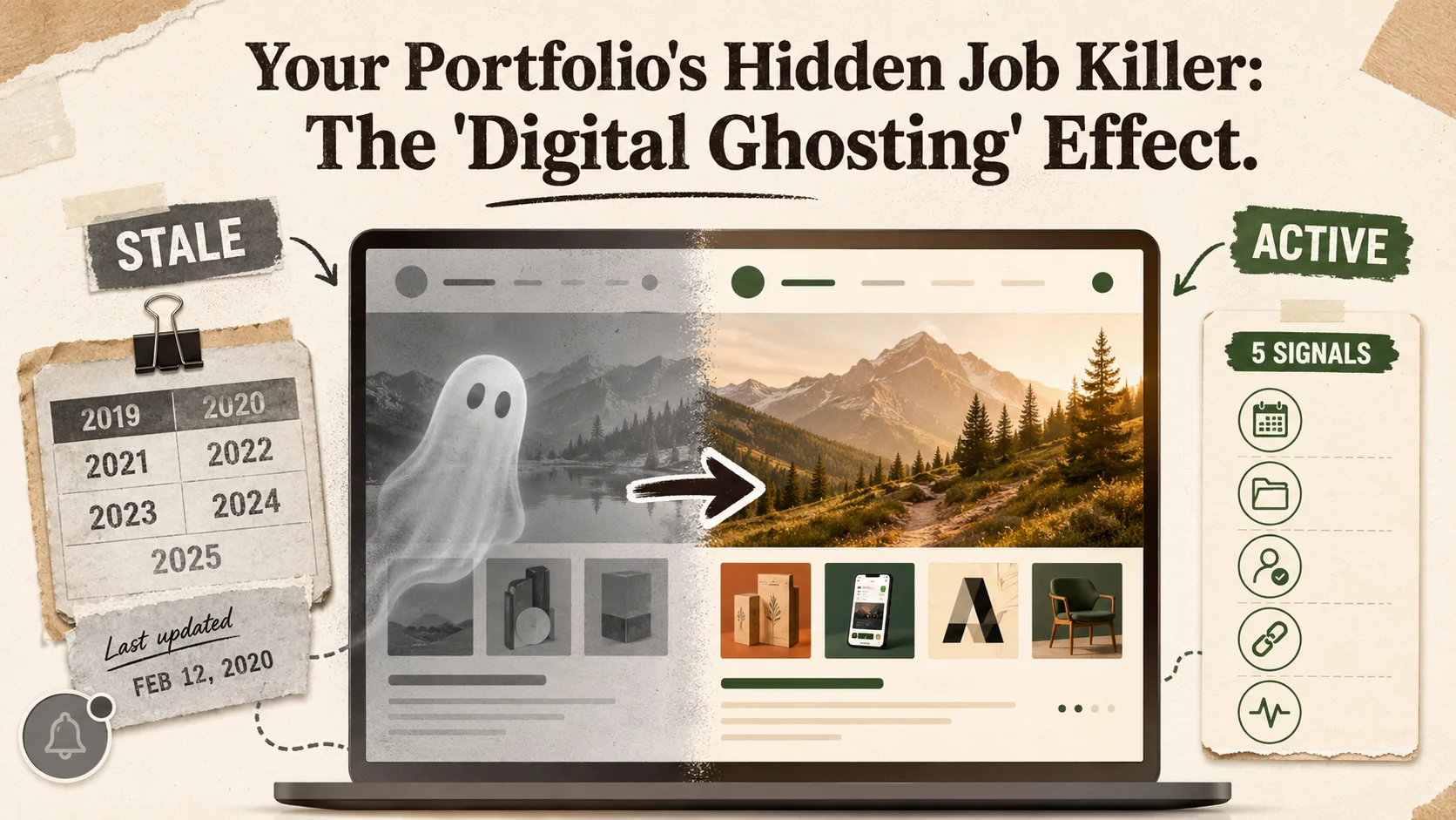
Your Portfolio's Hidden Job Killer: The 'Digital Ghosting' Effect
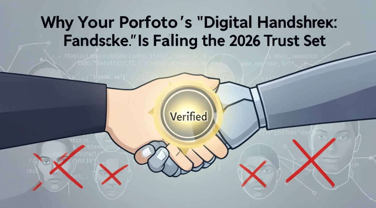
Why Your Portfolio's 'Digital Handshake' Is Failing the 2026 Trust Test
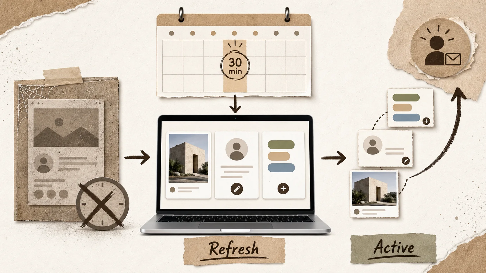
Stop Letting Your Portfolio Collect Dust: The 30-Minute Weekly Refresh That Actually Works
Stop Overthinking Your Portfolio. The 2026 Data Says Simplicity Wins.
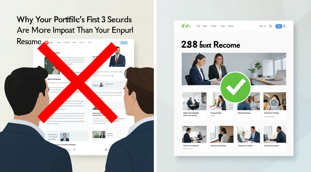
Why Your Portfolio's First 3 Seconds Are More Important Than Your Entire Resume
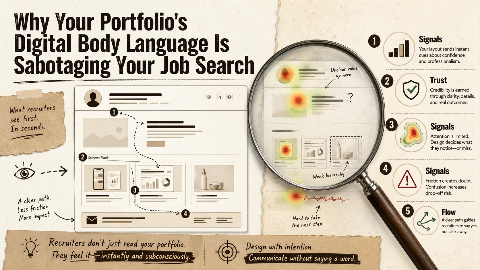
Why Your Portfolio's 'Digital Body Language' Is Sabotaging Your Job Search
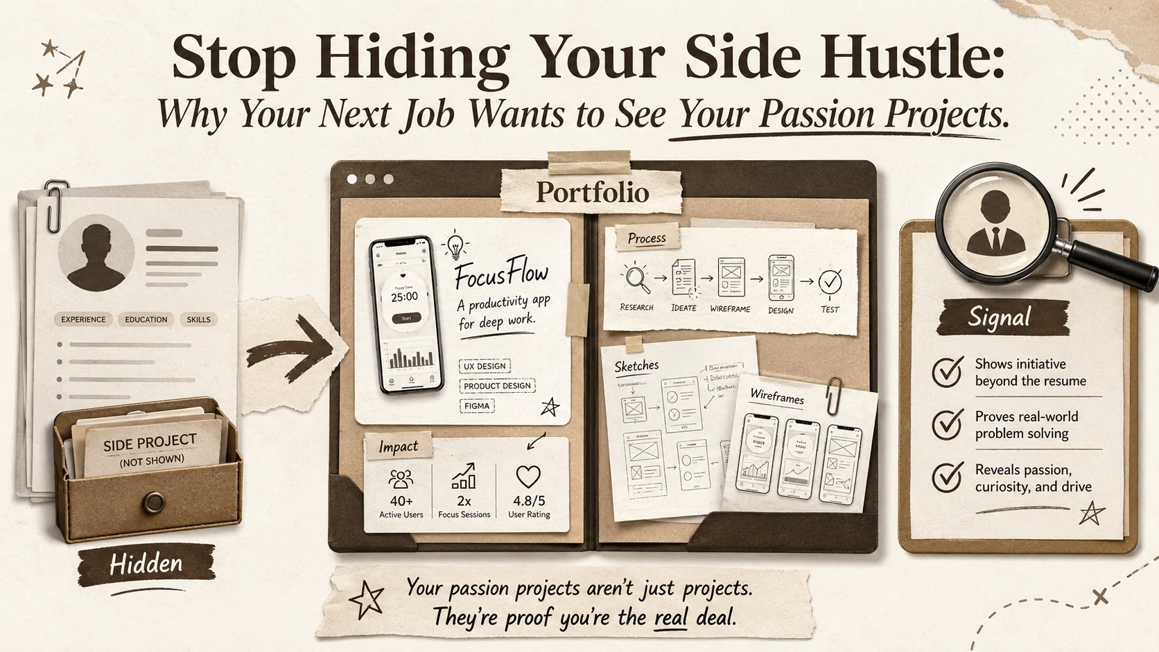
Stop Hiding Your Side Hustle: Why Your Next Job Wants to See Your Passion Projects
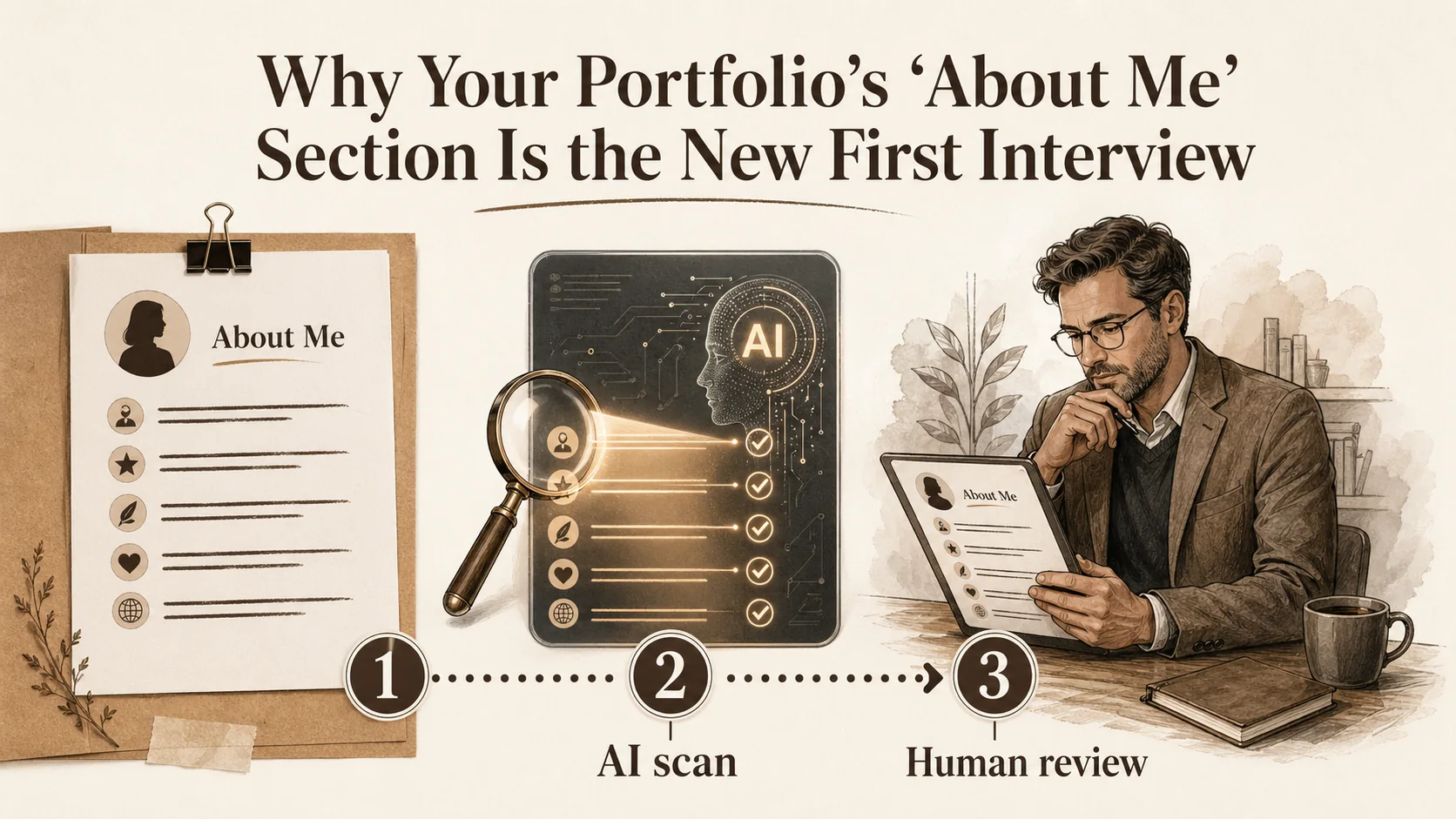
Why Your Portfolio's 'About Me' Section Is the New First Interview
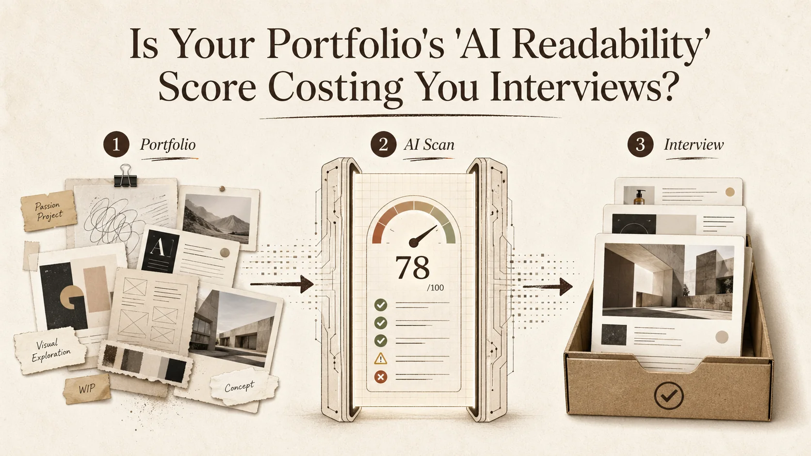
Is Your Portfolio's 'AI Readability' Score Costing You Interviews?
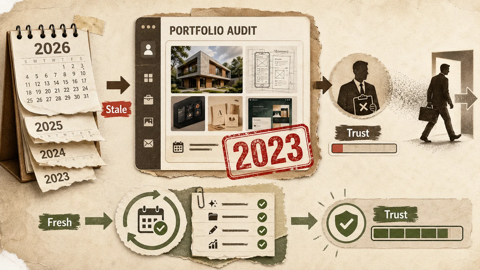
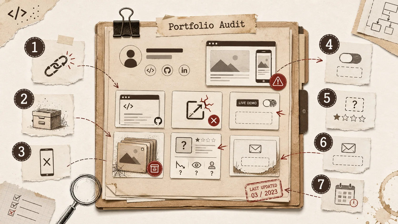
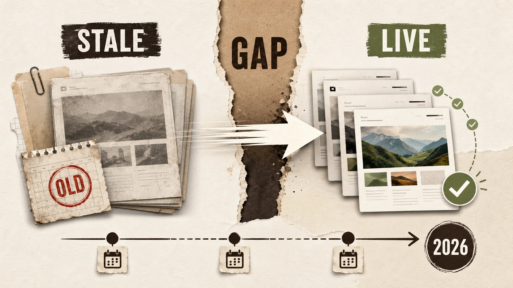
Is Your Portfolio's 'Last Updated' Date Costing You Job Offers?
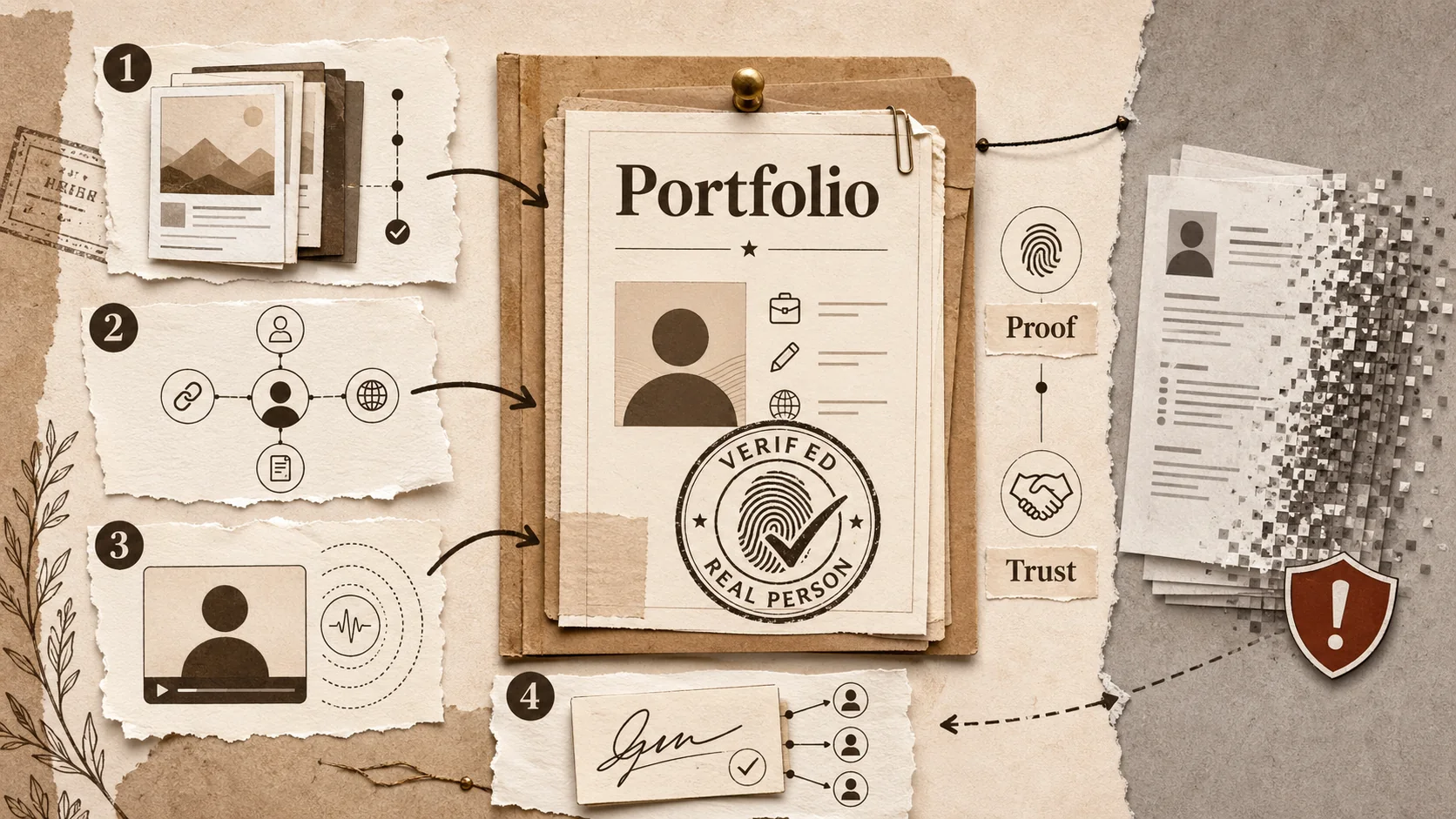
The 2026 Portfolio 'Proof of Person' Test: How to Verify Your Digital Identity in an AI-Saturated Market
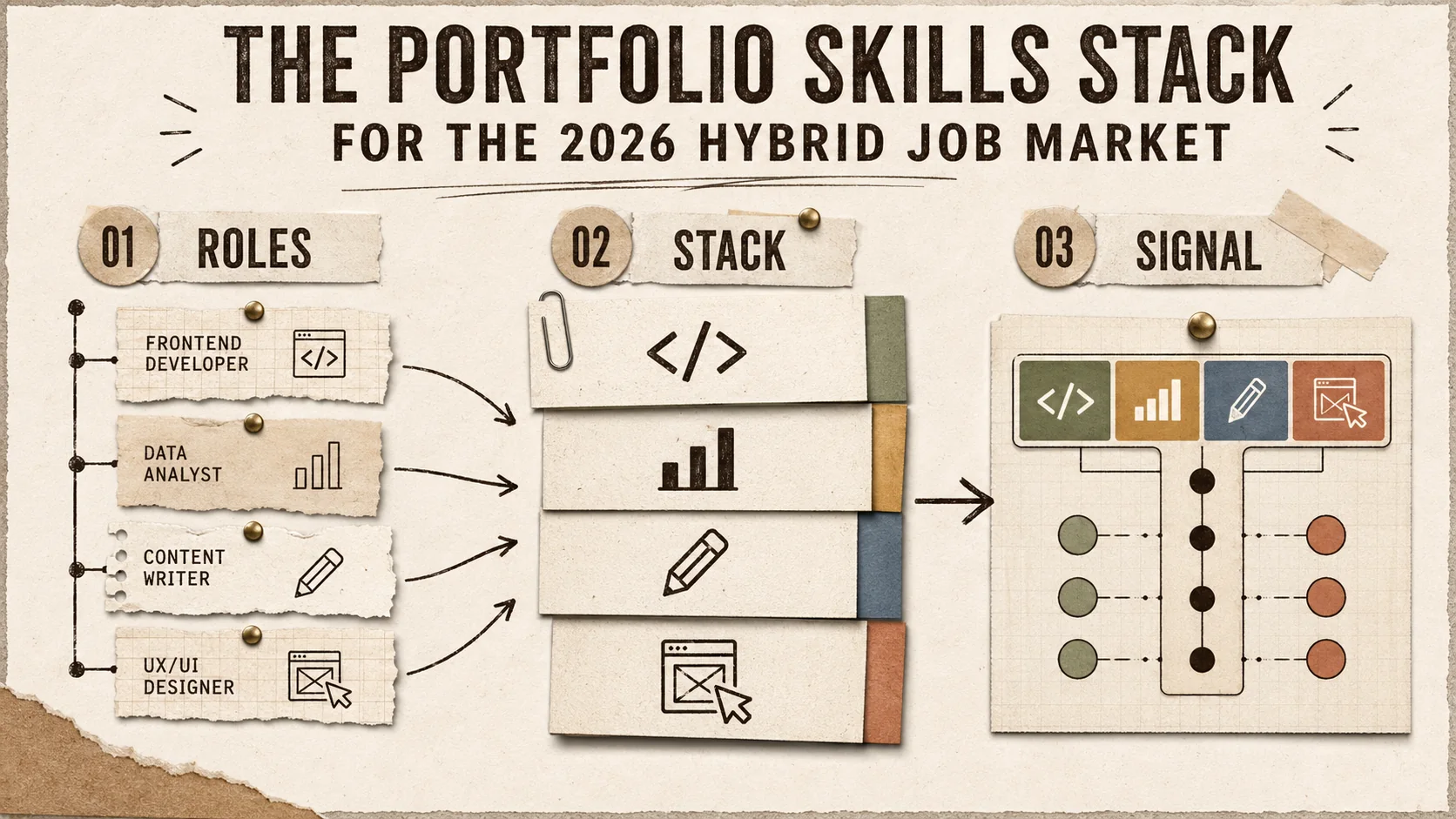
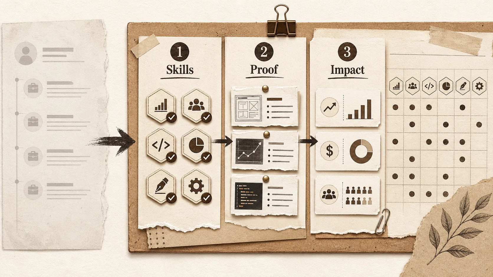
The Portfolio Skills Stack for the 2026 Hybrid Job Market
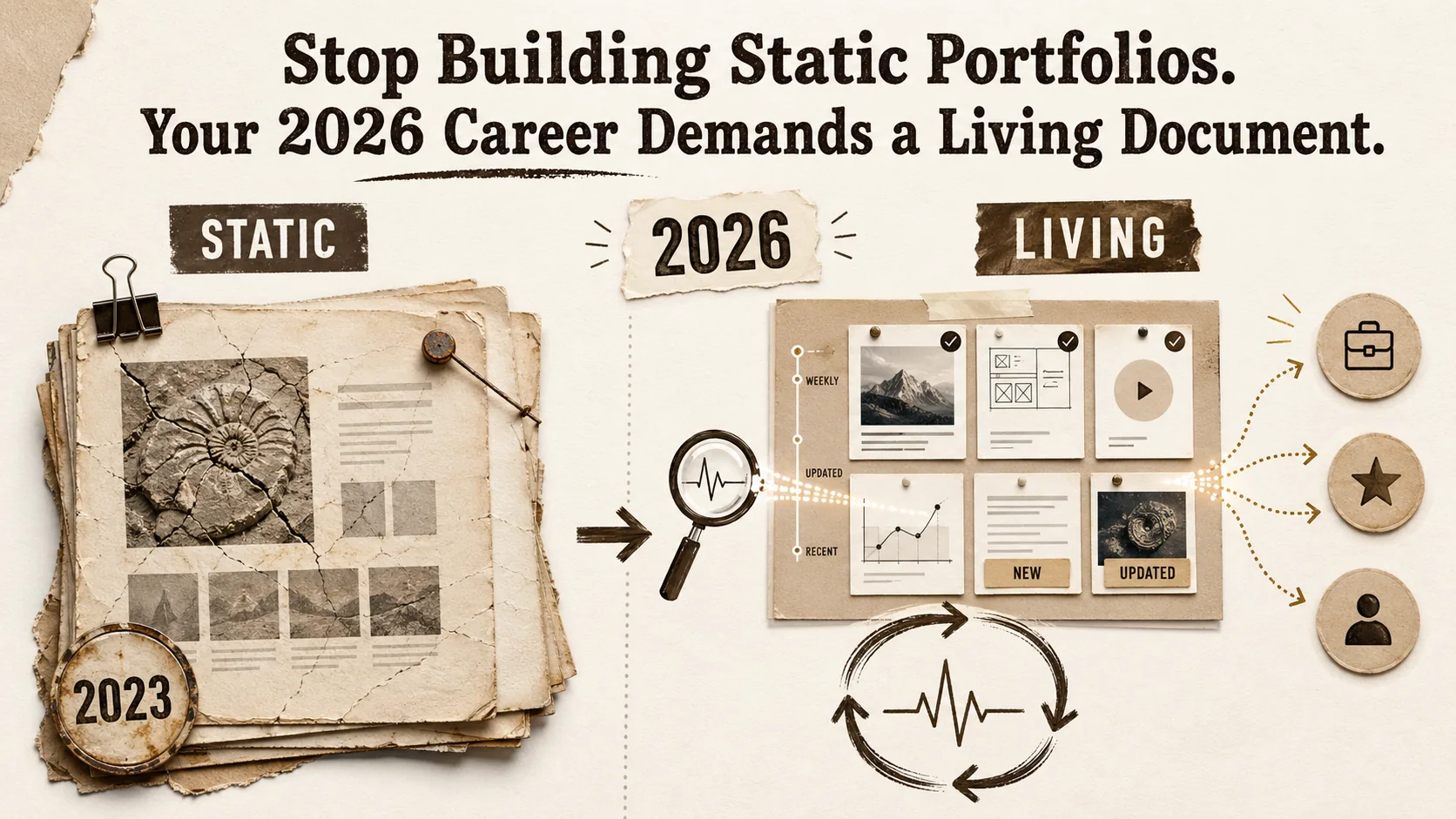
Stop Building Static Portfolios. Your 2026 Career Demands a Living Document.
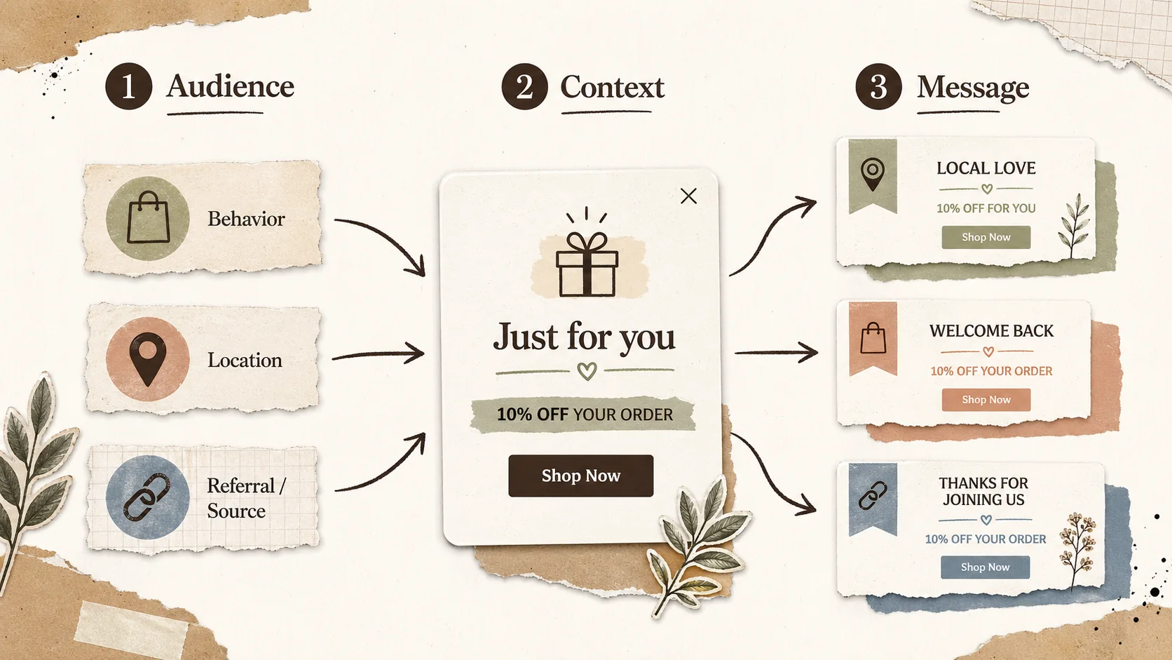
Popup Personalization Guide: How to Tailor Messages for Your Audience
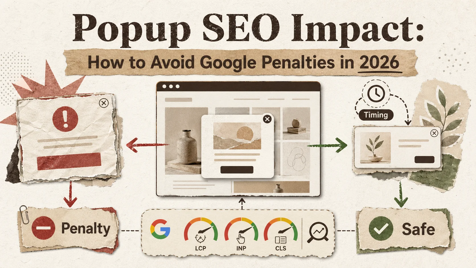
Popup SEO Impact: How to Avoid Google Penalties in 2026
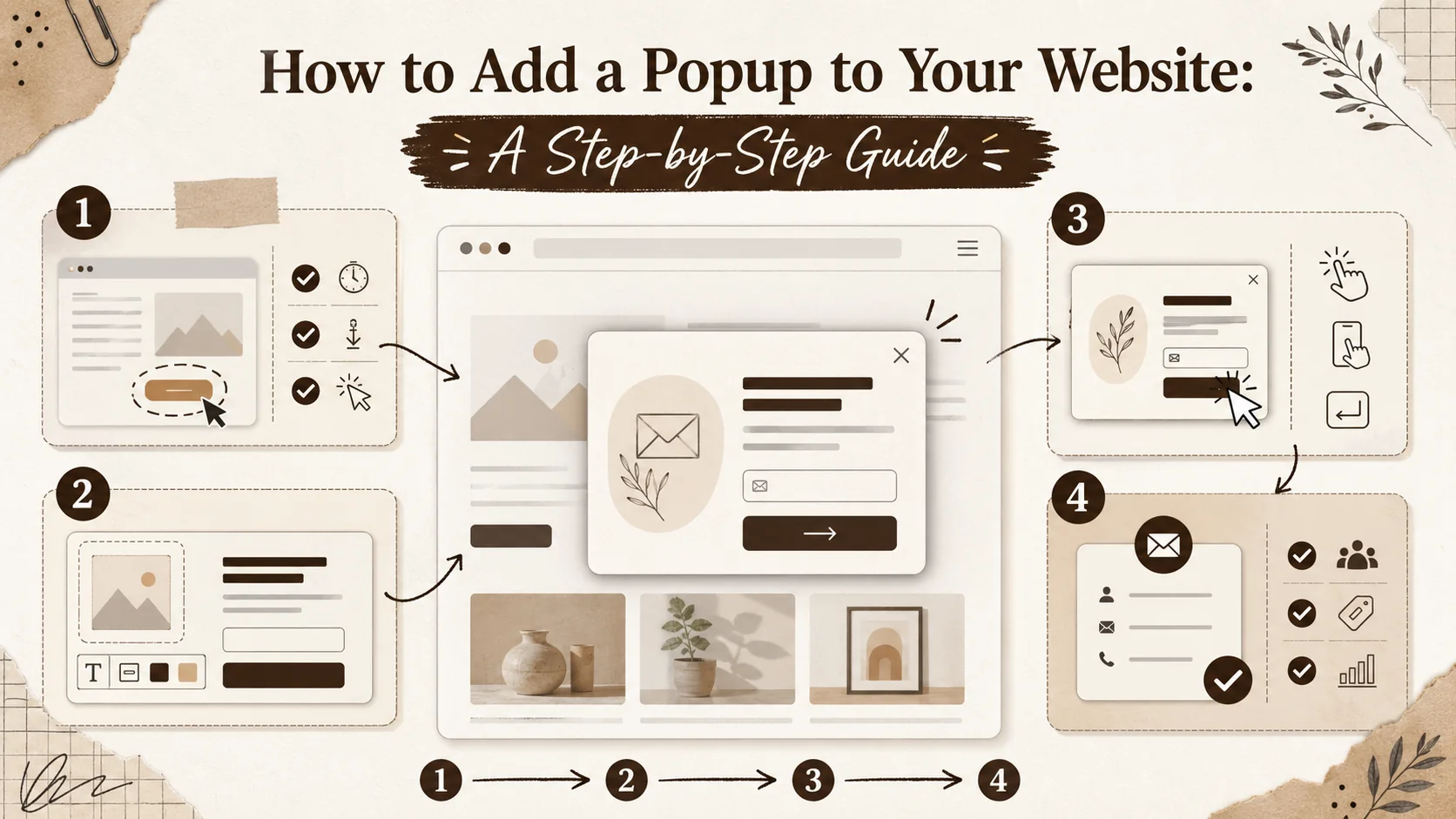
How to Add a Popup to Your Website: A Step-by-Step Guide
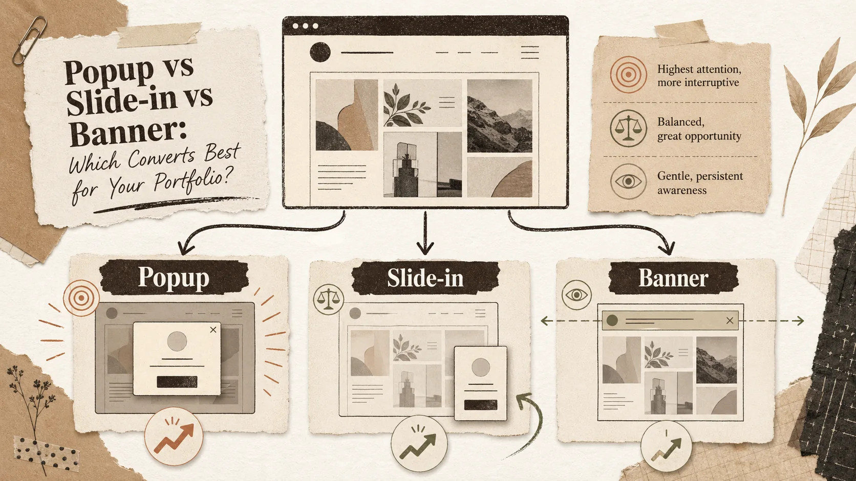
Popup vs Slide-in vs Banner: Which Converts Best for Your Portfolio?
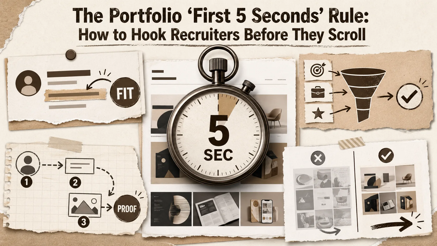
The Portfolio 'First 5 Seconds' Rule: How to Hook Recruiters Before They Scroll
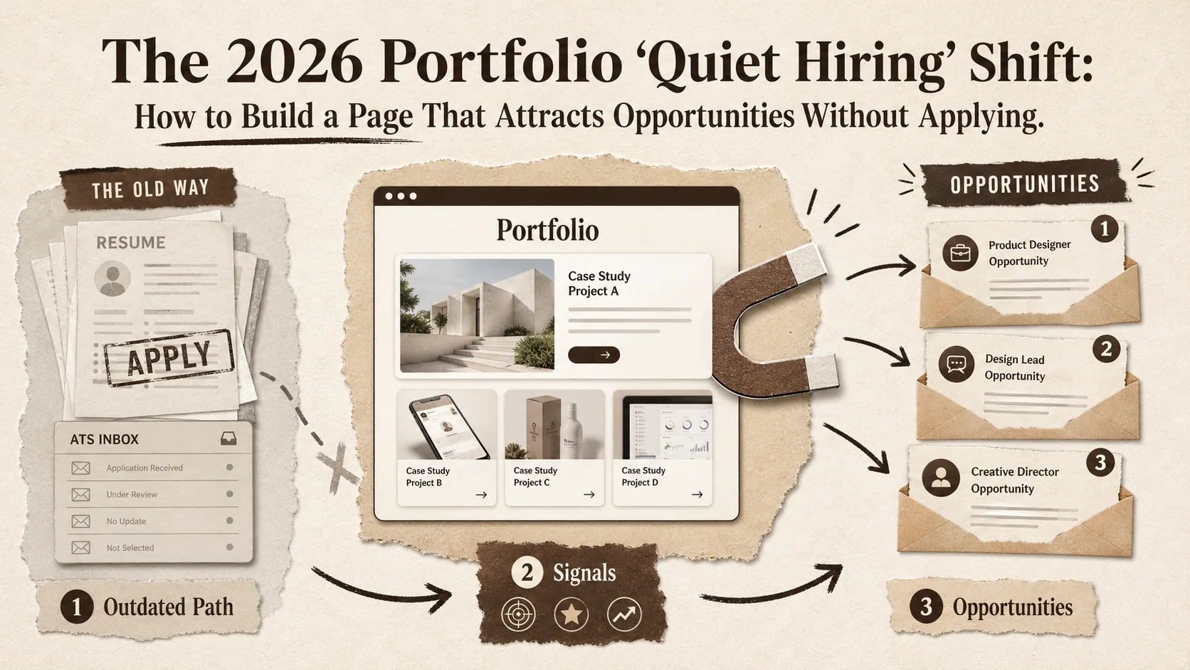
The 2026 Portfolio 'Quiet Hiring' Shift: How to Build a Page That Attracts Opportunities Without Applying
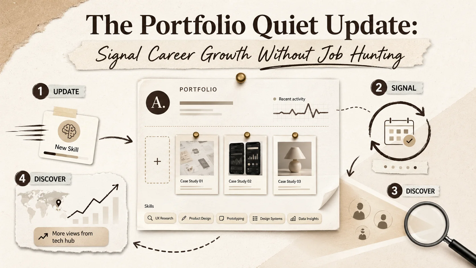
The Portfolio ''Quiet Update'': Signal Career Growth Without Job Hunting
The Portfolio 'Second Screen' Strategy: How to Capture Attention After the First Click
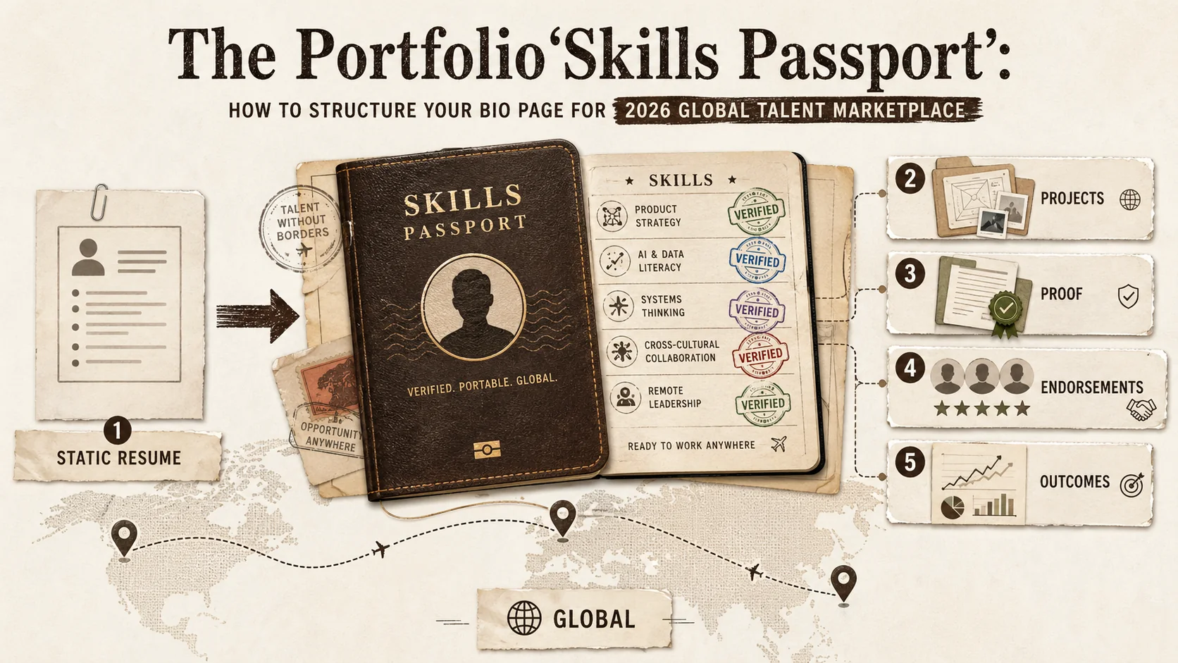
The Portfolio 'Skills Passport': How to Structure Your Bio Page for the 2026 Global Talent Marketplace
The 2026 Portfolio 'First Impression' Gap: Why Your Bio Page Is Failing Before You Even Click 'Apply'
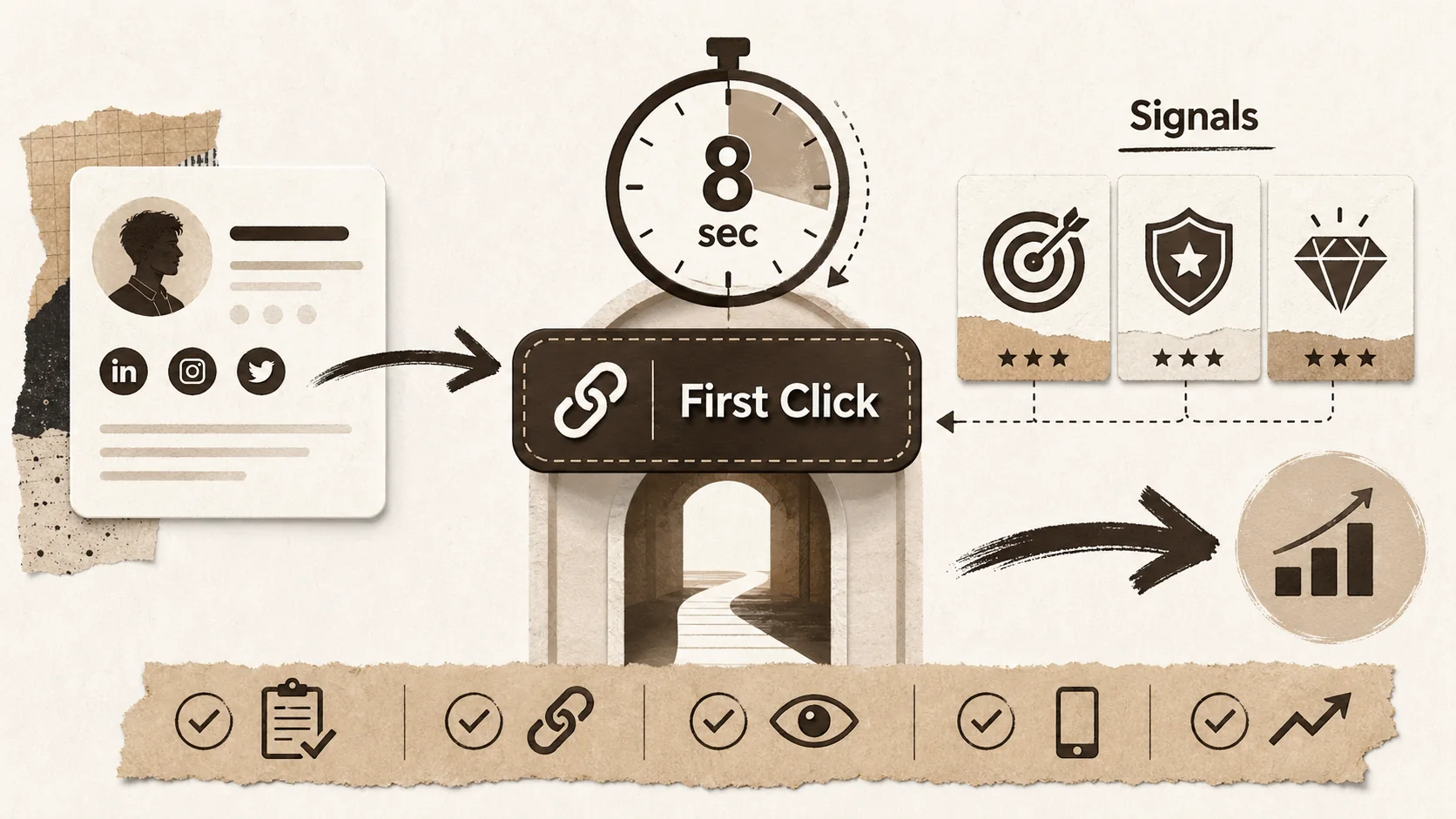
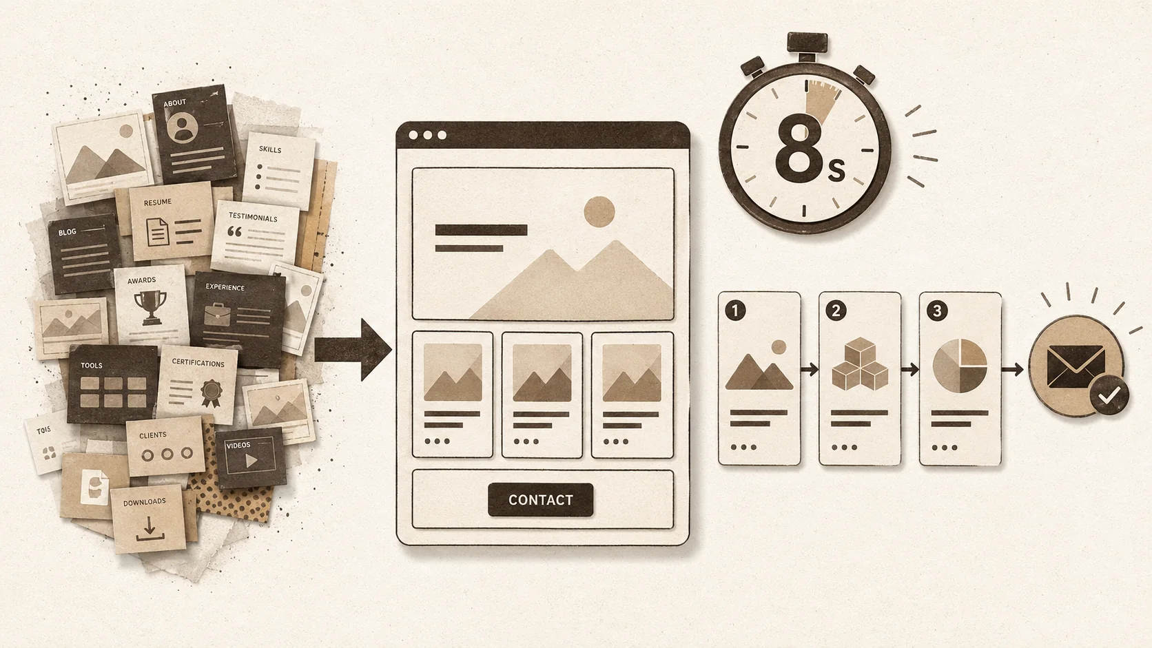
The 2026 Portfolio 'First Click' Test: How to Optimize Your Bio Link for the 8-Second Recruiter Scan
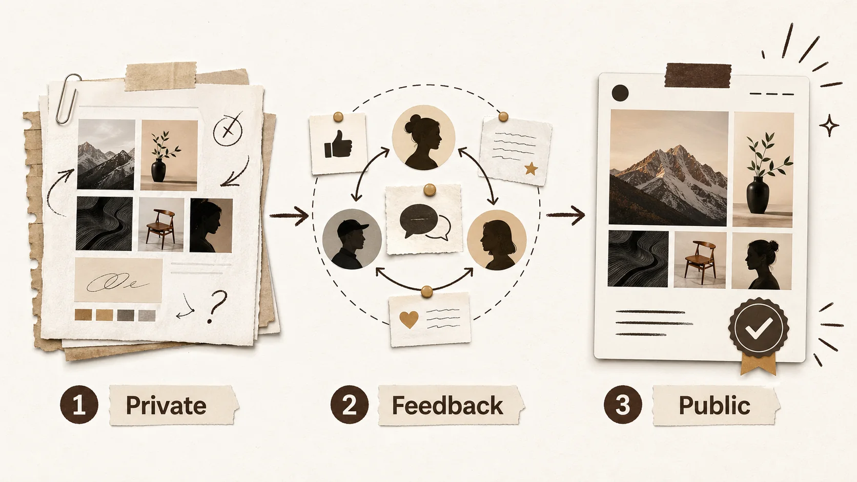
The Portfolio 'Soft Launch': Why Creators Are Testing Their Online Presence Before Going Public

The Portfolio Accessibility Audit: Is Your Online Presence Excluding Potential Employers?
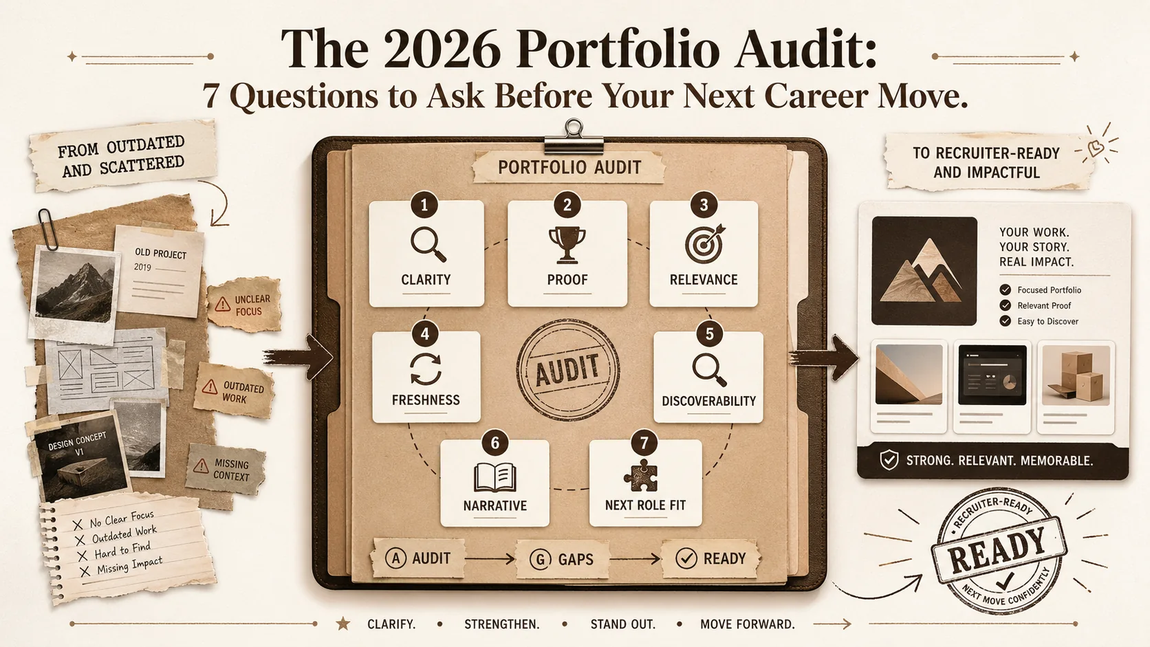
The 2026 Portfolio Audit: 7 Questions to Ask Before Your Next Career Move
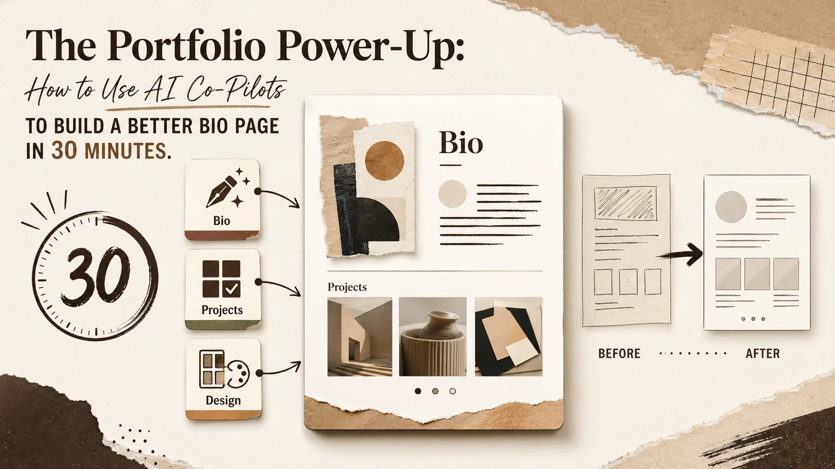
The Portfolio Power-Up: How to Use AI Co-Pilots to Build a Better Bio Page in 30 Minutes

The 2026 Portfolio 'Cold Start' Problem: How to Build an Online Presence When You Have No Work to Show
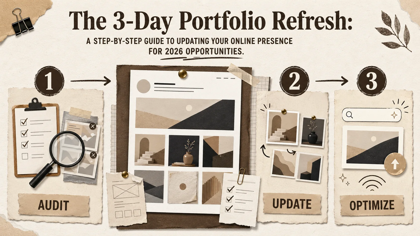
The 3-Day Portfolio Refresh: A Step-by-Step Guide to Updating Your Online Presence for 2026 Opportunities
The Portfolio 'Proof of Life' Check: Is Your Online Presence Signaling You're Open to Work?
Is Your Portfolio Ready for the 2026 'Skills Economy'? A Practical Framework
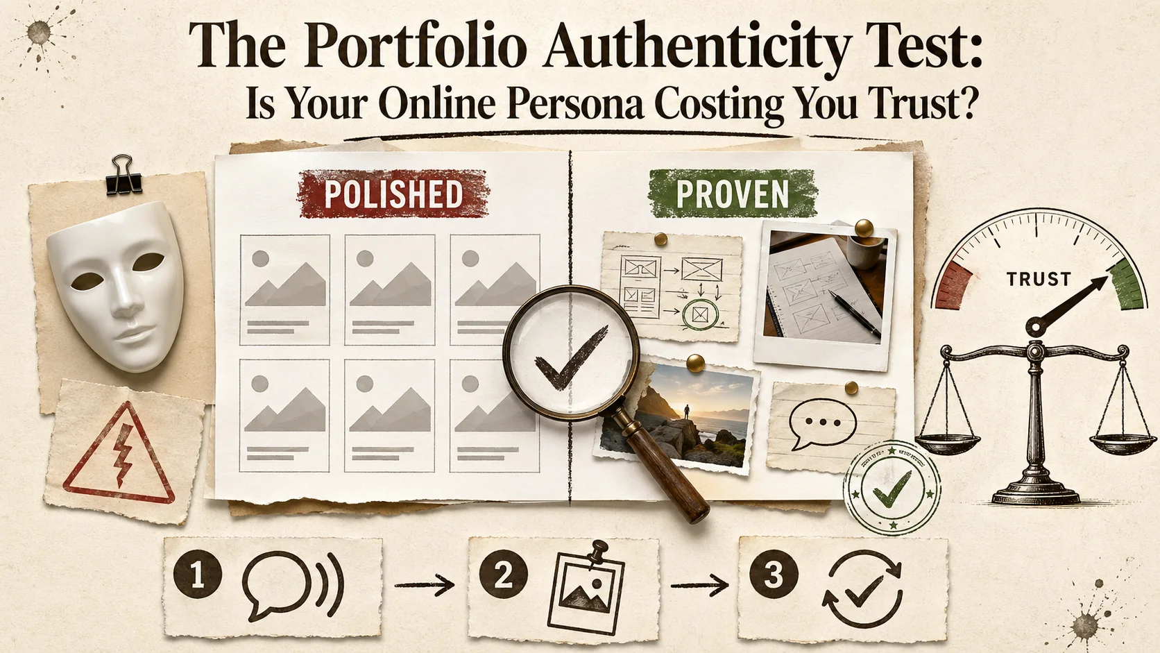
The Portfolio Authenticity Test: Is Your Online Persona Costing You Trust?
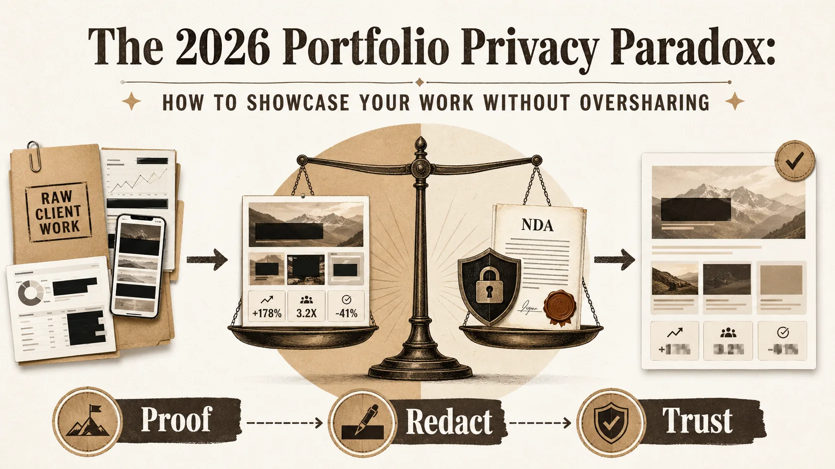
The 2026 Portfolio Privacy Paradox: How to Showcase Your Work Without Oversharing
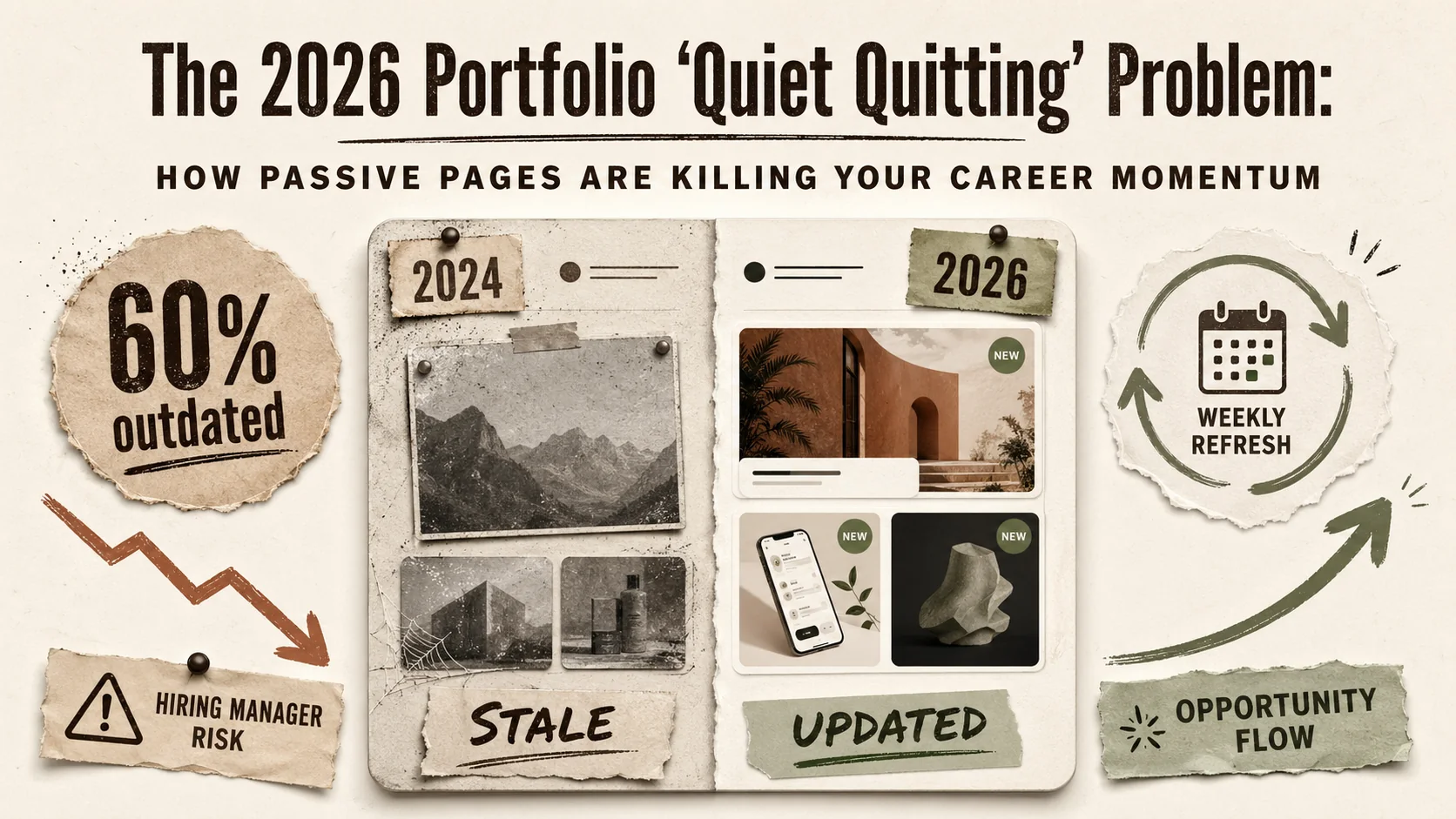
The 2026 Portfolio 'Quiet Quitting' Problem: How Passive Pages Are Killing Your Career Momentum
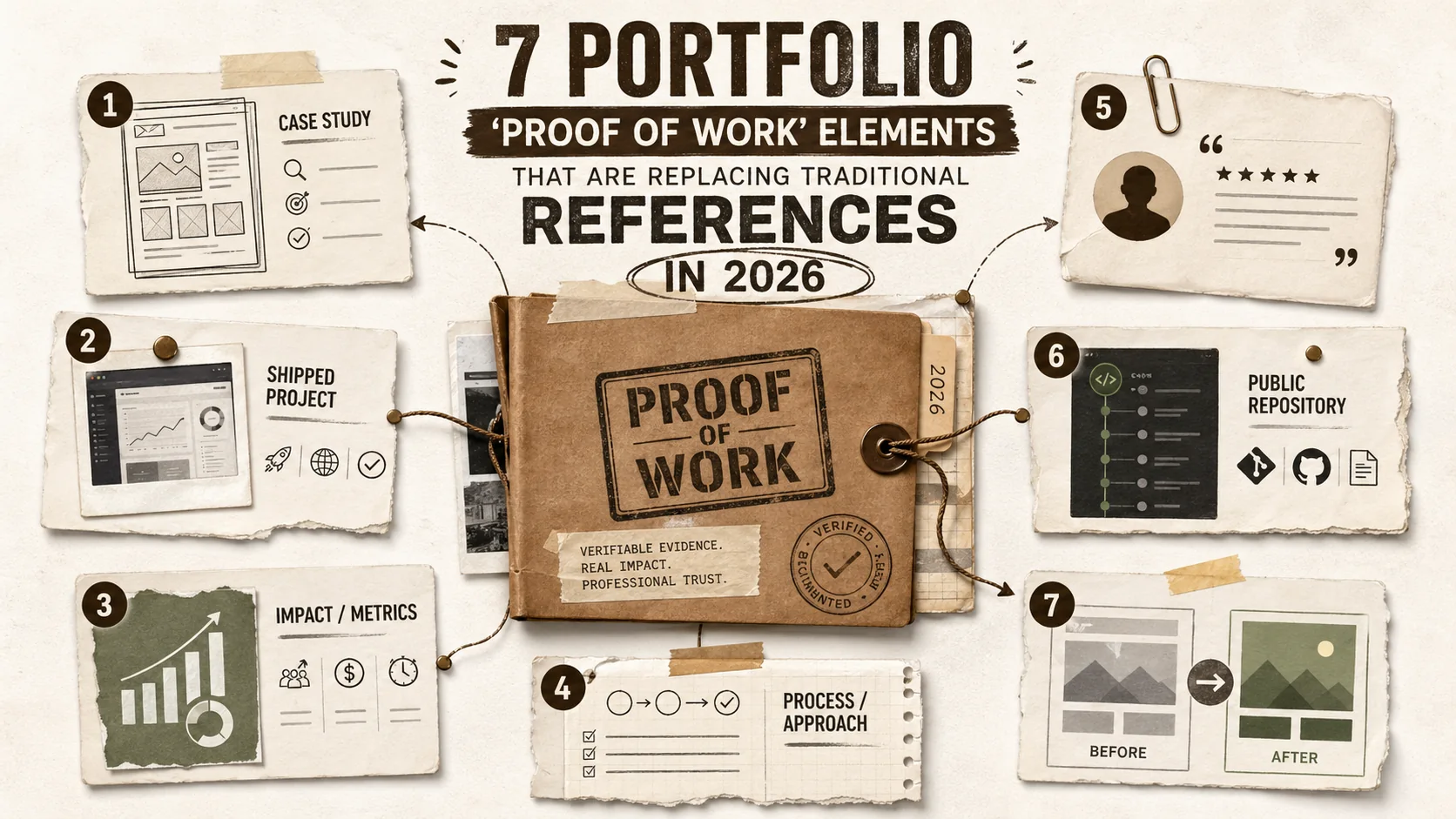
7 Portfolio 'Proof of Work' Elements That Are Replacing Traditional References in 2026
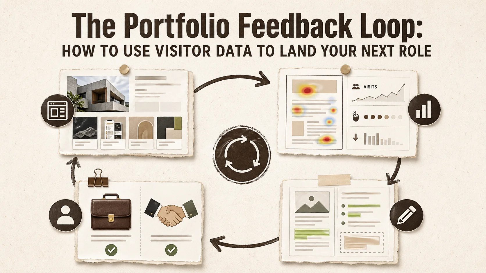
The Portfolio Feedback Loop: How to Use Visitor Data to Land Your Next Role
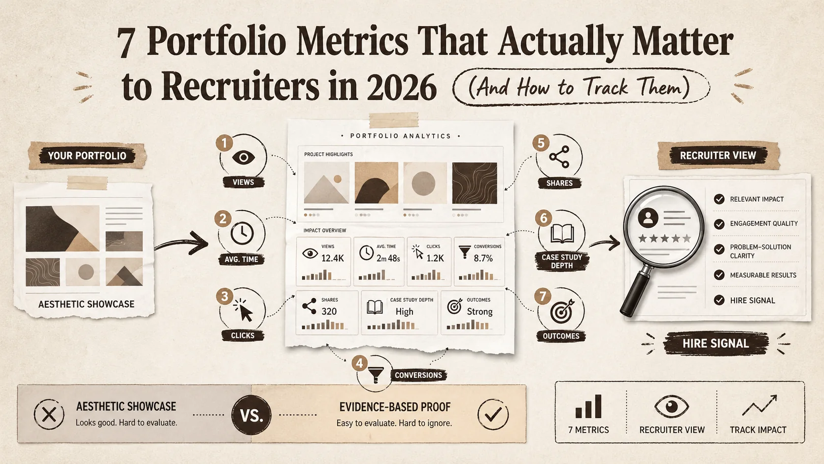
7 Portfolio Metrics That Actually Matter to Recruiters in 2026 (And How to Track Them)
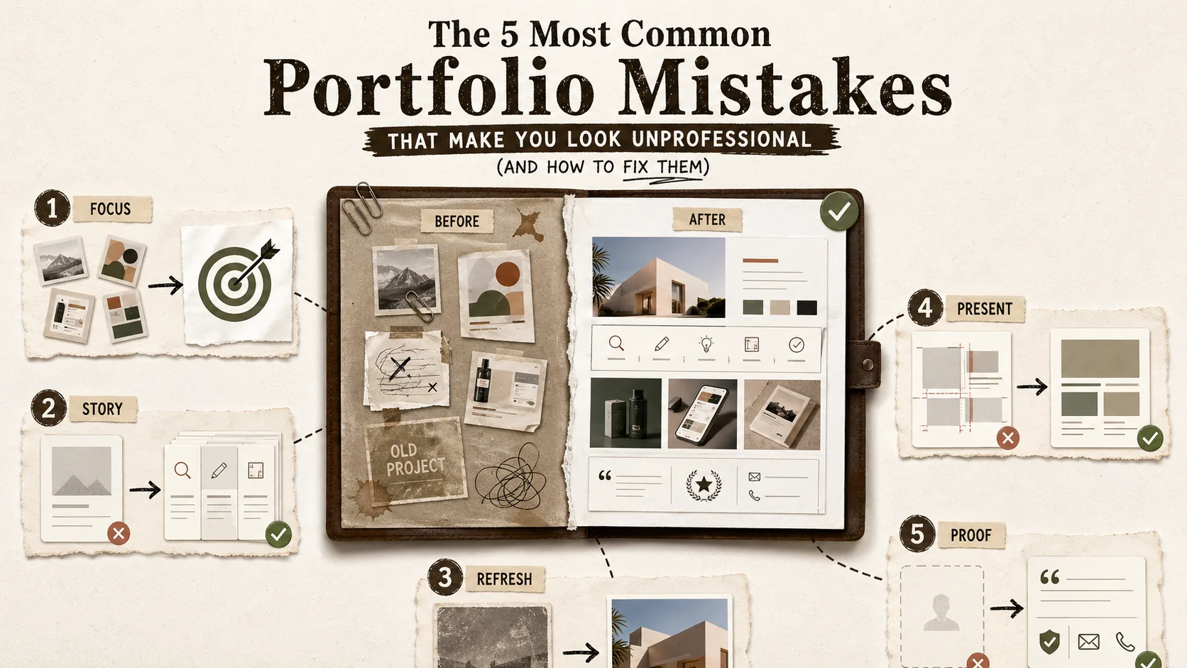
The 5 Most Common Portfolio Mistakes That Make You Look Unprofessional (And How to Fix Them)
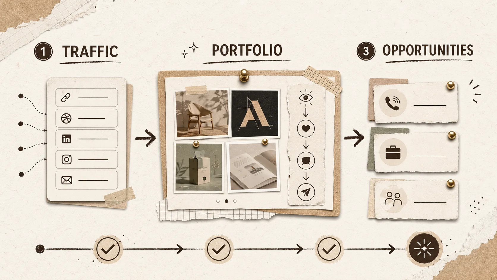
Build a Portfolio That Converts in 2026
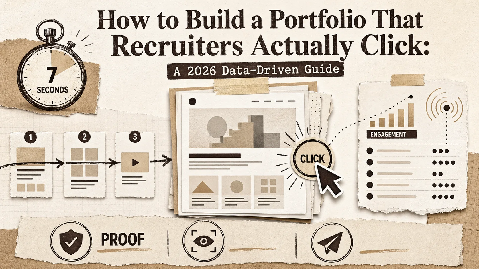
How to Build a Portfolio That Recruiters Actually Click: A 2026 Data-Driven Guide
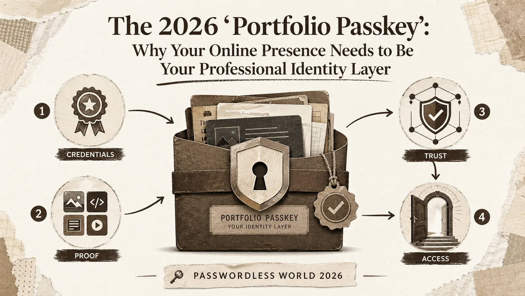
The 2026 'Portfolio Passkey': Why Your Online Presence Needs to Be Your Professional Identity Layer

The 2026 'Portfolio Pulse': Why Your Online Presence Needs a Weekly Check-Up to Stay Competitive
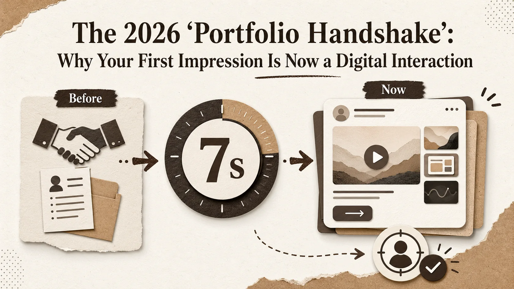
The 2026 'Portfolio Handshake': Why Your First Impression Is Now a Digital Interaction

The 2026 'Portfolio Pulse': Why Your Static Links Are Failing the Engagement Test
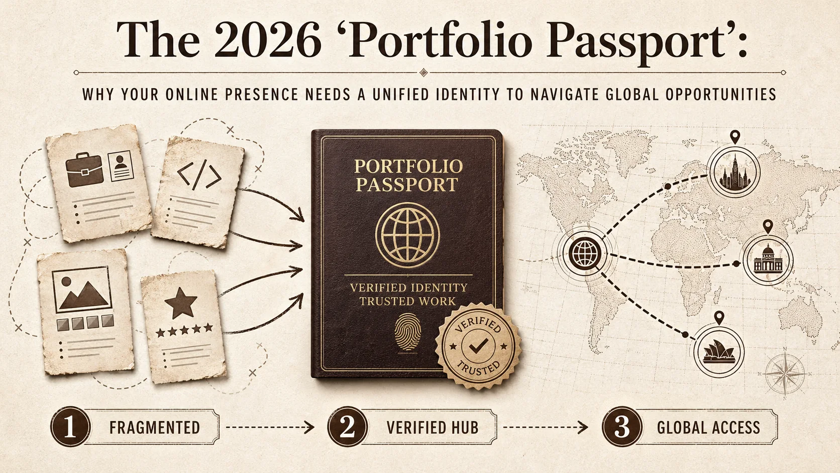
The 2026 'Portfolio Passport': Why Your Online Presence Needs a Unified Identity to Navigate Global Opportunities
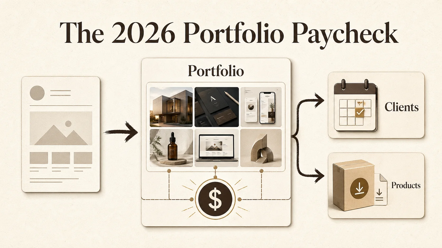
The 2026 Portfolio Paycheck
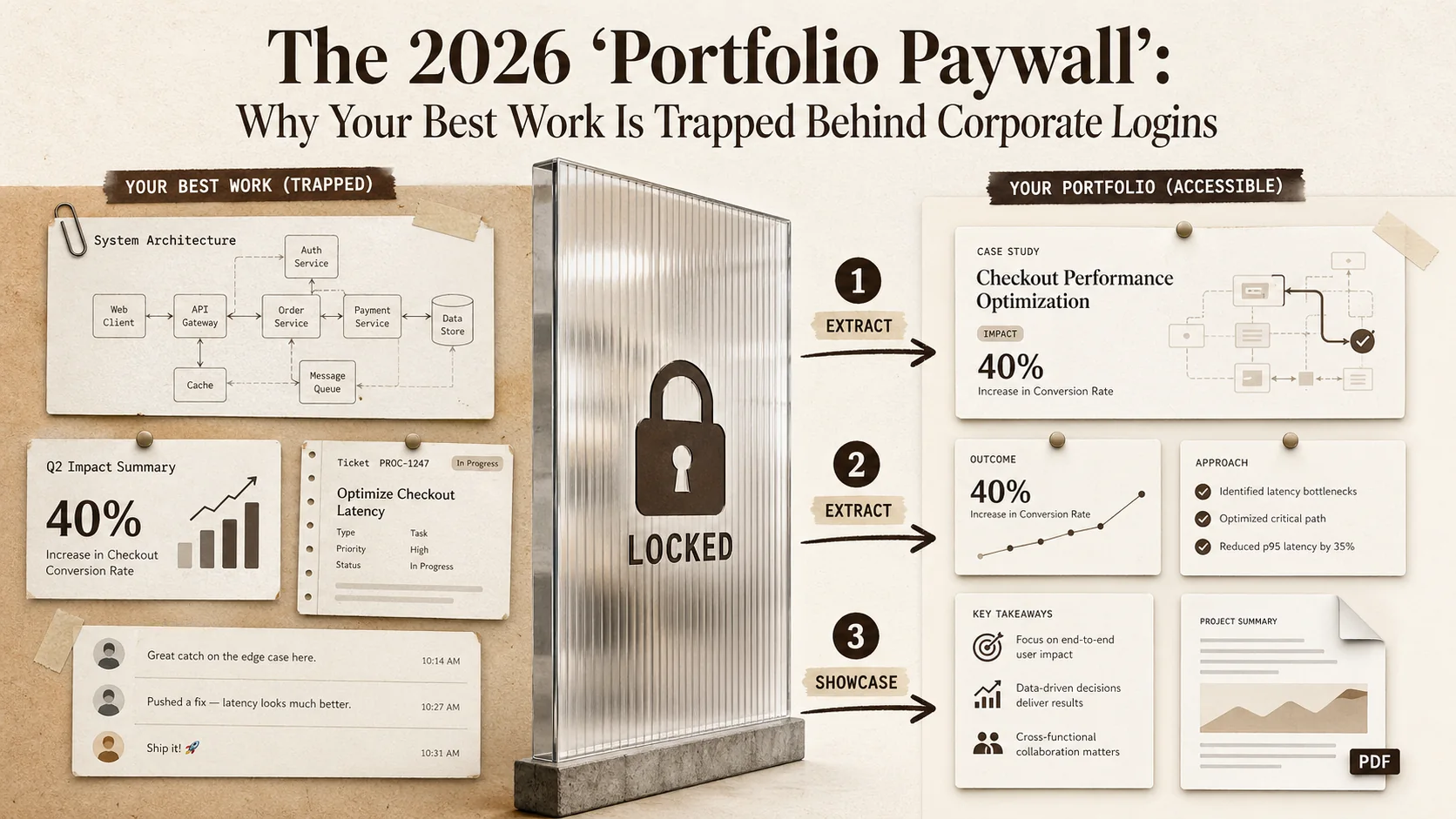
The 2026 'Portfolio Paywall': Why Your Best Work Is Trapped Behind Corporate Logins
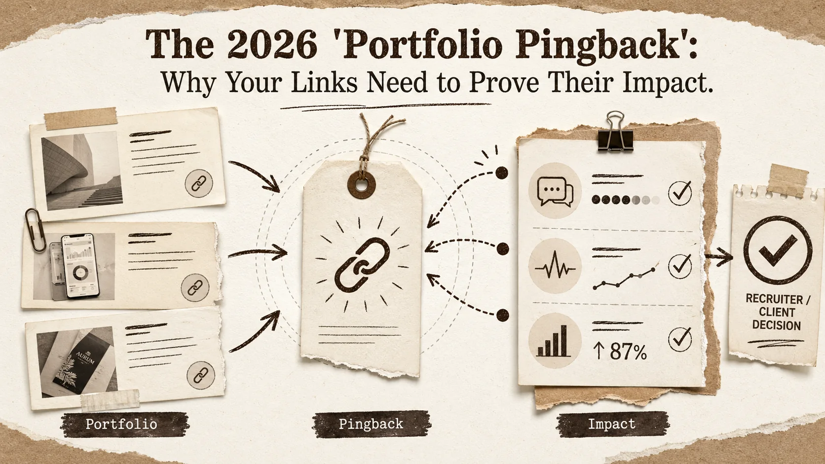
The 2026 'Portfolio Pingback': Why Your Links Need to Prove Their Impact
The 2026 'Portfolio Velocity' Gap: Why Fast Updates Are Now a Core Career Skill

The 2026 'Portfolio Echo': Why Your Online Presence Must Now Speak for Itself (Without You)
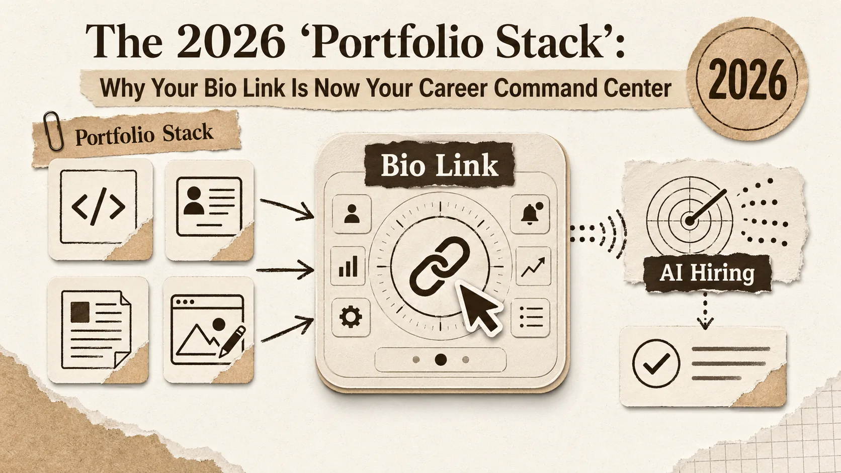
The 2026 'Portfolio Stack': Why Your Bio Link Is Now Your Career Command Center
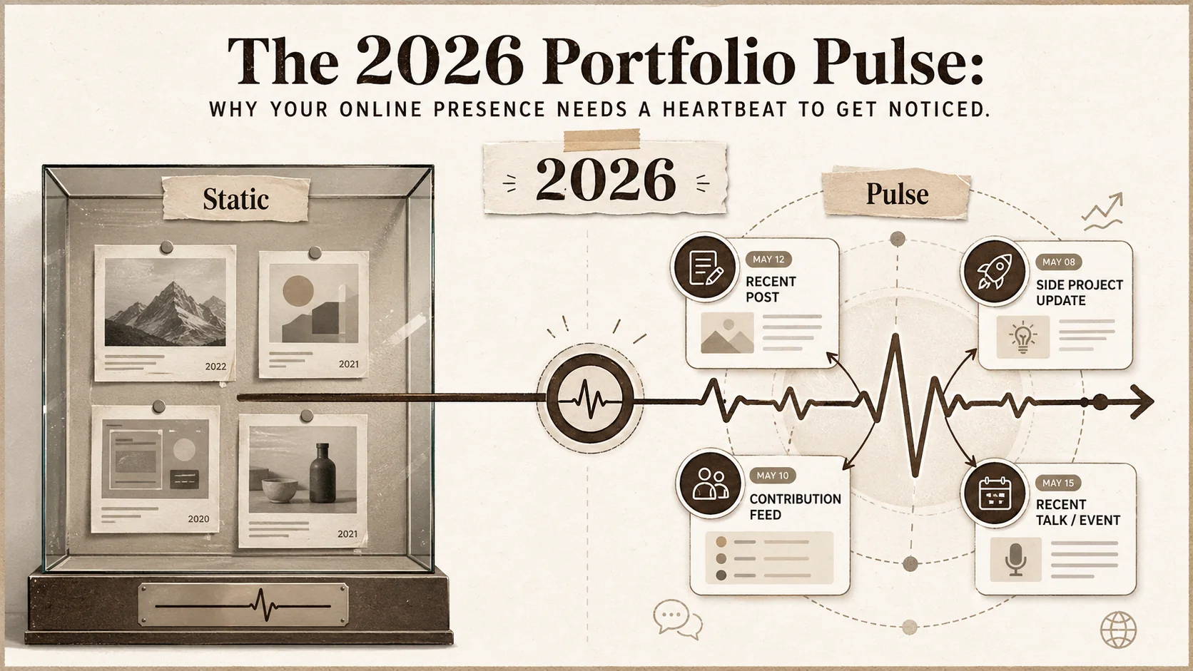
The 2026 'Portfolio Pulse': Why Your Online Presence Needs a Heartbeat to Get Noticed
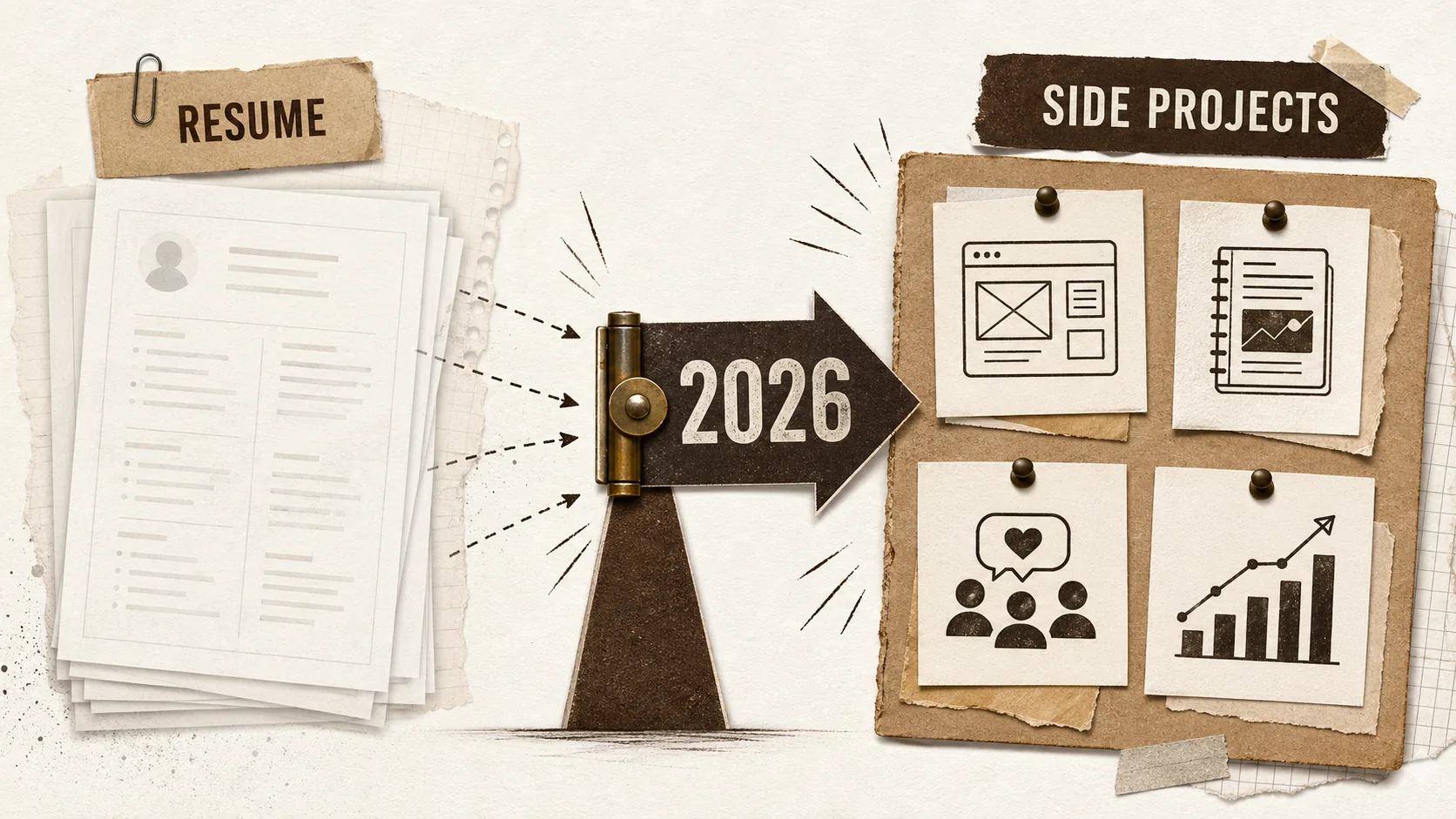
The 2026 Portfolio Pivot: Your Side Projects Are Your Career Asset
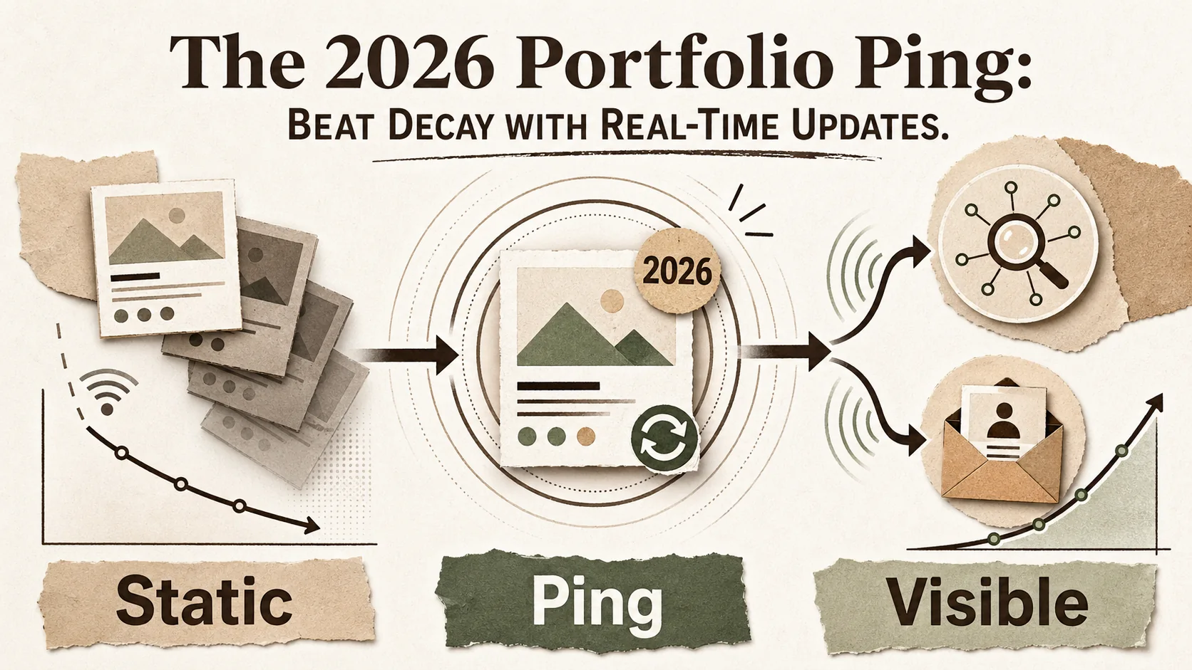
The 2026 Portfolio Ping: Beat Decay with Real-Time Updates
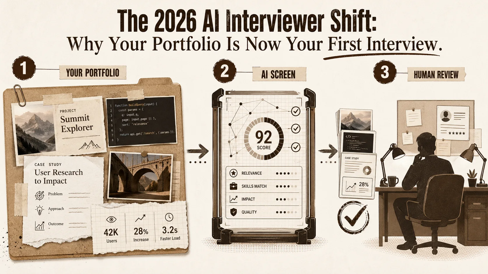
The 2026 AI Interviewer Shift: Why Your Portfolio Is Now Your First Interview
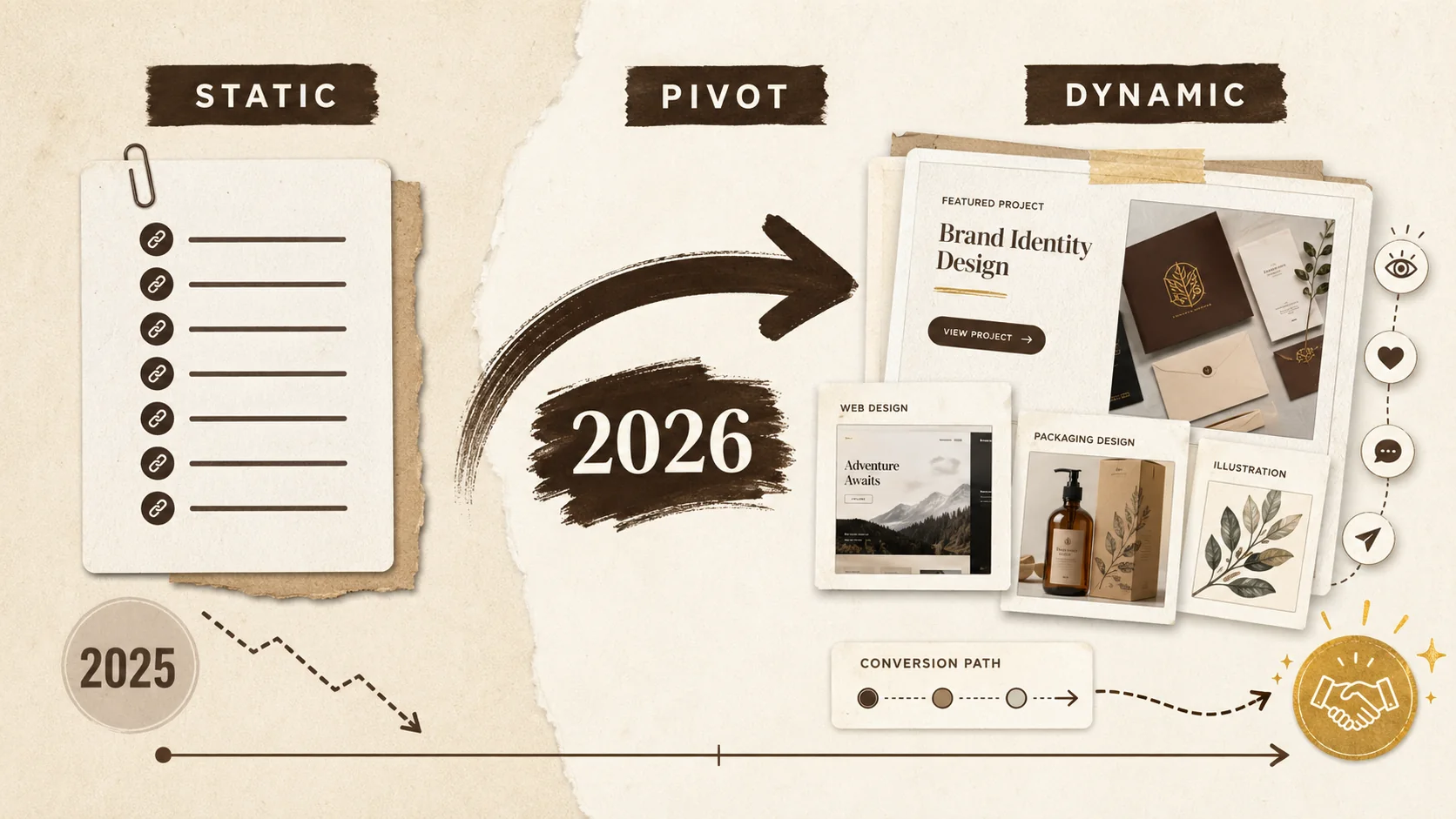
The 2026 Portfolio Pivot: Why Static Links Cost You Opportunities
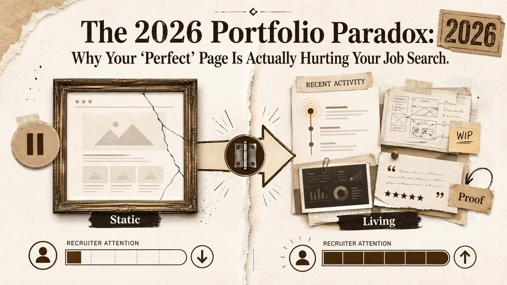
The 2026 Portfolio Paradox: Why Your 'Perfect' Page Is Actually Hurting Your Job Search
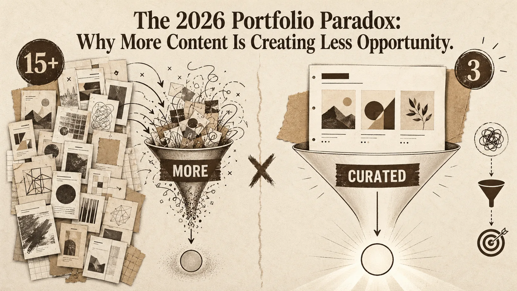
The 2026 Portfolio Paradox: Why More Content Is Creating Less Opportunity
The 2026 Portfolio Stack: Why Single-Page Sites Are Replacing Traditional Resumes
Why Your 2026 Job Search Needs a Dynamic Portfolio, Not Just a Resume
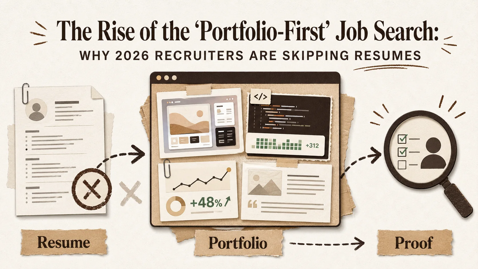
The Rise of the 'Portfolio-First' Job Search: Why 2026 Recruiters Are Skipping Resumes
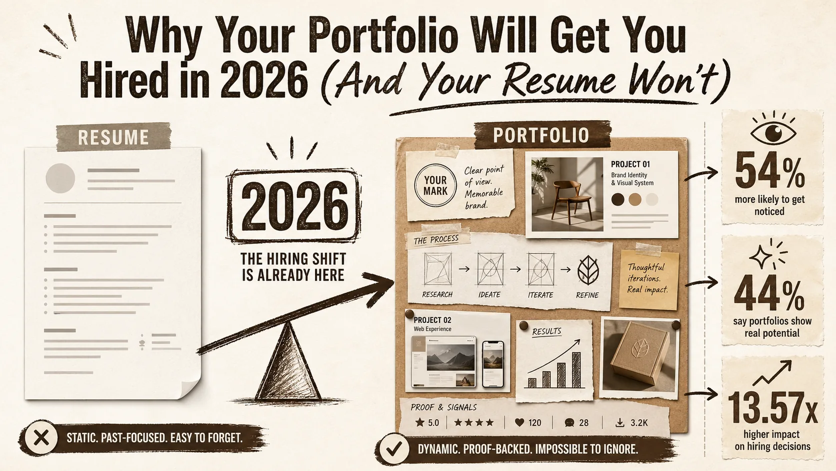
Why Your Portfolio Will Get You Hired in 2026 (And Your Resume Won't)
The hiring landscape has fundamentally shifted. This article explores the data-driven reasons why a dynamic portfolio is now more critical than a static resume for career success in 2026.
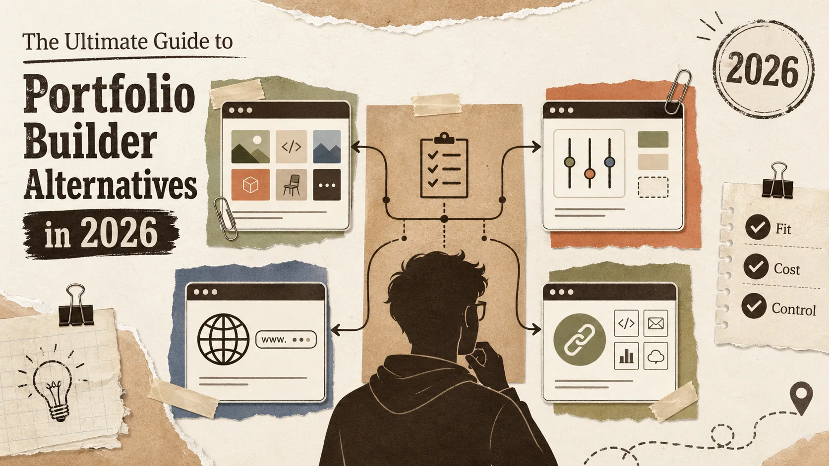
The Ultimate Guide to Portfolio Builder Alternatives in 2026
# The Ultimate Guide to Portfolio Builder Alternatives in 2026\n\n[INSERT_IMAGE: A developer looking thoughtfully at multiple portfolio website options on differe...
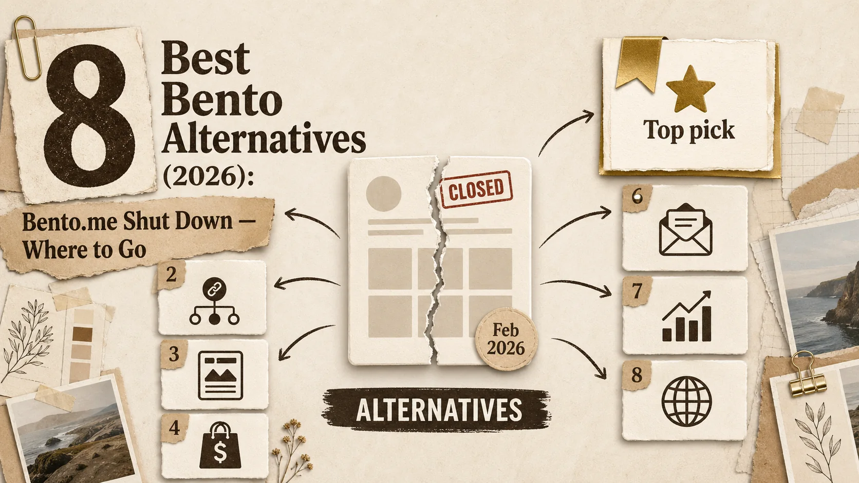
8 Best Bento Alternatives (2026): Bento.me Shut Down — Where to Go
Bento.me shut down on February 13, 2026. Compare the 8 best alternatives for former Bento users — from professional portfolio builders to included link-in-bio tools.
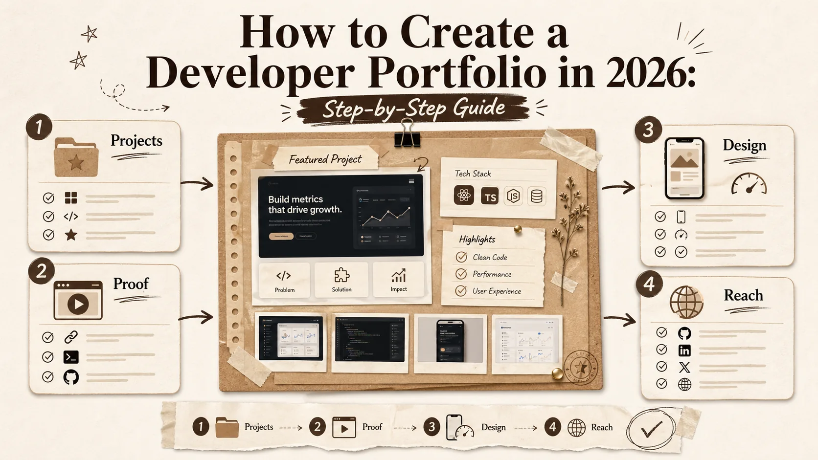
How to Create a Developer Portfolio in 2026: Step-by-Step Guide
Learn how to build a standout developer portfolio in 2026. From choosing projects to showcasing skills, this complete guide covers everything you need to land your dream job.
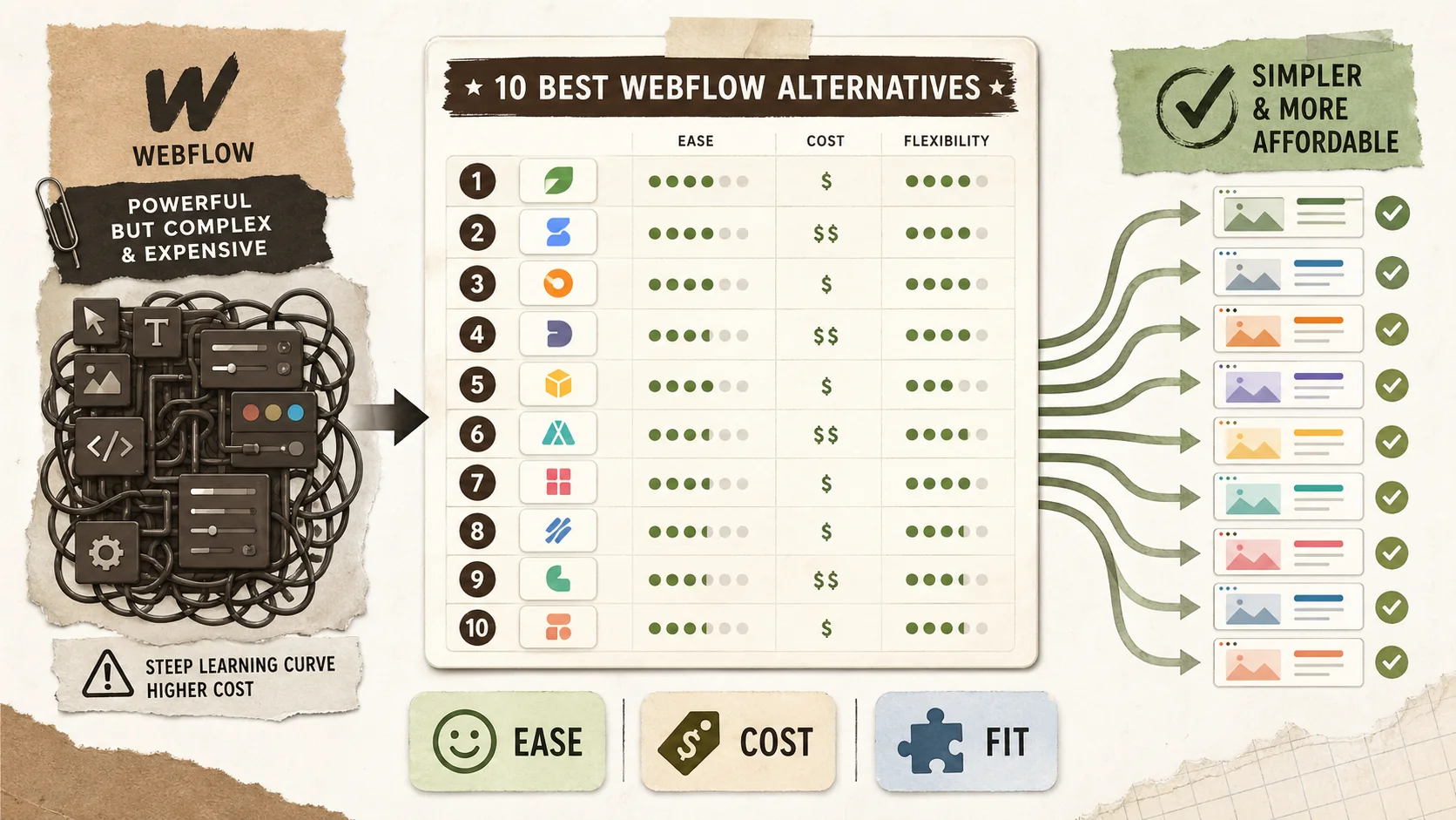
10 Best Webflow Alternatives (2026): Ranked and Compared
Discover the top 10 Webflow alternatives in 2026. From portfolio builders like Popout Page to visual editors, find no-code solutions without the steep learning curve.
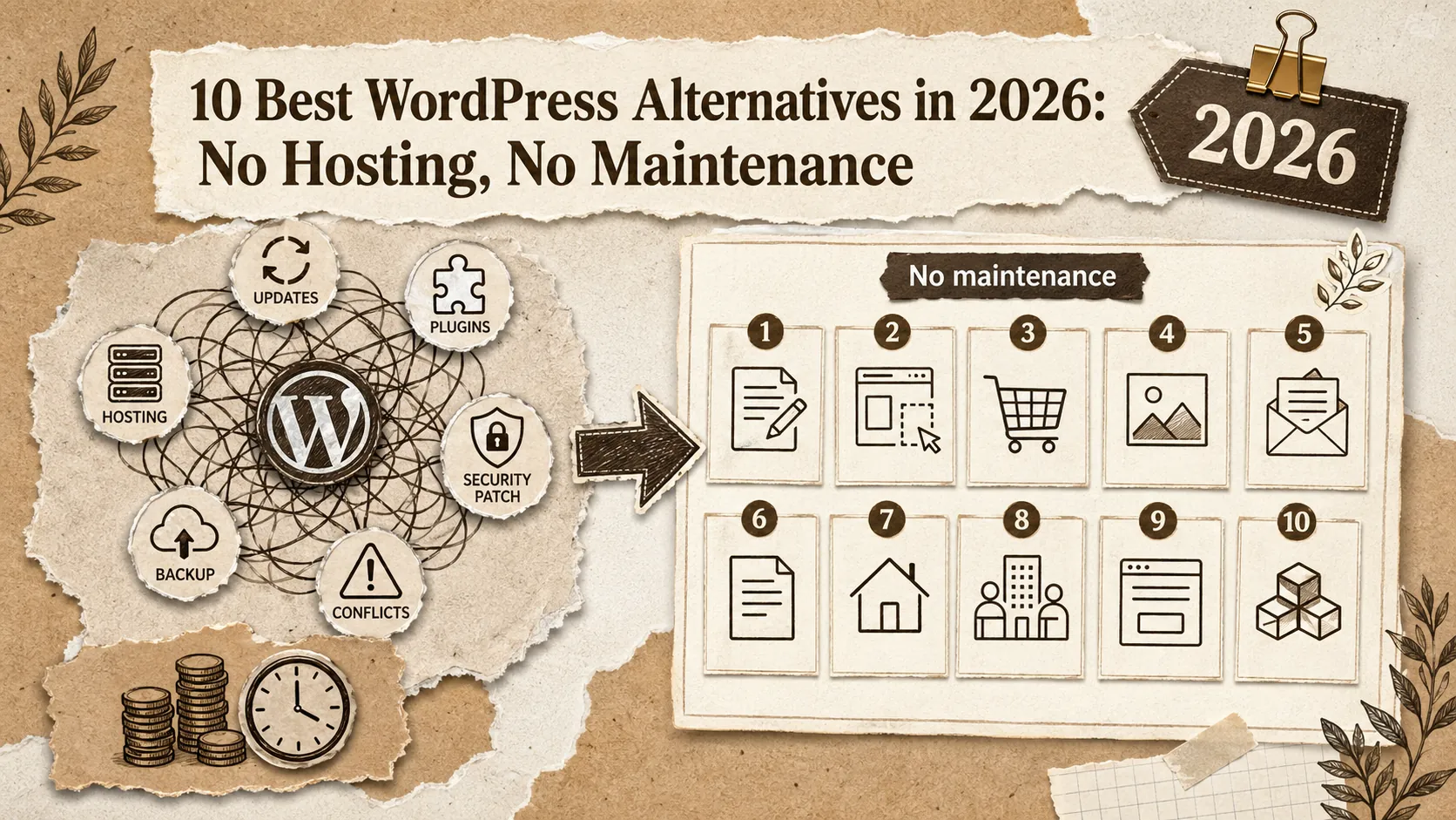
10 Best WordPress Alternatives in 2026: No Hosting, No Maintenance
Tired of WordPress updates and plugin conflicts? Compare 10 WordPress alternatives with pricing, features, and real pros/cons. Ghost, Webflow, Squarespace, and more — find the right fit in 5 minutes.
10 Best Squarespace Alternatives (2026): Cheaper & Better Options
Squarespace charges $16-52/month for features most users never touch. Here are 10 cheaper, simpler alternatives ranked with honest reviews. Updated March 2026.
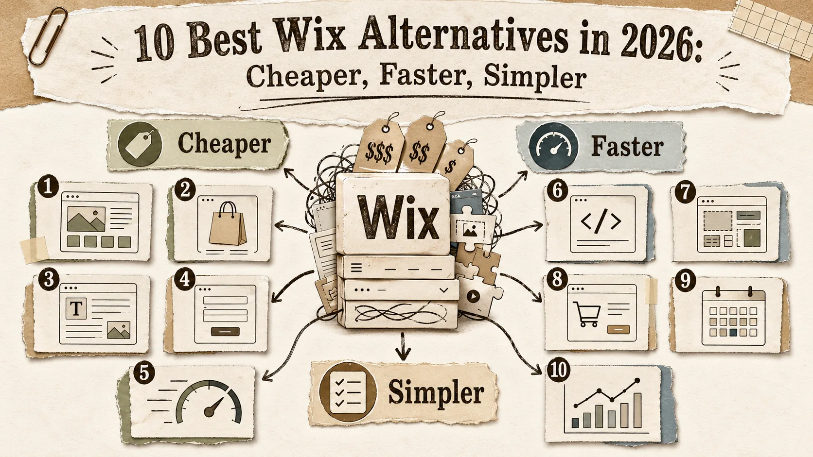
10 Best Wix Alternatives in 2026: Cheaper, Faster, Simpler
Wix is overpriced and overcomplicated. Here are 10 better alternatives ranked by pricing, ease of use, and real features. Updated March 2026.
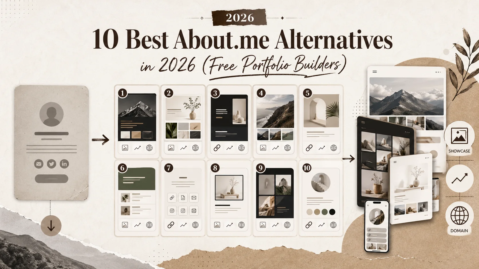
10 Best About.me Alternatives in 2026 (Included Portfolio Builders)
Discover the top 10 About.me alternatives in 2026. From portfolio-focused platforms like Popout Page to professional networking tools, find the perfect personal branding solution.
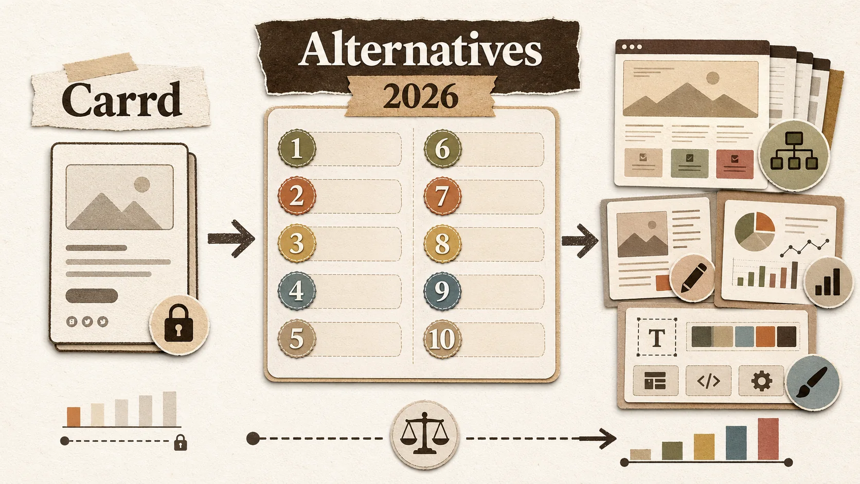
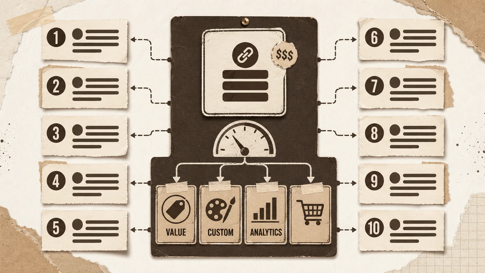
10 Best Carrd Alternatives (2026): Ranked and Compared
Discover the top 10 Carrd alternatives in 2026. From portfolio builders like Popout Page to landing page creators, find the perfect one-page website solution with more features and better value.
10 Best Linktree Alternatives in 2026 (Included & Paid)
Discover the top 10 Linktree alternatives in 2026. From included options like Popout Page to premium tools, find the perfect link-in-bio solution for creators, influencers, and professionals.
Ready to build your portfolio?
Create a stunning portfolio in minutes and get discovered by recruiters worldwide.
Start Pro for 1€